Modern fences aren’t really fences at all – they’re exterior walls. That might seem like semantics to you but it’s a significant difference to me. We have a urban infill project where there is very little yard and the entire house is designed around and focused on a center courtyard. We wanted to extend the interior courtyard out to the perimeter as an exterior room but the adjacent properties are physically very close. A screening wall was required to define this exterior room while providing some privacy from the neighbors (even if they are lovely people).
I have written about designing fences that read as walls rather than fences before: Modern Fences – Use Your Imagination – and I have to tell you I was surprised at how often people read that post. I had originally postponed writing on the subject of fences for months thinking that most people would find the subject matter incredibly boring. Turns out that of the 350+ posts I’ve written on this site, that is one of the most read.
Who knew?!?
Since its been almost two years, maybe it’s time to talk about modern fences again.
.

This is a 2d look at a 3d model I made of this fence in SketchUp – I need to tell you that I did not design this fence, it is from the landscape architecture firm Hocker Design Group, but I doubt they would lay claim to its original design either. The design is a fence I haven’t seen too often, and I really think it is turning out wonderfully.
.

This is the actual fence on site in the process of being built. The design of the wall is pretty basic – it’s a 1×6 followed by a 2×4 that has been turned on its edge … and then the pattern is repeated. This is not the most cost effective fence design due to the expense associated with using so many 2×4’s – even more so when the fence is being built out of sustainably harvested ipé wood. I have prepared some construction details down below but before any of you eagle eyes point out that I should be protecting the exposed ends (end grain) of the boards, there is a 2×8 top cap that has not been installed yet.
.

You could recreate this fence very easily and with a less costly wood – I think the strength of this design is in the pattern, and in the variation of depth in the face of the fence. In our version, the wall is running along the top of a tall concrete retaining wall so there is no need to bring the wall all the way down to the ground. We aren’t worried about landscape maintenance beating the stuffing out of the bottom of the fence – I call this a “sacrificial board”. By sacrificial board, I just mean the lowest level board that will get trashed by weed whackers and will receive the most amount of water damage. This board (when used) needs to be pressure treated since it will be in contact with the ground.
.

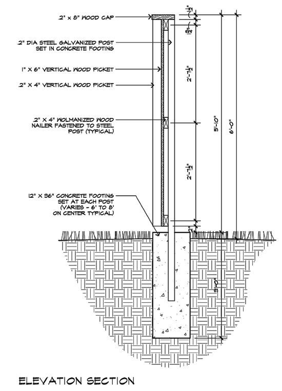
Depending on the material you choose to build out your fence, the metal posts are typically the single most expensive item. You could simply embed a pressure treated wood post into a concrete footer and avoid the cost of the metal posts altogether. Since our fence is made out of ipé – a wood that is rated to last more than 25 years, it wouldn’t make sense to hang it on posts that will start rotting out after 10 (or less) years.
.

.
In this elevation section detail, if your fence was being installed more traditionally down to the ground, you would install a pressure treated 2×12 instead of the bottom most 2×4 shown here. That would provide you with your “sacrificial board”, something that all fences should have… ALL FENCES!!

I didn’t need it in my condition but I have drawn in a circular footing (shown dashed in the plan section above) should you want to pass this detail on to your fence guy (or weekend warrior). You can see in the plan that the undulating pattern created by turning the 2×4’s on their edge really gives this fence some depth (and a place for spiders to build their webs – but don’t worry about that) – critical in this simple design to creating the look that this fence is more of a wall than a fence.
.

Here is a context shot I took yesterday morning of the courtyard. There is a large wood ipé deck to the left hand side of the courtyard (as well as a fence that hasn’t been started on yet) but on the right hand side you can see the wood fence in place. The landscape plan calls for a single continuous row of bamboo to be planted in front of this wall. By yesterday afternoon, the bamboo was on site but not planted yet – there is still some irrigation work to be completed in this area.
.

And here is a shot looking looking across the deck at the fence as it is getting installed. The gap you see in the middle of the fence is there because they are using the side yard to carry in materials to the courtyard and they don’t want to close off this access just yet.
There you have it – I hope you enjoyed this look at a very simple modern fence. To be honest, I don’t think my pictures give this simple and elegant fence detail the justice it deserves. Maybe the pictures from the professional photographer will capture the essence a little better.
Cheers.
.
.
