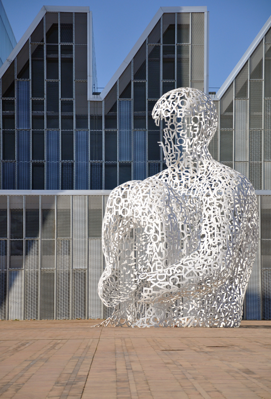
One of the buildings that I really enjoyed when I was in Zaragoza, Spain (for the Reign in Spain trip earlier this year) was the Convention Centre of Aragón – a centerpiece for the entire Expo that took place in 2008.
.

.
The Convention Center of Aragon was designed by Nieto Sobejano Arquitectos and is a dynamic multi-use space that was designed to serve a variety of functions once the Zaragoza Expo ended. It is composed of three main blocks that house a multi-purpose pavilion, a series of modular halls and offices, and the largest auditorium in the city.
The building was constructed using prefabricated panels – entire portions of the building’s exterior walls and façade were constructed off-site and outfitted with a variety of finishes ranging from shade screens to acoustic panels and sun-reflecting ceramic tiles. As a result, the building was able to be rapidly constructed and in the future, it can be easily repaired, maintained, and configured simply by switching out older panels for newer ones. Despite the flexibility designed into the configuration of the building, it isn’t readily apparent that the building was as modular and systematic as it actually is – something that wasn’t lost on the members of our traveling party.
.

.
 .
.
The convention center’s most eye-catching attribute is its dynamic roof, which is emblazoned with 12,000 triangular ceramic tiles arranged in geometric patterns that shift according to the incident of the sun.
.

.
The building’s glass curtain walls are shielded by a series of prefab mesh panels that form geometric brise-soleils that allow daylight to infiltrate while reducing solar heat gain. The building’s roofs are carefully angled to protect the interior spaces from Spain’s harsh southern sun, and a series of skylights were installed to capture sunlight and carry it through all of the center’s levels and rooms.
.

This is a look at the lobby space once you enter the building. It was a large and dynamic space and the large – no seam epoxy floor really looked great. You couldn’t help but notice the expanse and tell that there weren’t any visible joints … maybe you couldn’t help notice it if you were an architect taking a tour of the building so you tended to look for things like that.
.

I should have taken better notes while I was on this tour but I believe this space – which was on the upper-most level was used to receive the King and Queen of Spain when the Expo officially started. Honestly all I could think about was how fantastic the light quality was in this room and there were almost no light fixtures at all. It was amazing.
.

This photo of the chairs was taken while our tour guides were explaining something … other than cropping the photo, I didn’t edit this photo at all. Pretty cool right?
.

This is technically a hallway off the main lobby but was large enough to be a pre-function space. Again, almost no light fixtures and amazing light quality. Look how even it is in this picture.
.

This is a picture of the performance hall … and apparently where all the light fixtures were used.
.

So this post has been sitting in the draft section on my site since March … and I don’t have a good reason for waiting so long to show project or the pictures I took. I think I had grander plans for the review of the building and keep putting it off thinking that I was going to include diagrams and sketches, explain construction sequence and methodologies, etc. I finally decided that some days, the pictures are enough.
I would also like to once again thank ASCER, a Spanish Trade organization that promotes Spanish tile sales in North America under the name Tile of Spain, and Amanda Eden at White Good& Co. for bringing me along on one of the most educational and thoroughly enjoyable trips I have ever had the pleasure to attend. I learned more about the culture, people, and tile of Spain than I thought I would and it has made me a more informed and knowledgeable architect.
.
.
