It’s been a long time since I have provided an update on the KHouse Modern so I thought I wold take this Superbowl Sunday and put together a post that brings you up to speed. We received our permit at the end of October of last year so I know what you’re thinking … why haven’t you started construction?
I don’t have a good answer for you to be honest. Our owner is crazy awesome in that he really cares about the design process and keeps asking questions that pushes the design and invariably causes changes. Even thought this is a cost+ project, the contractor has prepared a budget bid price and we have made some revisions to save some money – most of which were structural changes. In addition, we made the deck both bigger AND smaller at the same time (that’s the kind of architectural magic we perform at my office).
So, let’s kick this update off but for those of you who are new, you can find all the KHouse Modern updates and articles here … they will change your life.
[and by “change your life” I mean, “distract you for 10 or 15 minutes” at most]
Today’s post is really going to be a comparison of how things have changed from early August of 2013 to our most recent construction issue towards the end of January 2014. I have taken the old BIM rendered images – the first from the beginning of August 2013, followed by one from the end of October 2013, finally ending with one that we rendered this weekend (January 2014) so that you could easily see how things have changed and evolved. I think it’s pretty interesting and I hope you do as well.

This is the original site model that we built – this dates back to July of 2013. I am amazed at how little the original concept actually changed despite all the tweaking we have done to the plan.
This rendered site plan still shows the vegetative roof – something that we were pursuing since this will be a LEED for Homes certified project. In the end, we removed this feature because the expense didn’t warrant its inclusion into the final product. 
This is the latest and greatest site plan. Make a note that we are showing a fence that rings the property … but there really isn’t a fence, at least not a proper fence as most people would think. We ended up removing the wood board fence and decided to go with a chain link fence that has shrubs planted on both sides so that it provides the security of a proper fence – but will visually disappear. Keep this in mind as you look at the rest of the pictures in this post.
In this image, you can see that the original design included a 4′ tall cast in place concrete wall that ran along the front yard setback line. We also have a cantilevered ramp along this elevation. One of the items we spent time thinking about was how the client would age in place at this house. Being able to incorporate a ramp to access the hour was important to us.
In this image, the cast in place concrete wall has actually been enlarged to 6 foot due to privacy concerns that the owner expressed. We also redesigned the deck off the master bedroom so that there was a generous seating area available.
The cornet wall has been removed, we didn’t show the vegetative chain link fence in this final render (not much value as a communicative render if we had…). We also came back in and added the trunks of trees to the model. One of the things that was throwing some people off was that there weren’t any trees being illustrated in these renderings – you can thank me for that. I always turned the trees off on these images because the landscaping is so think you wouldn’t actually se any of the house if we turned them on. Showing the trunks was my way of letting you know that there are in fact, a lot of trees on this site … and we avoided all of them.
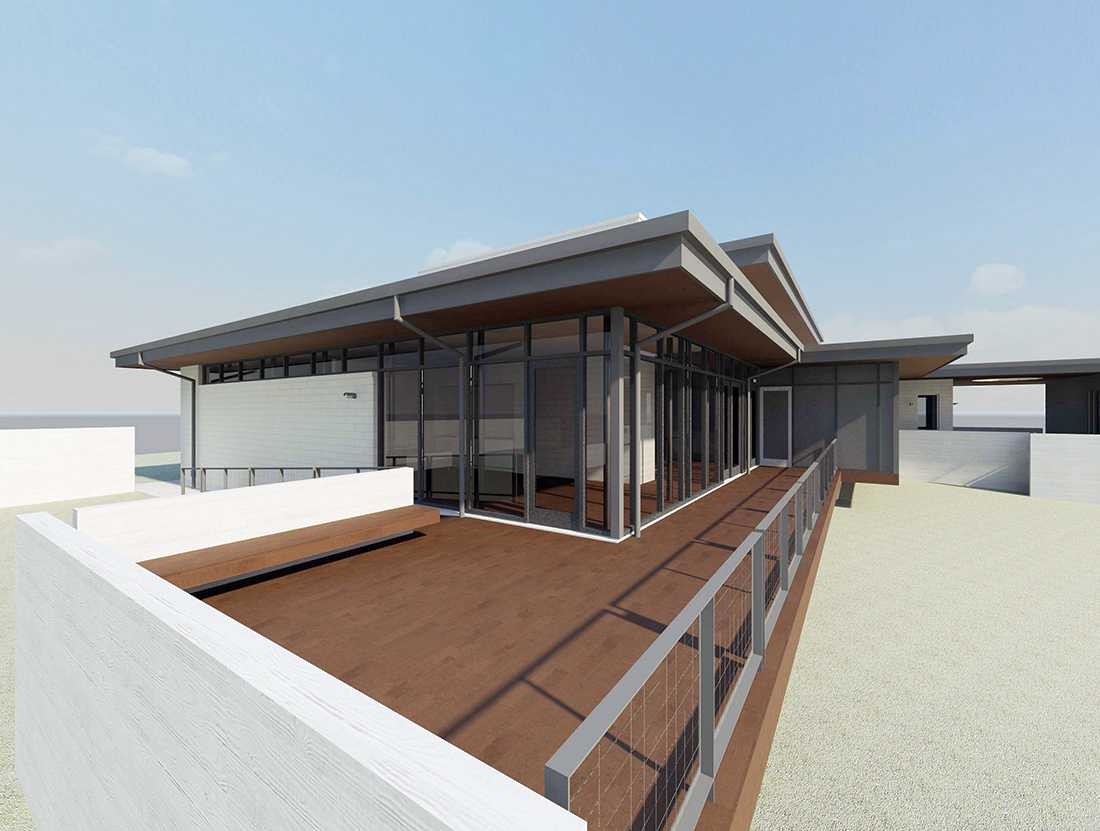
This is a view right off the master bedroom – with a small gathering space at the top of the ramp. Architecturally it worked but we always thought we were missing something that could make this area far more useful.
And in this image, you can see how we changed things up. We made the deck area here considerably larger and added a seating area. This makes getting in and out of the sliding door at the master bedroom far nicer. At the end of the deck, there is an outdoor dining room that is completely screened in … the mosquitoes are rather larger here in Texas but the weather is nice enough for 6 months out of the year that dining al fresco is something worth accommodating.
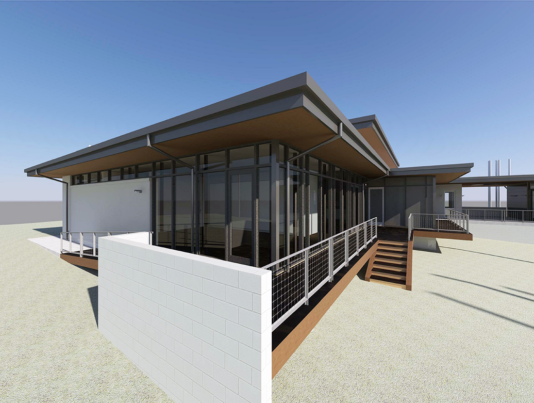
You can see the enlarged deck was reduced again – we relocated the outdoor seating area off the main living area and added a set of deck stairs to make accessing the rear yard a bit more direct. Yes, I know these stairs aren’t anything to write home about, they’ll change before we’re through with things.
Here is a view looking back up towards the house from the era of the yard. You can see that there isn’t easy access to the yard in place and the concrete retaining wall (shown on the right hand side of the image) is still fairly awkward. The client thought there was simply “too much concrete” in this area for his tastes.
We got rid of a bunch of the concrete and added a bunch of large windows in the guest bedroom wing of the house (the right hand potion of this rendering). Much better in my opinion and the client still wanted “less concrete”.
Turns out the client was right and in this last image, you can see that we got rid of even more concrete retaining wall. We also connected the wood deck from the left hand side (Master bedroom) around the outdoor dining area, and connected it to the guest bedroom wing.
Finally, I thought I would add a bonus image that looks up towards the house from the rear yard … I think it is a fairly dynamic view. Of course, when I look at all of these images, I don’t see just see a cool house, I see opportunity for improvement – particularly in the size and scale of the retaining walls around the project. One of the really amazing things that working in BIM (Building Information Modeling) is that you are taking the time to create a real 3-dimensional model of the house and there are few things that you can’t discover. Knowing how the house will come together while we are still working on paper (rather than the contractor working on site) is a powerful tool that can not be ignored for long – at least not to your own peril. I know we are not the cheapest firm in town to work with, but I can promise you that we can solve problems during the drafting stages for far less money than discovering the problem when the contractor calls you from the job site.
These renderings were created using Revit and to be completely honest, they are a total pain to generate. Some of these images took over 12 hours to rendered and half the time, we discovered that something wasn’t right after we had already invested the time. I’m sure – like all things – we’ll get better the more frequently we create them. We aren’t giving up on them because we can see the value in preparing them even if no one else can … yet.
Cheers – and thanks for following the KHouse Modern project. We should be breaking ground any day now.
Cheers,


