Things used to be much more simple – but that doesn’t mean they were better … but in this case it does. During the holiday break, I had some time to continue flipping through all the old Architectural Forum magazines we acquired and I found a real gem of a project. Among the many funny ads – which have been the subject of many posts – there are projects that get featured in these old magazines that I do not think would ever get any attention from today’s print media. Why is that? Is it because they aren’t made out of bleeding edge technology or shipping containers, or living walls? I couldn’t tell you the answer other than those things probably sell magazines better than practical solutions to typical problems that have been resolved in a considered and thoughtful manner.
That’s too bad.
I found this project – ‘Bottling Plant’ in Greensboro, North Carolina from J.P. Coble, Architect in an issue and thought it was really something great. Construction costs were to be kept at a minimum (who hasn’t heard that before) and according to the description, it had a bright color scheme with green equipment (featured prominently inside the glass wall along the main elevation), bright red columns, and aluminum colored interior walls. The exterior was white with a red billboard type exterior signage to take advantage of the building’s prominence on the main boulevard just outside of town. I really wish these pictures were in color.
What originally caught my eye was the wall section … when I looked more closely, it would appear that the wall section doesn’t quite match the adjacent photos. The way the glazing goes from floor to ceiling with no header – allowing the ceiling plane to move through the window wall and extend out as the overhang. There is no interruption as your eye moves from interior space to exterior space – the wall section shows a slight difference between the interior ceiling and the exterior soffit but that’s not how it was built. The offset was either removed or the roof overhang was thickened up – but I don’t think that was the case considering that the roof overhang doesn’t appear to be more than 10″ – 12″ thick.
 I decided I wanted to see how this building has fared since it was built some 70 years ago. I didn’t actually think it would still be functioning as a Canada Dry Beverages Bottling plant … I don’t know what I thought to be honest. I tried searching on the architect, then the engineer, then bottling plants in Greensboro – you name it, and I came up with very little information and no images. I even spent the time to go through Google Maps to see if I could find a shot of the building from the roadway – zilch. What I did find was an article to buy the plant here from November 26, 2008. They are going to tear it down along with some housing for the poor and turn the entire area into a complex that features some combination of restaurants, retail and hotel accommodations.
Yippee ..? I don’t know the area so I suppose I shouldn’t cast dispersion and say that this is another example of progress being made in favor of some combination of restaurants, retail and hotel accommodations. We need more of those things right?
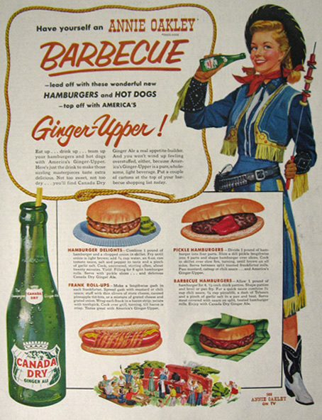
So as depressed as I was over the demolition of a building that up until a few hours ago I never knew existed, at least I found some awesome ads from Canada Dry.

They call him GINGER but I just I call him freaky crazy!
 Mmm …. a Ginger-Upper! That does sound good but the other items on that picnic? Not so much. Pickle Hamburgers and Hamburger Delights? Sounds a little dodgy … I’ll stick with the soda thanks.
 Picnics were clearly a theme – makes sense to me, picnics are delightful! Except why is that bottle so big and is the diving board that kid is sitting on a piece of lumber? The wheels are flying off on this ad but that’s what makes it so good. I’m going to switch to Canada Dry Ginger Ale today!


