“If you go on vacation to Ireland and don’t enjoy yourself, then that’s your fault.”
This is what a man told me as I sat in the British Airways lounge in Heathrow airport while I was waiting with for my flight to Dublin, Ireland, with my wife and daughter. We are currently enjoying my daughter’s spring break holiday from school and decided to adventure in Ireland for a week. This will be my second trip to the island, a sort of homecoming for my wife since she lived here for awhile when she was a child, but the first time for my daughter.
While I took the comment above in the good-natured spirit it was delivered, it has me thinking about how this sort of attitude can be applied to almost any area of your life.
So now I am currently on family holiday in Ireland – a jam-packed 10 days of adventure and exploration … but that doesn’t mean I’m not working. We had a 12-hour layover in London on our way to Dublin so we took that opportunity to go visit “The Making of Harry Potter” at Warner Brothers Studio in Leavesden, UK during this time, and while I found it incredibly fascinating, and seeing the hand-drawn production drawings of the various sets and structures was absolutely the highlight of the entire tour. In one part of the tour, these sorts of construction drawings are put up on the wall as a sort of wallpaper and I couldn’t wait (for the first time ever) to get to the gift shop at the end of the tour, only to be disappointed that almost nothing of what I wanted to see was included in any of the books made available.
I go on vacation and I still spend my first few hours out of the office looking at construction drawings ….

Speaking of construction drawings, we are elbows deep at the moment as two really interesting projects I have been working on are coming towards the end of the construction drawing process. The first of which is was most recently focused on in the new series “Architectural Sketches” … in this case, it was the second installment where I took a focused look at the retail component of a 20,000 square foot new development that will include a medical practice as well as additional tenant space.
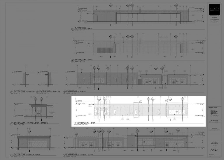
We have been working on closing out the “shell” building (just the exterior walls and roof) portion of the project and really getting into the interesting bits of design. I thought I would show some of the exterior elevation work we’ve created – the drawing above is the construction drawing sheet that focuses on the exterior elevations. I’ve grayed out the entire sheet with the exception of one elevation in particular that I will focus on.
The city where this project is being built has a development standard in place that dictates all sorts of whacky things in their attempts to ensure that the buildings are architecturally considered. The percentage of masonry, the percentage of “complementary” masonry, how the building is supposed to offset and undulate in both the horizontal AND vertical planes based on the overall length of the building, etc… I understand why they are doing it but the methodology is ridiculous. All that is really happening here is that they are driving up the cost of the project.
This is not a little building and we have gone to great lengths to avoid having this project look like all the other generic developer projects that scatter the frontage road of the highway like buckshot. If you can look at these elevations and not have the prescriptive rules appear blatantly obvious to you, then I will take that as no small measure of our success.

One of the items I am particularly excited to see developed is a metal screen we have at the main entrance to the medical practice. We have removed a sizable portion of the building’s footprint to create a covered courtyard that will both physically and visually ease you into the building. We didn’t want this “courtyard” to feel like a dark hole so we have opened it up along one edge with this metal screen to allow a controlled measure of light and airflow into this space. This metal screen is a theme that makes several appearances throughout the project – hopefully to great effect.

Another project that we are working on is the renovation and refurbishment of a 1980’s era speculation built office building in Dallas. Once the existing interiors were removed, the building has a nice, clean, open floor plate to work with … the exterior is not so lucky. It is a two-story building elevated above a ground-level parking deck, with a stucco exterior finish and ribbon windows around the entire building.
Boring.
We are going to minimize the amount of actual demolition occurring at the exterior and instead focus our efforts on reshaping how that exterior is perceived. We have had a few high school students (Bethany and Lauren) spend time with us as part of a work program at their high school (both will be attending college to study architecture in the fall) and we had them do some work on this model to help visually represent what the finished product might look like.
The particular area of attention was the screen that wraps half of the building, and the new vertical exterior stairs we added so that we could deal with some 1980’s code nonsense on the interior. It would take me a post in and of itself to explain why these new stairs were required, and in the end, you would hate me for telling you all about it.

The process of building this physical model, and walking around the digital model using virtual reality headsets, allowed us to determine that the cladding we were putting on the exterior stairs wasn’t working the way we wanted. Sure, it added a measure of transparency, allowed air to flow, created a new visual mass for the building that help update the form of the building, etc., but it didn’t quite come out the way we were hoping …. so we went back to the (literal) drawing board to come up with another idea.
Translucent polycarbonate paneling. (That’s probably what you were thinking too)
The structure was simplified and the geometry refined and the result is what you see in the quick rendering above.
We will need to continue refining a multitude of nuanced parts that are secondary and tertiary players in this solution but quite honestly, that will be the most fun of the entire process.
I am really excited to see how this front elevation continues to develop over the next few weeks as we move past design-development and through construction drawings. I strongly believe that it is the detailing that will make the difference between a good idea and a great idea.
Lastly, because I apparently like to torture myself with endless amount of work (as evidence, I submit to you exhibit ‘A’ that I am writing a blog post from the kitchen table of my Airbnb in Dublin on a Sunday night), I decided I needed to continue working on my photoshop skills … and that means new architectural t-shirts.
Truth be told, I don’t really make do this to make any money, I make them because I want to wear them myself as I lay about my backyard in summer while working on my barbeque skills … so the answer is “yes, I do have one of each design hanging in my closet.”
I thought I would work on distressed patterns and images, hoping to create what would appear like either a vintage t-shirt or one that was made using a raw potato and an ink stamp. Architectural Jolly Rogers?
Yes, please.
Vintage patterns and stamps … who doesn’t love them?
Of all the t-shirts I have ever made, the BIMja has been the most popular. I thought it was time to reimagine the layout (even though the large old version is still available).
And if you are going to make any architectural t-shirts, it seems only fitting that Le Corbusier’s “Modular Man”makes an appearance.
There are loads of other designs in place and if you wear t-shirts at all, I feel fairly confident that you can find one that will be unique and accurately represent your love of all things that make you an architectural insider. You can access all the architectural t-shirts here, or by clicking any of the images above, you will be magically transported to that particular design.
There is a lot going on and I am extremely happy and excited about the projects the office is currently taking on – going to work every day is an adventure … except for the next week when I am on vacation and other people are taking care of my projects and living in my house.
Cheers!


