Who has an Oculus? (finger-pointing) This Guy. More accurately, my client has one, but hopefully I’ll get to visit it every so often … maybe on every other holiday and weekends.
Oculus is a word that you don’t get to say very often … even less often do you get to put one of them into your project. Let’s admit it, they are the duck-billed platypus of the architecture world. I will admit that I didn’t realize I was as big of fan of this particular architectural feature as I have become … but can you blame me.
They’re awesome.

The image above was when the idea first came in to existence (combination sketch + Revit drawing) when we were looking at an exterior covered porch for the KHouse Modern project. This project has 4′-0″ deep overhangs and this space is deeper than is it wide and we were concerned that this outdoor area would be a little on the dark side …
… and the Oculus was born.
For those of you who are new to my oculus, I’ve described it previously this way:
“An oculus is basically a round opening that is located in the center of a dome or wall. The most famous oculus is in the Pantheon, and while everyone who has ever been to the Pantheon remembers the oculus, few probably knew what it was called.”
They probably just called it the coolest hole in a ceiling that they’ve ever seen.
As the KHouse Modern project is coming to a close, I thought it would be fun for me as the proud parent to take a look back at the oculus from its infancy to where it is today as a precocious teenager. These photos are the equivalent of pencil marks along the door frame indicating the passage of time and the growth that occurs.

I don’t make it out to the job site every day and I technically missed the birth of the oculus. It simply showed up one day – I have pictures of the framework being built but I wasn’t there as it was lifted into place.

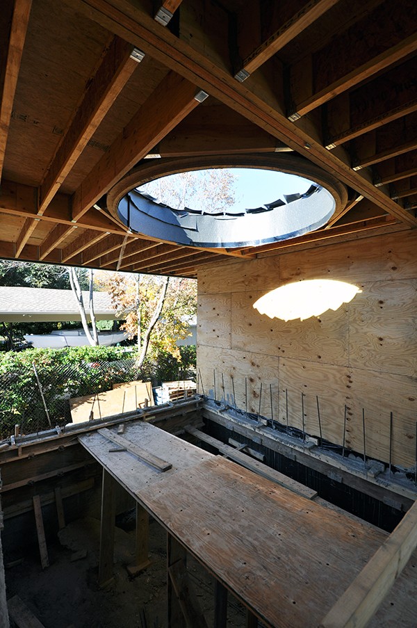
The sheathing is going up and the space is really starting to be defined. One of the things that I love the most about this particular space is the tree that is framed in this view. This tree looks like it’s doing kung-fu.

Now that the sheathing is in place, the pattern that the sun makes on the wall finally has a place to land. You can also see in this picture the grade change from the right hand side of this space and the left hand side. The contractor ended up building a bridge to help the workers move across this space … I’ll confess that it was at this stage that “someone” might have thought that the bridge should remain and a water feature be considered.


The exterior walls are all cast in place concrete in this area and for months, there were wooden walkways built all over the place. I “might” have talked like a pirate when I was taking these pictures …

Check it out … dirt. The hole is now filled with dirt and that delicious looking orange stuff on the wall is a building wrap that I like to use behind metal siding called “Wrapshield”which is made by Vaproshield.

These pictures of the oculus are taken from the roof … kind of boring, really. We have a low slope membrane roof (1/4″ slope in 12″) and the curb that extends above the roof plane is pretty minimal.

Just because I want credit for routinely putting my life at risk in my ongoing efforts to bring you the freshest and hottest pictures possible, I use a true wide-angle lens. I am literally hanging over the oculus opening and looking through my viewfinder. Falling over the edge here is almost given, if it weren’t for my ridiculously developed sense of balance, this might have been the last picture I ever took.

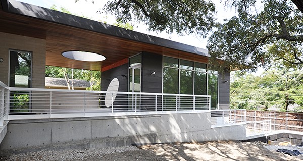
The ceiling (soffit) that we have on the House Modern is 1×6 tongue and groove mahogany with a clear finish.

The color of the mahogany along with the gray of the G90 steel siding looks terrific. The zinc coating on the steel gives it a warm tone and finish which compliments with reddish-brown of the wood.

We finally got a slab poured in this area and that means the steel siding can start to get installed. (rubbing hands together). There are moments when I truly can’t believe that this is what I get to do for a living. This is about having a vision, something that you imagine coming together in a very specific manner and as the pieces fall in to place, you start to see the executed version of what’s been sitting in your head for months … it’s very exciting.

In an effort to help you understand the “vision”, this is a rendered view of the oculus porch prior to the project even breaking ground. We endeavored to get the finishes accurately rendered in this image, and I will admit that I am amazed at how close we actually got this.
#scoreboard

This is a look at the “almost” finished product. Don’t get me wrong, we don’t guess at how these spaces will look as finished products … I’m not that surprised. For the most part, I am extremely happy with how this looks – but there’s a problem. To the right of the oculus above, you can see one of the two speakers that have been added to the ceiling plane.
I almost died when I saw it.
I went back in to the office and announced that I had stopped by the job site on my way in to work and saw that a speaker had been added to either side of the oculus. And it was a WHITE speaker.
Everybody froze and as everybody nervously looked around at each other … you could have heard a scale drop. Which I realize isn’t all that quiet, but we do have carpet in the studio, so, there’s that.

For all of you eagle-eyed folks out there, you might be thinking that these pictures are out of sequence. There’s a band of steel siding missing from the top that was previously installed and the speaker appears to be missing. Well, I can assure you that the speaker IS in fact there – we had it hand-painted to try to match the mahogany ceiling.
I don’t know why the siding was removed, but I’m sure there was a good reason for it. It was Sunday (yesterday) when I went by the job site and took these last pictures and as you would expect, I was the only person on site.

Maybe you can see the hand-painted speaker grills better in this picture. Another thing I should point out is that we had two of the wall sconces in this space powder coated – specifically the two that are mounted on the steel siding. (Just look to pictures earlier to see them before they were refinished.)

I was going to write a post on it but never did – so I thought I would include this particular view of the oculus so that I could tell you about the masonry e have on this project. These are actually solid concrete masonry units – 3 5/8″ thick but they come in a myriad of sizes beyond what you would typically have access to if they were standard bricks. On the house, we used a 4″ tall by 16″ long unit with a raked horizontal mortar joint and a flush vertical joint. The freestanding walls are 8″ x 16″ units – also with horizontally struck joints. We also used white sand as part of our mortar mix so that we could keep the walls looking really white – which is a nice contrast with the dark steel siding.

I’m standing down in the yard for this last pictures. We are really coming to the end now and for the most part, all that’s left (other than that missing steel siding panel) is the landscaping.

I plan on writing one or two more posts on this project before moving on to my next featured project. Next week, I should finally be able to talk (write) about the black locust wood deck we have on the project. It has been complete beating so far and it was something that I thought I would have already talked about … but the wood came in to the job site in terrible condition. Stupid black locust.
At any rate, it’s been a pleasure sharing this project with you. I hope you’ve enjoyed it as much as I have.
Cheers,

