Maybe this will be exciting, maybe it won’t, but I am going to start writing a few articles a month on architectural graphics and what I’ve done to get my drawings to look the way they do. I might talk hardcore technical computer specifics from time to time but for the most part, I am going to focus on the really small details. The idea for this series came to me the other day when I was asked by one of my employees to walk through some cabinet shop drawings and explain exactly what they are supposed to be reviewing. As I sat in front of the drawings, explaining why we do certain things, I realized that I have had similar conversations with almost everyone I work with … and if they all had these questions, it stands to reason that other people will have them as well.
To that end, the Architectural Graphics 101 series was born. There isn’t anything special about the topic I have selected for the very first entry in this series – in fact – I’ve almost gone the opposite direction and chosen something pretty vanilla as a starting point. If people seem to respond well to this series, I will continue them every other week or so.
So here we go ….

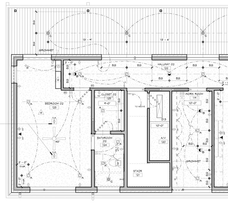
This is a “reflected ceiling plan” and it is exactly what it sounds like … a view of the ceiling looking down as if there was a mirror on the floor reflecting the plan back at you. Sounds complicated but it’s not; it’s done this way so that the orientation of the floor plan and the orientation of the ceiling plan are the same. If you wanted to show the ceiling as if you were laying on the floor looking up, the plan would be reversed – that’s why it’s “reflected”. This way you can look at the plans from the same orientation (looking down) but in one instance you are seeing the floor, and in the other, you are looking at the ceiling.
Okay, it still sounds complicated … but let’s pretend that we are all on the same page here and move on.
The point of a reflected ceiling plan, at least in my office, is to indicate where lighting and electrical get located. Trying to put this information on the floor plan would make that drawing overly congested and difficult to read so we separate this information out into its own drawing

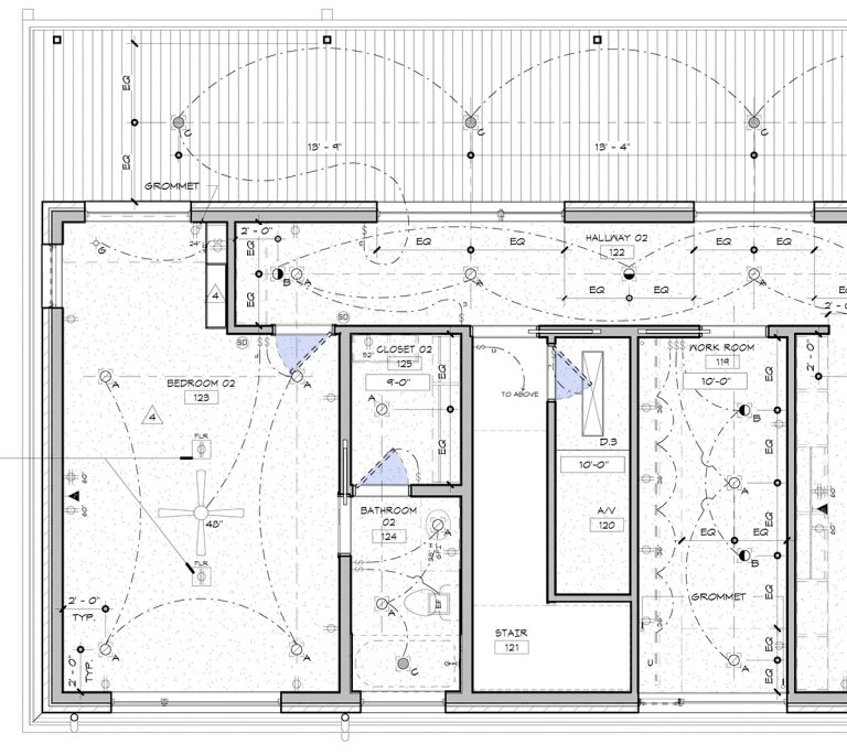
The focus of this initial Architectural Graphics 101 post will be the doors shown in this reflected ceiling plan. When I graduated from college, back when we still used vellum and pencils to draw, the vast majority of my time was spent working on commercial projects.
We did not draw in the door or door swings in these drawings. Why? I couldn’t really tell you … we just didn’t, that’s not how things were done.
Fast forward too many years for me to calculate, and I am now working almost exclusively on residential projects and nothing is done using pencil and vellum … and we draw in the doors and door swings. Shocking Being told to do this was a complete blast to everything that I had been told, this went against the grain, weren’t we going to get in trouble for this? So I asked my new boss (this was back in the year 2000) and I asked him “Why?”
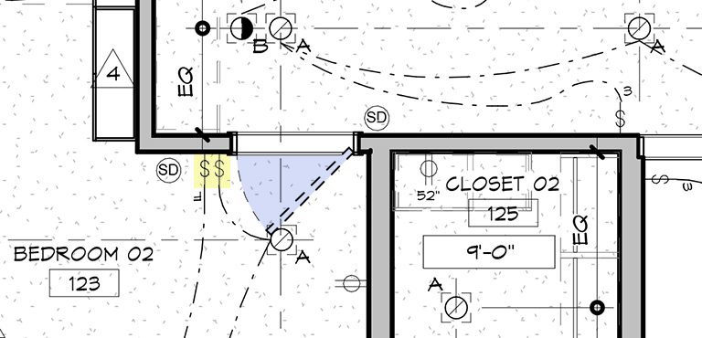
He told me it was to make sure that the light switches weren’t placed behind the doors when they were opened … and that made perfect sense and I have been drawing the doors and door swings (showing them dashed) in my reflected ceiling plans ever since.

More times than not it is pretty easy to avoid accidentally locating the light switches behind the swing of the door, even if you don’t show your door and door swings in your RCP, but those generally aren’t the ones you have to worry about … it’s the weird situations that always catch you by surprise.
Cheers,

