Time for another installation of Architectural Graphics 101! The previous installment was received pretty well and despite the fact that this series is not intended for seasoned architects and architectural technicians, those folks still have an opinion on the matter that I welcome. These short articles hopefully create some dialog about the importance of communicating effectively through drawings while giving an inside peek into how much thought and effort it takes to create architectural construction drawings. For now, until I can get a few more of these sorts of articles under my belt, I am going to keep their focus rather broad for the time being.
I am very particular about how my drawings look and I haven’t stopped tweaking my drafting standards since I started using computer software to prepare my drawings way back in the year 199[mumble-mumble]. I tend to preach drawing clarity through pen weight and material specific hatching, but there are a few other considerations that can help your drawings look thoughtfully considered … specifically alignment and note layout.
Drawing Alignment and Notes?!? … I promise that this will be better than the title might suggest.
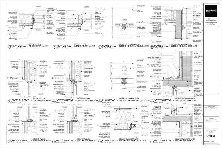
Let’s start by looking at an entire sheet of drawings – in this case, it’s a sheet mostly consisting of window details:

This is what a standard sheet of details looks like in my office. Pretty dense, isn’t it? I don’t like having white space on the sheet so I try and put as many drawings onto a sheet as possible rather than trying to group them together by detail type and spread them across several pages where drawing gaps can occur. While there are always exceptions, most of our details are drawn at a scale of 3″ = 1′-0″ – which means that the drawings are large enough to graphically show a single line that might represent something like a vapor barrier or metal flashing. That scale also (typically) translates to about 12 details maximum per sheet when drawing on a 30″ x 42″ (E sized) sheet of paper.
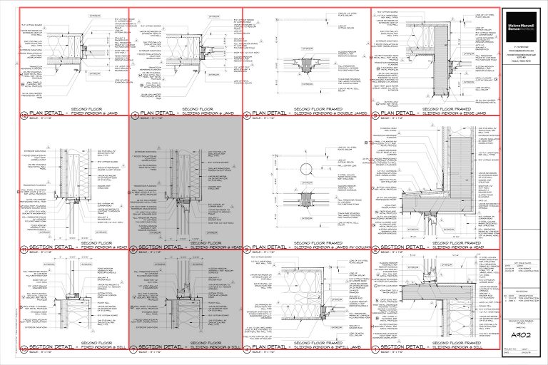
To help with clarity, we have an implied grid on each sheet that we work within, and the goal is to have the drawing, dimensions, and notes completely fill up this area. We help define this implied grid by extending the title bar beneath each drawing to the outermost extents of the detail it represents.

Visually, paying attention to drawing and note alignment really helps the drawings read – but let’s zoom in a bit and take a look at a few individual drawings. I am going to focus on the head and jamb details that I’ve grayed out in the image above.

One important consideration – and I’m pointing this out for my sanity and for the possibility of keeping this as an ongoing series – today’s conversation actually has nothing to do with the specific notes or the types of drawings I am using as examples. If you think I’ve noted something incorrectly, keep it to yourself (or send me a private email). Okay? Great – thanks.
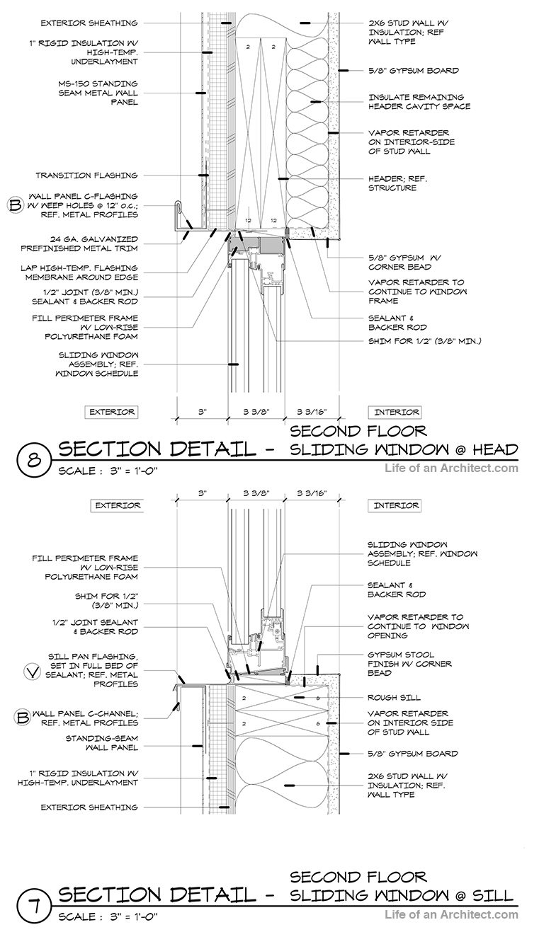
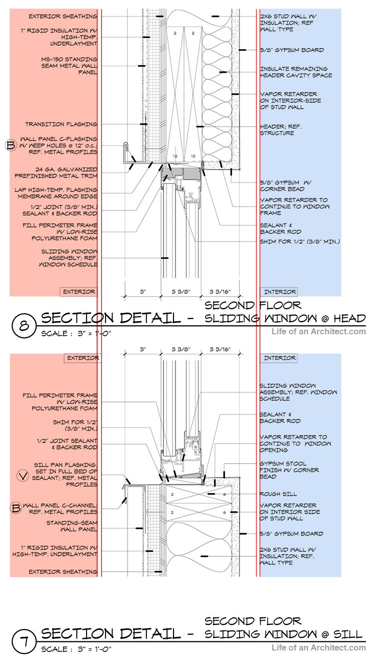
I’m using a window sill detail (drawing labeled as 7) and window head detail (drawing labeled as 8) to show you how I’ve paginated my details. Feel free to take a look for yourself and see if you can pick out the relatively low hanging fruit that helps with the clarity of these drawings. If you’ll remember, this is a screen grab of details 7 and 8 taken straight from the overall drawing sheet. The point I am trying to hint out is that these enlarged drawings have this same locational relationship to one another in this article as they do in the overall sheet of drawings. What you should notice is that the window head detail aligns directly above the window sill detail. I’ve added some color to these details in the next image to help clarify some of my talking points.

These details align vertically with one another – which is important because this is the relationship they have with one another in the real-life built version.
Let’s take a look at the notes – the notes are broken up into some on the left and some on the right. In this example, the exterior notes are on the exterior side of the detail while the interior notes are on the interior side of the detail. In addition, I always justify the text on my drawings to align towards the detail … and this alignment carries through to any other details represented in other drawings (in this case, detail’s 7 and 8). Generically speaking, I typically hold my notes about 1/2″off my details and I leave a 1/8″ gap between the notes and my leader lines. Where these dimensions can vary is when the dimensions start to play a larger role in the detail. In the examples I’ve shown you today, a lot of our dimension control happens on other drawings and they are simply keyed here as “B” or “V”. Just the fact that I have a “V” should let you know that there are a lot of enlarged dimension control details in this set.
So there you have it, alignment, alignment, alignment … that’s the takeaway from today’s Architectural Graphics 101 article.
Alignment,

