Time for the next installment of Architectural Graphics 101, and this time I decided to take a look at architectural symbols which are really wayfinding devices for our construction drawings. They are not very complicated items but shockingly I have some opinions on the matter. Sure, every architectural firm in the world basically has all the same elements and the graphics don’t change all that much from firm to firm, but that shouldn’t come as a surprise – they wouldn’t work very well if there weren’t some sort of institutional standards in place.
So why am I talking about them? Other than “Why not?” I felt that it gave me another opportunity to climb aboard my soapbox and proselytize the importance of using lineweight in your drawings.
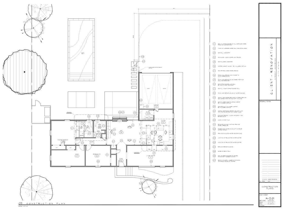
The plan I am showing above has some sentimental value to me and it took a ton of time to make it available for today’s post. This was the third house I owned and technically the first residential project I ever prepared drawings for in my life. As a result, when I look at it, I have a small amount of amusement at the time I spent making tree symbols, getting my lineweights where I wanted them to be, and I even prepared my own graphic symbols. Just to find this drawing took me days of digging through old hard drives followed by rebuilding my old *ctb pen table (only a few of probably even know what that is) just so I could create a pdf file to use as an image. If I believe my own nomenclature, this drawing file was created approximately 20 years ago and I still think it looks pretty good … it certainly demonstrates my resolve towards the proper use of lineweight.
Feel free to click on the image to open it up and see things in use a bit more clearly …
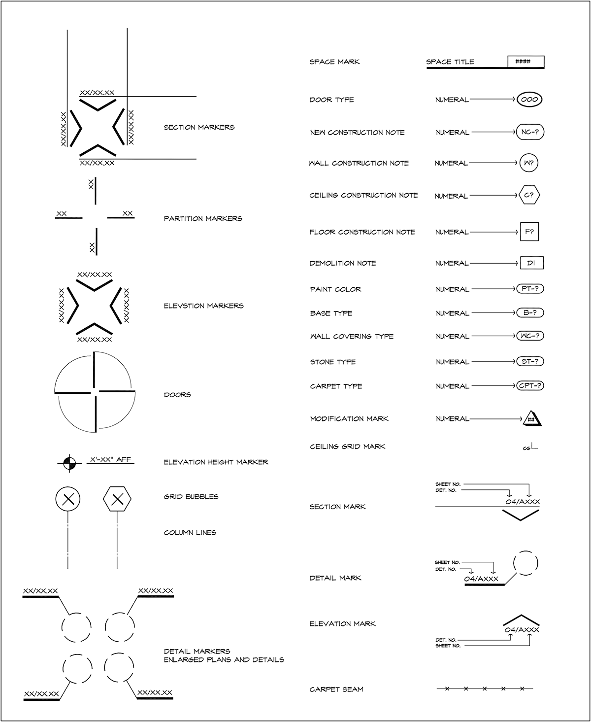
This is not the symbol legend that I created and used for that first plan – but it’s pretty close, and there is nothing truly magical about it. In fact, I bet if you draft, your own symbol legend looks similar to my own … but I can tell you that I can look at this without any context and I would know that it was created in AutoCAD and not Revit simply because there is lineweight and hierarchy to the symbols and not the “one-size-fits-all” persona that modern-day symbols have to them.
Why is that?
One of the things that I expect people to get worked up over is which geometric shapes are used in what capacity. I can literally hear this in my mind right now:
Internet: “Hey Bob, circles are supposed to be used for door tags!”
Internet: “Your “Room” tag is ridiculous … they’re obviously supposed to be rectangles …”
Yeah, I hear you but I don’t really care because the very idea of a legend is I can use whatever I want as long as I am consistent in its application. You’ll see that as we move from one graphic example to another, you will see symbol legends that span two decades and for the most part, they have the same value to them and none are any more correct than another.

Here is another example of the evolution of the symbol legends I found as I went through years (and firms) worth of drawings. There is one thing from the legend above that drives me just the tiniest bit crazy …the size of the Keynote Number, and both the size of the mark as well as the text are too small.
Complete fail.
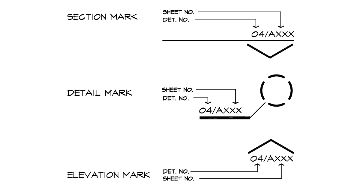
I have isolated the one thing that people who don’t read drawings might not automatically figure out on their own. These three symbols are really the only ones I ever explain to a client – and eventually, I just built the explanation into my legend. If I use the mark for the ELEVATION MARK, you just need to know that if you go to the drawing labeled as 04 on sheet A/”whatever” you will find the elevation that correlates to this mark.
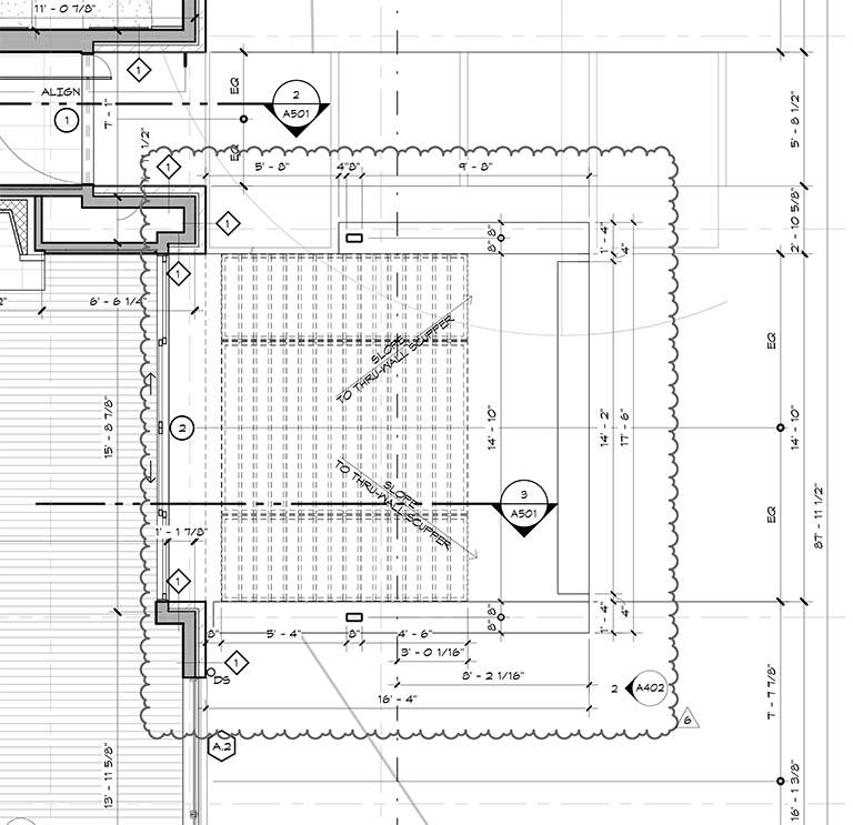
I went hunting for a small plan example of several different types of symbols within the same view. The drawing above is from a steel trellis I featured a few years ago (Modern Steel Trellis) and in this single plan view, you will find:
- Door Tag
- Window Tag
- Wall Tag
- Wall Section Cut
- Elevation Tag
- Revision Mark
The thing that I want graphically from my symbols is that they pop out on the drawing from within all the other information that is being presented on the drawing. There is a lot of data in that drawing and the symbols are the devices that are used to route you to more specific information – typically shown at a larger scale so additional (and presumably important) detail would be included.
… but we aren’t here just to look at floor plan symbols. What about symbols used for Reflected Ceiling Plans? Don’t worry, I got you –
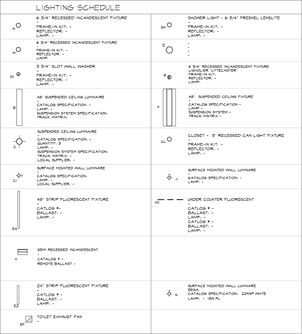
The image above was the first Reflected Ceiling Plan legend I ever personally made – it seems that during my career, especially since I seemingly changed jobs every 18 months for the first several years, I found myself in the position of setting up the graphic standards of every place I worked. On one hand, this is not very surprising considering that I have fairly strong feelings about how drawings should look once they’re plotted out. On the other hand, this is fairly remarkable because part of the reason I changed jobs so frequently in those early days is that I felt like I didn’t have any technical skills and all anybody wanted me to do was to design and talk to folks. The reason that was a problem is I was creeping closer and closer to being 30-years-old and I felt like I didn’t know what I was doing and since I worked at small firms during this time, there typically wasn’t anyone available to tell me how to do what I needed to get done.
So I made it all up myself – the upside of which is that I could make things look the way I wanted them to look.
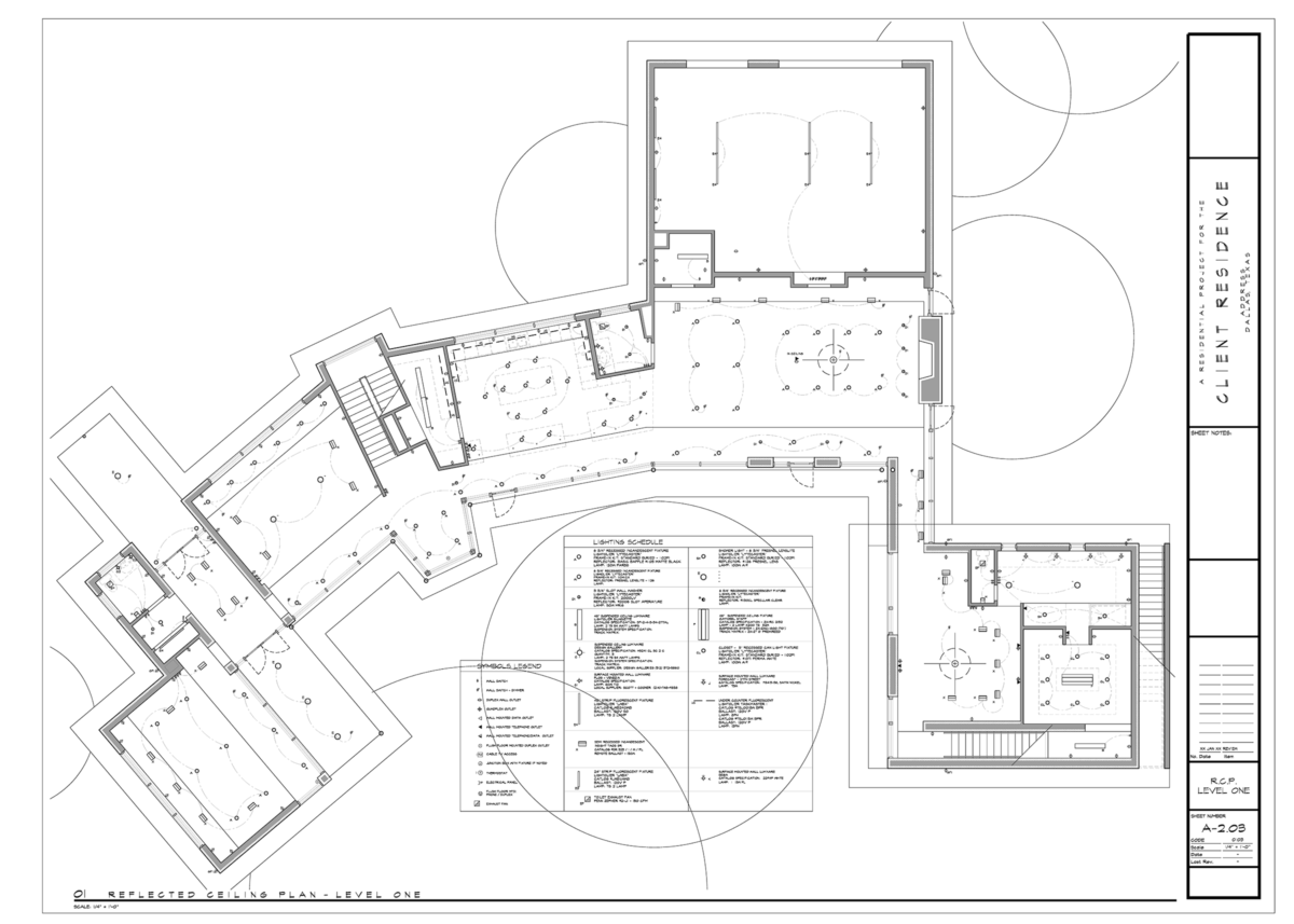
Here is a look at the sheet from which I took that enlarged Reflected Ceiling Plan. In keeping with a post of firsts, this was the first house I ever designed from scratch (to that end, you should ignore the specifics of the data assigned to the fixtures shown in this legend.
Just as with all legends, the symbols themselves don’t really matter and when it comes to lighting plans, those symbols generally look like the fixtures they represent.
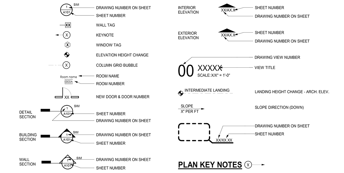
This is the current symbol graveyard for my current office and while I don’t hate it, I don’t love it either. For those of you that have been around the site here for some time, you might have noticed that I no longer use the chisel fonts that I am fond of … and no, it wasn’t even a conversation that I approached the people in my office who have ownership of such decisions. Since *.SHX fonts aren’t searchable, that reason alone makes it reasonable that they fall out of my favor. The main reason that I liked those chisel fonts is that they had lineweight within the characters rather than the monolithic tone that our current font type employs.
Boring … but I get it and I’ve moved on.
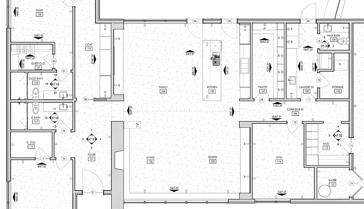
I decided to through in a partial plan (that is already out of date) of a house project we are working on that employs the use of our current symbol library. If you really pay attention, you will see that I have already changed a few things … and I have a few more that I think should undergo additional modifications. What sort of changes do you ask? For starters, the “Room” title could be a bit bolder. I also think that the line the creates the geometry, (the circle, rectangle, etc.) could be a tad bit darker. The entire point of providing these wayfinding labels is to help people find what they are looking for and as such, the labels themselves should be easy to find.
Architectural Graphics 101 – Symbols
I will readily admit that architectural drawing symbols are not the sexiest of graphic topics I can cover … but I feel like they go a long way in determining the graphic nature of your drawings. Along with lineweight, titleblocks, and drawing organization, symbols help the visual communication process and they deserve to get a little extra attention. If you’re using the symbols that come with the software, don’t you think you could do a little better? Just in the few hours I spent going through old CAD files, I think I found no less than 6 iterations of symbols that I personally created … maybe that just reinforces the fact that I might have something wrong with me.
Carry on,
ps – This is the 9th installment in my Architectural Graphics 101 series. If you would like to see the others, you can find them all here.

