Okay … I hear you. It’s time for the next entry in my Architectural Graphics series and due to overwhelming feedback, it’s apparently time to talk about line weights. Despite my efforts, I can’t ignore this topic any longer – and I only made it two posts before caving into the pressure.
But where to start? Getting your line weights correct is 37% science, 59% art, and 22% personal preference … unless you work in my office and my preference will eventually become your preference.
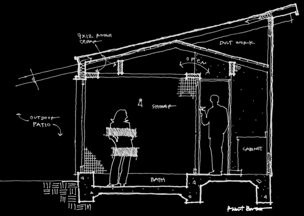
Part of the reason I was hoping to hold off on the topic of architectural line weights was that people are asking me insanely specific questions … AND these folks work in AutoCAD or Vectorworks or Revit or ArchiCad … and on and on. I consider myself extremely proficient in AutoCAD, know just a tiny bit about Revit, and I’ve never used any of the other software platforms. So how do I answer these insanely specific questions? By ignoring them. Instead, I am going to elevate this conversation a bit and talk about something other than your digital pen settings, so if that’s the only thing you came looking for, prepare to be sorely disappointed.
I am fairly consistent with my use of line weight, and it doesn’t really matter if I am sketching or working digitally. I typically work with 3 line weights when sketching (because I’m not completely crazy) and 5 when I am drafting digitally. They are:
Sketching:
Profile – basically I’m tracing the perimeter of the components
Light – just about everything else
Poché – hatching and/or shading
Digital:
Profile – very heavy, typically the profile of the drawing container or the ground plane
Heavy – the perimeter of individual component items, things I am cutting through, or whenever adjacent planes are fairly far apart
Medium – usually reserved for delineating masses or opening in walls (think of a cased opening in an interior elevation)
Light – detail lines that would otherwise turn into a big blob of ink when printed
Hatching – you’ll be able to see that hatching plays a major role in all of my drawings
See? That’s not so bad, and with just a teensy amount of additional effort, the improved line weight will have a significant impact on the clarity of your drawings.
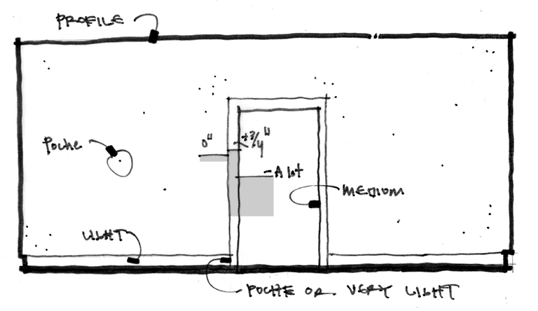
The irony of this sketch … it isn’t very good (look at how I wrote “medium”, it’s like I forgot how to spell it halfway through) but I thought that I should come up with something that might quickly explain the whole heavy-medium-light line weight decision-making process. If you were in my office sitting next to me, I would sketch up something like this elevation to walk you through my logic when I choose my line weights. Everything is related to the distance between adjacent surfaces, so let’s focus in on the cased door opening right in the middle. I am going to say that the surface of the wall is our 0″ plane. the outer line of the casing sits in front of the wall, but only by a very small amount (3/4″ typically.) As a result of this tiny distance, this outer line of the casing is drawn with a light line weight. Moving in you have the cased opening – and the inferred space beyond (as far as you know) is set at an infinite distance – but we know it’s something between a few feet and a bunch of feet (just not infinity). As a result, this inner line is drawn with a medium line weight. That’s because I have reserved the heavy line weight for the perimeter outline of the room.
Finally, you have the poché or very light line weight. Since I tend to be a fan of material specific hatches, I don’t want my drawing, which is composed of several lines very close together) to turn into one big fat dark line. As a result, most of my hatches are the lightest pen weight on my drawings. This is also the pen weight I choose when I have a line that delineates either a material change or a seam in the material that is in the same plane. For example, take a look at the vertical joint between the cased opening and the floor base trim. Technically these are in the same plane but I want the line that indicates how they are to meet to be apparent – so I use the lightest pen weight setting.
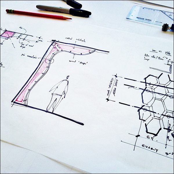
This process of using line weights is expressed in all of my drawings – even my sketches. However, I don’t carry around 5 different pens just to articulate such refined nuances in a drawing that is typically quite unrefined … so I tend to use just three pens. I think it is fairly obvious when I use each pen but a quick scan of my sketches will reveal that the thought-process is typically the same as when I draft digitally.
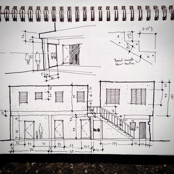
The sketch above was created when I was in Santo Domingo doing some charitable architectural work (and performing surgery) and even when taking site measurements, I use different pens for their line weights. I helps me understand the depth of feild better when I don’t have the luxury of just popping back over to the job site.
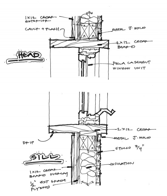
And then you have these sorts of sketches – detail sketches that are more for thought clarity than construction. Most of these sketches are created using a single pen and then I’ll go back over it with a heavier pen to create a profile line. I started doing this a long time ago just as a way to make my drawings look a bit more “architectural,” but looking back on them years after they were created, I can see a consistent thought process at work.
But let’s move on to architectural drawings that I prepared using AutoCAD.
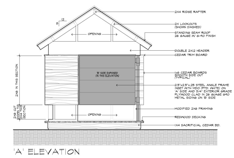
This is one of the elevation drawings I prepared for the ‘Movie Theater’ playhouse I designed back in 2015. Again, now that you know what to look for, you can see that the ground plane line is the heaviest (profile), the perimeter of the playhouse is the next heaviest (heavy), the interior geometry line where there is some amount of distance between adjacent planes is medium, assembly lines are light (look at the trim joint lines or the lines at the roof – these would all turn into a single dark blob of a line if the pen weight wasn’t light), and finally the hatches are shown with the lightest pen weight.
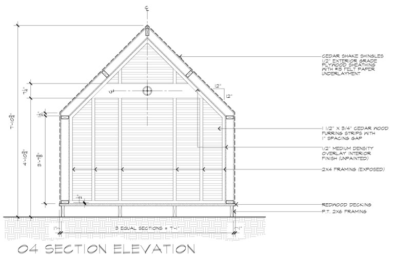
Can you see the same techniques at work? You can also see the framing joint lines where the vertical 2x members sit on top of the sill plate – they are in the same plane so I want the line to be distinguishable, but just barely.
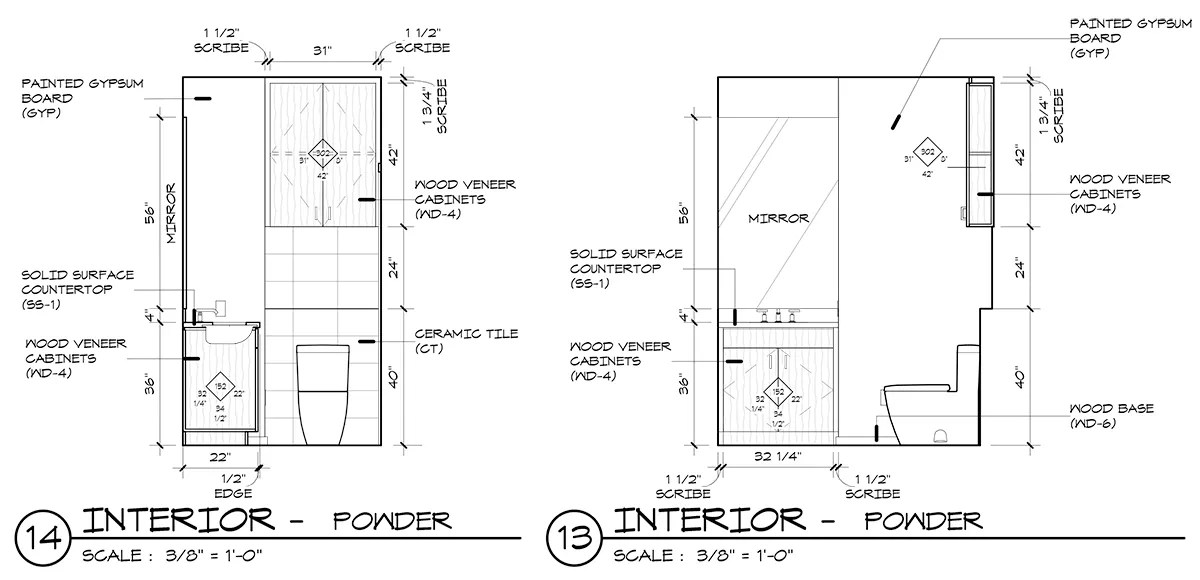
Now we move onto current drawings … that were created in Revit. A few years ago, back before I worked here, all the interior elevations were drawn with the same line weight. I didn’t think that the drawings were particularly easy to read, they didn’t convey any sense of priority, and didn’t help the contractor focus on what was important in each drawing. These new interior elevations are light years better, but we still have some work to do. In my office, everyone seems to have fully grasped the concept of profile, heavy, light and hatch … but the medium level lines are missing. If you look at the drawing above on the right, just to the right of the mirror, there is a wall that should be delineated with a medium weight line. This bathroom is in the shape of an ‘L’ and the mirror is actually 24″ further back than the adjacent wall … do you see it now?
Most people who either create or read drawings for a living would be skilled enough to actually notice that the room jogs just by comparing these two elevations. My point is that with the correct line weight, you wouldn’t need to compare the two elevations to come to this conclusion.
Use those pen weights!

PS – for those you you who just can’t stand it, my AutoCAD pen settings are:
Profile – 0.53
Heavy – 0.4
Medium – 0.3
Light – 0.15
Hatching – 0.09
