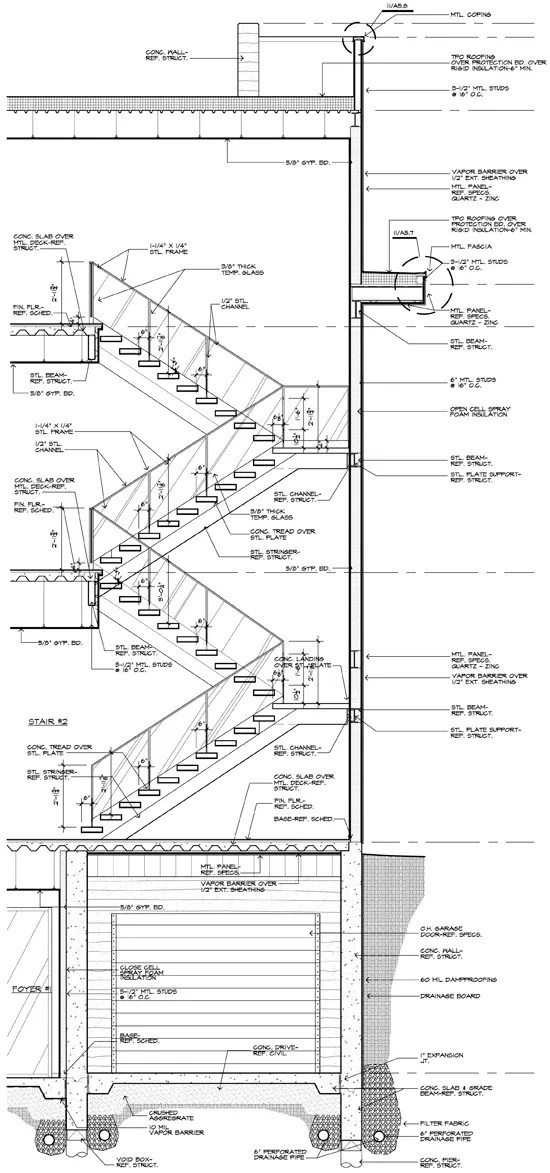
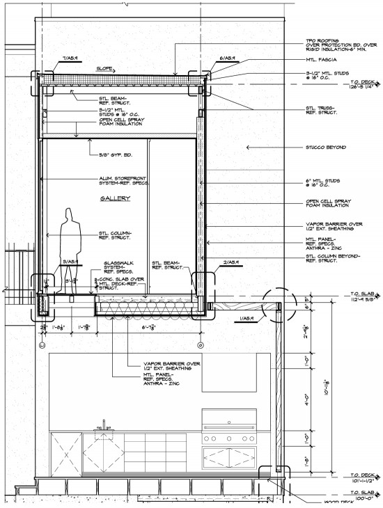
How an architect draws is a reflection of many things – you can frequently tell the priorities of a firm just by looking at the quality of their drawings. I didn’t say the content of their drawings – and this isn’t just semantics – it speaks to the culture of the firm. For the purposes of today’s article, I am going to assume that all architectural drawings are correct and serve their purpose of conveying intent, scope, and quantity.
But that’s not really the entire story, is it?
When I graduated from architecture school in 199[mumble-mumble], computers were not that prevalent. Some of the larger production commercial firms had the resources to buy “CAD Stations” and dedicate substantial office space to server rooms complete with NASA-looking tape storage systems, but most firms were still drawing things by hand. This was where I really learned how to draw but before you old folks say “that’s right!” and you younger folks look at this as old-timers syndrome, I’m not saying that we drew better, I’m just saying it was different. I used 3 or 4 different lead holders with leads of varying degrees of hard/soft to them. I consciously endeavored to add profile lines, hatching, foreground and background indicators in place. You could look at the hand drawn construction drawings and frequently tell who had drawn what sheets and what details. It was art to me … I thought these drawings were beautiful and I didn’t want other people working on my sheets, adding their sloppy pencil work to the magic I had created. It was a big deal to me 20 years ago and even though we don’t draw by hand anymore, it’s still a big deal to me.
Ever since I left the last big firm I worked for (RTKL 97-98), every office I have worked for, I’ve changed the graphic standards in that office. Every. Single. One. May not seem like a big deal to you but I’m in my 5th office since that time. In fact, the firm where I currently work as a principal is one of those 5 offices (I worked there 2001 – 2003) and I put the drafting standards in place then … and now that we are in Revit, I am once again making changes. Your first assumption might be that I can’t hold down a job – observant but not true. Your second assumption might be that I am some technically minded CAD jockey … zzzzzzttt!! Wrong again. I make the changes where I go because I make it a point to care about how our drawings are perceived by the people who read them. Not only do properly delineated drawings read better, they convey a sense of what it took to create them.
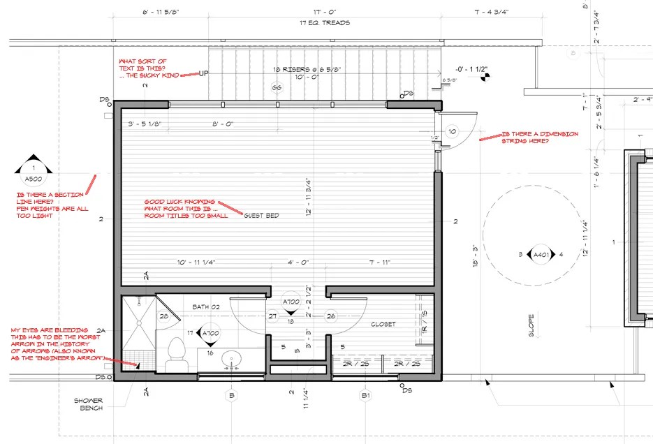
Since moving over to my “new” old firm, we have started to make adjustments to the standards that they were using in Revit. As I asked more and more questions, I discovered that most of what was in place was simply the standards that came out of the box as provided by Revit. As a result, we have been going piece by piece (at times) through the drawings and evaluating how the drawings look and if they convey the information we are striving for … do they look hand drawn?
Of course not, but that’s the graphic bar we are reaching for. This is all about the pen weight and graphic semantics –
Does it make sense?
Is it intuitive?
Can you tell what is being cut through?
What’s closer and what’s further away?
Can you tell a center line from a section line?
Is this a setback line or a property line?
The list goes on and on and if you used what came right out of the box, you might be factually correct but there’s no office culture conveyed in the drawings. This means making custom graphic keys … it might be a giant pain but it’s worth the time and energy.
The drawing shown in the image above was slightly beyond out of the box – I didn’t decide to document this process until we had already made some changes. You can see that the pen weight isn’t very good, the graphic drawing keys are too light and in some cases, it’s almost like they don’t exist.
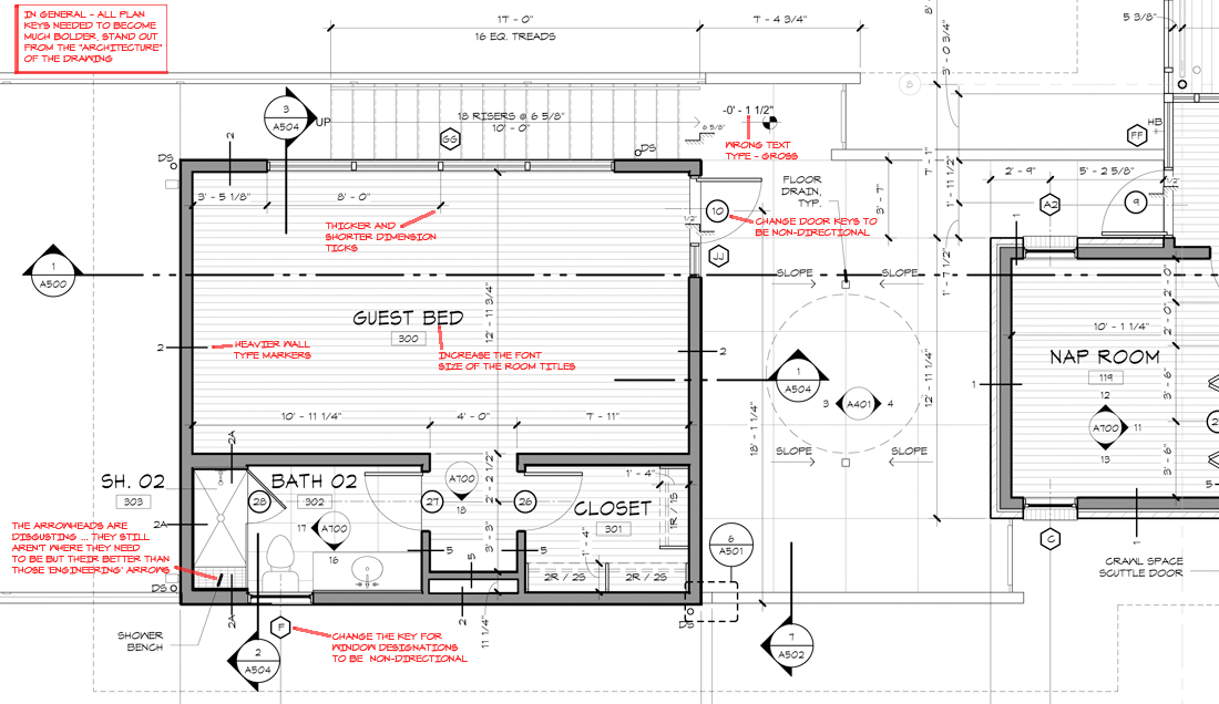
The above graphic is the next iteration of standards – not quite there but significantly further along in its development. Pen weights are falling into place, fonts sizes are hierarchically appropriate, the balance of light and dark coming into balance. One side effect of having the graphics and pen weights in balance is that you can incorporate more information into a single drawing and still have the document be legible
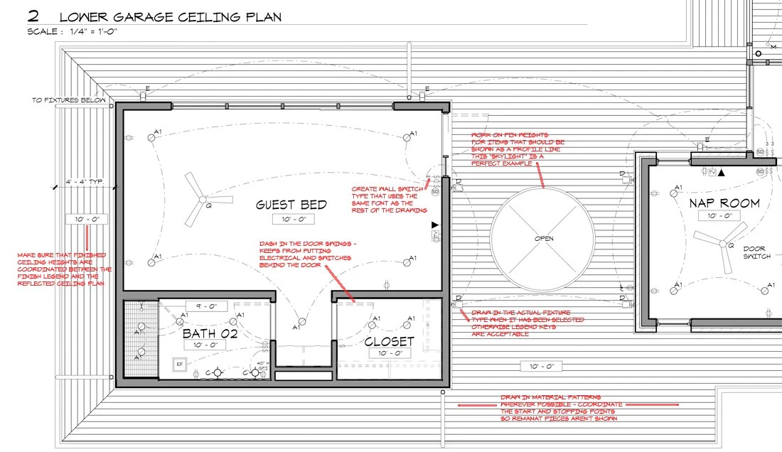
We are still working on designing the symbols we are using in our reflected ceiling plans. Wherever possible, we use a symbol that is the actual light fixture being used (although there is a downside to doing that should the fixture type get changed). The logic behind showing the actual fixture is to coordinate the other items that might be in close proximity – particularly useful when there are fans and sconces involved.
Sometimes people get moving so fast that they fail to think about which way the doors are swinging and as a result, we like to show doors swings in our reflected ceiling plans. This is another level of coordination to doors don’t cover light switches or hit wall sconces.
There is also the matter of how we draw our walls. New construction – which is the entirety of the images I have shown today – are shown hatched and shaded. For exterior walls, we shade the interior stud cavity, leave the air space empty, and hatch the exterior masonry.
We also like to dimension to the finished face of the walls rather than the face of the stud or the centerline of the stud. I have seen all three at various stages of my career but everywhere I’ve ever worked has dimensioned to the finished face. I can understand that you would dimension to the face or centerline of the stud for the benefit of the framers, but since so much of what we design to is the interior face clear dimension, we don’t dimension to the stud.
Finally – because I get asked about it ALL THE TIME … the fonts we use for our drawings are architect.shx for the majority of our text and archititl.shx for our drawing titles. All of our text is generally scaled so that it plots out at 3/32″ tall – the only exception is equipment labels (sized slightly smaller) and room names (sized slightly larger).
Working on the graphic standards is always a lengthy process of trial and error. In most cases it not’s just about the output of the drafting software, it’s also about how you draw the things that convey the information. Depending on how this post is received, I might prepare some follow up posts where I’ll focus in on some specific items (symbols, legends, title sheets, etc.). If this is of some interest, please let me know what sort of information you might like me to show.
Cheers,

