Apparently, I am a glutton for punishment because Architectural Graphics 101 the series is back after an unreasonably short time to discuss window schedules. I know … I’m all aflutter as well.
Schedules, in general, have been on my list as a topic for this series since day one and I have been thinking about how to approach them for there are so many to consider: Door, Window, Finish, Lighting, Plumbing, and Casework just to name a few. I decided to start with the humble Window Schedule because it’s relatively straightforward and would allow me the opportunity to talk about drafting schedule nomenclature just a bit.
(by the way, all the images in today’s post can be enlarged in a new window just by clicking on them)
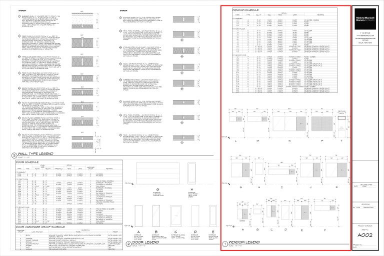
This is a typical schedules sheet from one of my projects … in fact, this happens to be from one of the early iterations of the Modern Cabin Project. I decided to use this project as my case study because A) so many people are familiar with it, and b) it is well documented and it contains just about every single schedule type that I would want to talk about … which brings us back around to window schedules. I have drawn a red box around the portion of this sheet I will be looking at today; a tabular schedule and a graphic representation of that schedule – something that we typically include.
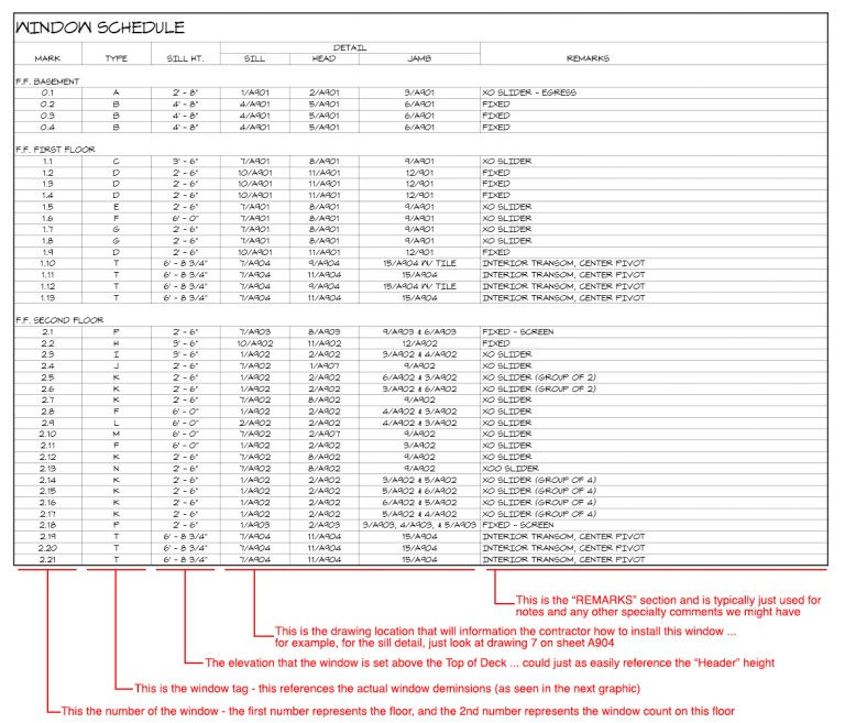
Let me enlarge it and break it down into those two distinctions –
I think most people could figure this schedule out for themselves but I thought I would add some additional clarify notes along the bottom. I don’t think this schedule – or its arrangement – to be particularly unique. It is made up of a listing of windows, it identifies them by type, identifies the details associated with that particular window, and any specialty notes or comments we feel should be given additional consideration.
We used to have a column titled “Rough Opening” which would be the opening that the framer should frame to accommodate our window … except I found it to be worthless. It was typically just a 1/2″ larger than the actual window itself and on occasion, we might change window manufacturer’s during construction for cost adjustment purposes, and that particular window manufacturer might have a different rough opening requirement. So we eliminated it and put that coordination responsibility onto the contractor … and have never heard one peep about it.
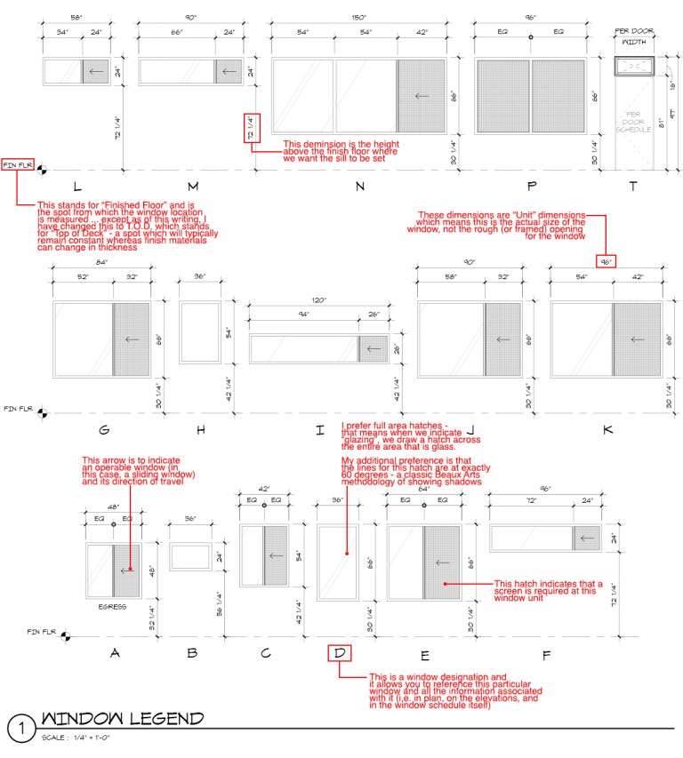
The second portion of our window schedule is the graphic portion that typically accompanies the tabular data. This isn’t something that I see too often and the reason it is here is that I received feedback from general contractors that they liked it and felt that it added clarity that the tabular data did not provide. I originally drew a graphic section of the windows only when we had “stick-built” windows on our more modern projects. These are windows that are built from standardized window sections and are cut to size on the job site … they do not “come out of a box” so to speak. Now there are enough window manufacturers out there that sell modern profile metal windows that we rarely do “stick-built” windows anymore, and you would think that this graphic section would be unnecessary.
I’ve added some thoughts for your consideration in red as to why they are necessary and why mine look the way they do.
The next bit is to review how these windows look in plan, elevation, section, etc. that help coordinate their placement into the project.
You might remember this particular plan from the recent post ‘A Simple Deck‘ … I’ve brought it back in a rare bit of visual blog post cohesion. In fact, it’s fairly important for today’s post that I indicate the same windows throughout and how they show up in all sorts of different types of drawings, and how the window tags are reflected in those drawings.
In the plan view, we use a hexagon as the shape for our window tags – which is supposed to be a directional tag except we haven’t figured out how to rotate it just yet inside Revit. All of the tags are centered on the windows and then we dimension to the center of that tag (conveniently not shown here because I turned off all the dimensions when I made this graphic for the deck post!)
This is the same exterior elevation that you would see from the plan view I just showed you. Obviously, all the window tags have been highlighted in red and are still centered on each window. In the good old days, we would never show tags in multiple locations – this level of redundancy would just increase the opportunity that something would change and if you didn’t/couldn’t find all the tags, you’ve just created a coordination problem. Last time I checked it was the 21st century and these sorts of coordination issues are no longer a concern.
This is a building section through the center of the cabin and you can see that the window tags show up in these drawings as well. I could easily turn them off when we plot these drawings but I can’t think of a reason why I would do something like that. As long as the drawing is legible, I am going to put as much information as I see fit into it.
I would be interested to hear if anyone does things markedly different than what I’ve shown here – other than the redundancy issue (which I hope I’ve addressed sufficiently) I can’t imagine that much more I would do differently but you know how I love to be proven wrong.
Cheers,

ps – if you like this series, you can go here to find all of the Architect Graphics 101 posts that I’ve prepared


