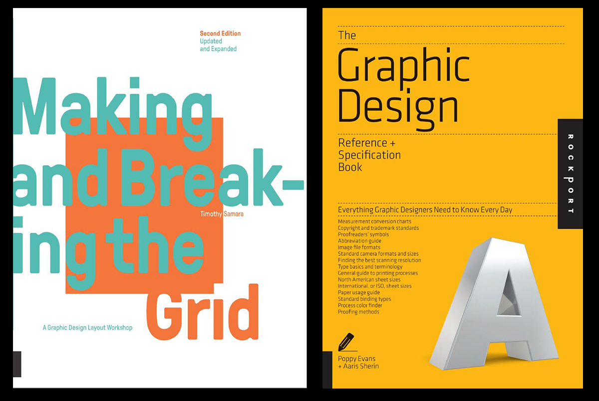
So I have been talking a great deal lately with my students about many aspects of graphic design as they relate to architecture representation and presentation. I am always amazed at how little this is discussed within most architectural educational instruction. I believe it is a critical component to the success of any type of architectural scheme, presentation, or visual communication. Now I will admit I am not a graphic designer, I have never been “trained” as one, but I would call myself a hobbyist and advocate for a solid foundational understanding of graphic design as it can relate to architecture.
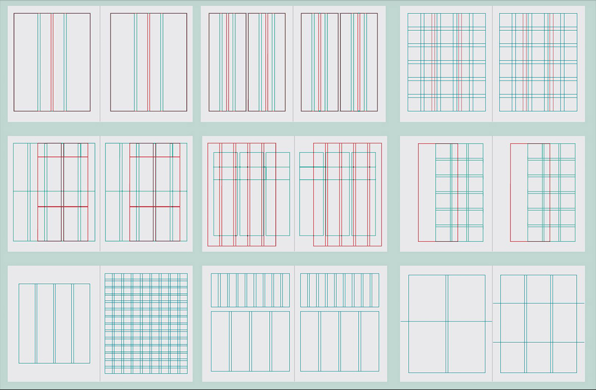
The Grid
This is one of the first items for discussion when I begin to speak about graphic design. I find that many of my students do not understand the real concept of a grid. They all seem to view a grid as something that is “too restricting” and overly prohibitive to their creativity. I have to then go through the process of explaining how a grid system can help establish some rules for work and that then can create opportunities to break away. And then when those elements break away their impact is felt even more. I will admit that I am a huge proponent of a strong grid and prefer that in all my graphic work, but being able to prove that it can be viewed differently is an important piece of wisdom to impart. I myself rarely depart from my grid system, but it is quite possible for anyone to do.
I also like to enforce the idea of the grid as establishing some rules for the visual presentation. This provides the backbone for all of the visuals and typically makes it easier to create an organizational scheme. I always like to say that the rules have to exist and you have to know them well before you can truly break them. Without rules to be broken there is just random assembly or chaos and that is more difficult to tie together in a cohesive manner which ultimately the presentation of the work and even your idea. Grids are good. Grids are flexible. Grids are your friend.

Typeface and Fonts
This area is one of the most foreign I think to students. Most have spent their lives up to this point with very little understanding of typeface and fonts and the true impact this can create in a visual sense. They have probably only ever used digital fonts to express their ideas ye their comprehension of how and why typefaces are designed is not even on their radar. I discuss the basics of Serif and Sans Serif and the origins of those in the actual process of printing and the concepts of how those are read in various visual/graphic contexts. At times I am certain I get a bit nerdy for their needs, but we even discuss ideas like kerning, tracking, baselines, ascenders, descenders, and all the other various components of type. I try to convey the importance of this knowledge and how it relates to design elements and can possibly impact the project visuals. While I know this may be beyond the critical knowledge I am trying to impart, it helps to understand the process.
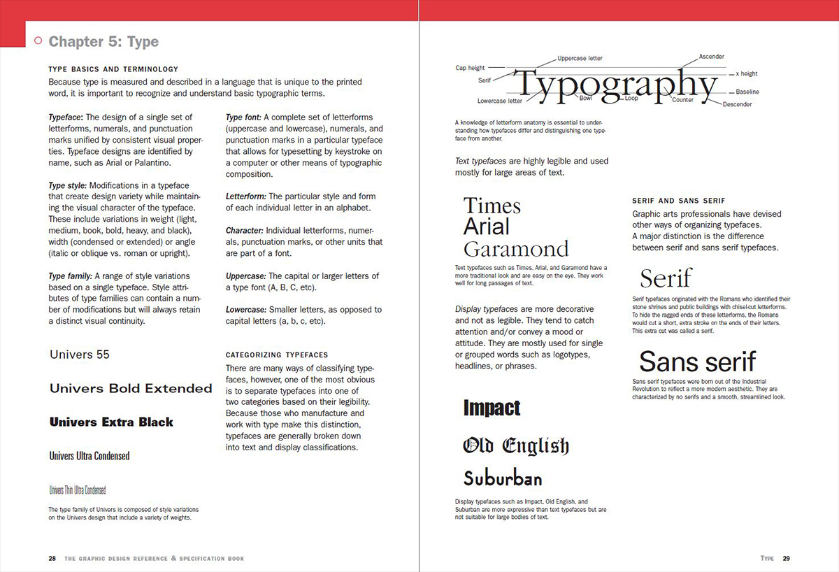
I also discuss how certain typefaces can emote and actually push a graphic to be viewed with a certain attitude. Again, maybe too nerdy, but I believe all things are design including the choice of typeface. Comic Sans is acceptable for a circus poster, not for an architectural presentation. Not even if the project is a new circus tent. We also discuss the methods of creating hierarchy within a typeface system. This is a design problem and therefore must be addressed as such. This is a way to provide additional organizational clarity to the work they are presenting. Make some rules for the text of the visual presentation. Please for the love of all things holy do not mix 5 fonts in your presentation. Please! That hurts not only my eyes but my sensibility as a designer. (and my soul a little bit!)
Cartooning Drafts
The idea of creating drafts of any presentation is important to its success. The idea of making multiple drafts of architectural imagery seems like a foreign concept to many. I will admit that when I was in school I never did such things. I was always working up to the last moment in an attempt to squeeze that last ounce of creativity out of my brain. But I have since learned in my professional practice that drafting graphics is important. Plain and simple it is important. I spent many hours cartooning SOQ packages, promotional brochures, marketing materials, business cards, websites, client presentations, and of course construction document sets. I learned the value of this process and how it can also inform the graphics, drawings, and images that you need to create to tell the proper story.
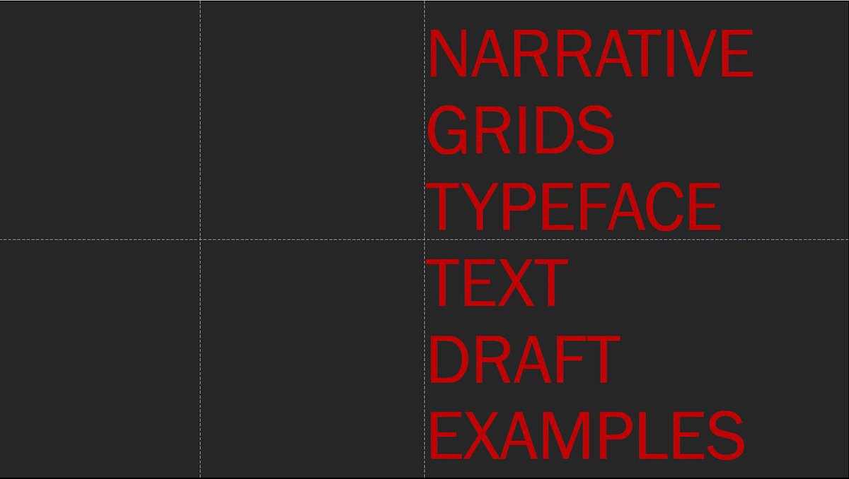
So this process of drafting out all these graphic mediums is again another design process that benefits from some preplanning and organization. And this process can actually inform the work that is getting organized for that medium. It can be as simple as understanding the need for portrait images versus landscape images. It can also be as complex as providing the type of images needed to match the story the graphic design is telling and how certain elements in several images need to align to create a more powerful combined image. These types of realizations tend to not happen in the last hours of producing work. Or if they do become realized they are not executed because at that point it creates too much work and is therefore abandoned.
So I could go on and on about the ideas of how critical graphic design can be to selling architectural ideas but I will step down from my platform. I didn’t even get to discuss white space, color palettes, or graphic hierarchy which are also critical elements. I will say that I think my formative years spent in yearbook journalism when there were not any computers gave me the respect and affinity for graphic design. Also, it led to my emphasis on its importance and possibly my adherence to the grid.
I rarely think I am alone in my thoughts about the importance of graphic design within architecture, but I am not certain where others in the profession stand. I think much of my experience actually came from outside architecture. This makes me curious about others in the profession. Let me know.
Until next time,
Books from this post:
The Graphic Design Reference+Specification Book
Graphic Designers Essential Reference

