I received an email asking if I would share details from some of my projects. While I bristle at the risk I might be exposing myself to, I remembered that I enjoy looking at details quite a bit, so I thought I would try to come up with something. Meantime, while this was in the back of my mind, I am feverishly designing and sketching on a new project we have – a tenant improvement project that has no time for proper development and has a limited budget. So in an effort to keep our fees down, I am not doing much of the drafting on this project but rather spending my time developing the concept and detailing the ‘wow’ features.
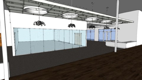
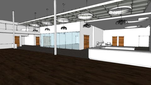
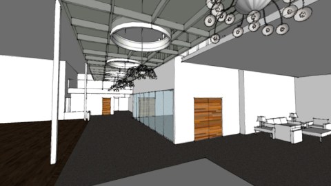
What I am going to focus on is this floating ceiling tray concept that I am developing. It should be unique, cost-effective, and something that would make most people stop and go “wow” (but in a good way). This ceiling tray is running down a central open corridor and will serve as a defining element for social gatherings – one of the program requirements for the project was that the space be able to rent out for parties.
I decided to make the corridor 12′ wide so that it could accommodate tables and chairs during events but not be so wide that a visitor might feel lost during the normal course of doing business. Because the ceiling is around 20′ high, I wanted to bring the ceiling tray down to create a sense of enclosure and make it a little easier to have a conversation during events. I also want to maintain the loftiness of the shell space, so the design concept is to wrap the tray in translucent paneling which would allow for some light to pass through and give us an opportunity to highlight some pendant light fixtures that would be suspended from the deck, through circular openings I located in the tray.
Some of the construction issues I am trying to address is you make a thing translucent and still provide construction tolerances, places to hide connections, mask the edges of the polycarbonate paneling, all while working under the premise that this needs to be more cost-effective than creating a traditional ceiling tray out of gypsum board. These are some of the methods for becoming a cost-effective solution:
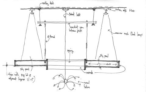
- the translucency allows us to avoid running electrical through the tray itself while reducing the number of lighting fixtures. A gypsum board tray would have required recessed down lighting to illuminate the area under the tray. (Oh, and did I forget to mention that there is a mezzanine from where the top side of this tray will be visible? That’s a nasty bit of wrinkle to deal with.) Now we are able to provide fewer fixtures, make them the cost-effective surface mounted variety, and use a narrow beam spot lamp to create the sense that our tray is floating.
- Polycarbonate sheets are extremely durable and very lightweight. They also are sold in unit costs (big pieces have the same costs per square foot as smaller pieces – approx. $43 for a 4’x8’x1/4″ sheet) and I can get them as large as 48″ wide by 24′ long. This means the labor costs to install them is going to be very low. When compared to installing a gypsum board tray where I would have the weight, and the expense of paying for tape, bed, texture and paint, $43 a sheet doesn’t seem so expensive anymore. Putting a drywall lid on the top of this tray just wasn’t a viable option because of the premium of expense this would create – but we had to do something with the top, you know, because you can see it!
- I also spent some time working out the geometry of the stud spacing because it would be visible through the paneling and I needed it to be as simple as possible to construct. Everything is on a 16″ module so that it would minimize the amount of unique panels sizes and reduce the number of cuts that needed to be made. I also modified the radius of the openings in the ceiling tray so that they fell within the 16″ module (3 x 16″ = 48″ radius) left to right and I was able to create the symmetry this design required between the individual openings. These issues touch on my opinion that cheap materials don’t have to look cheap when you pay attention to the execution.
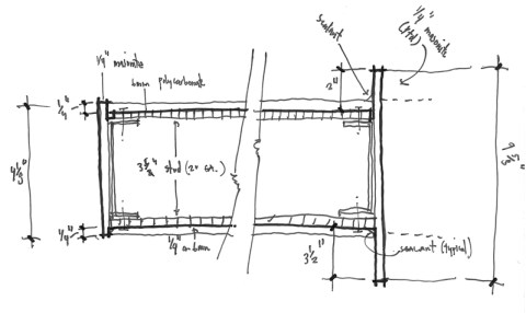
The next issue to address was how to finish off the edges of the polycarbonate panels. Since the cells are ribbed only in one direction, the edges are different in the x-direction than they are in the y-direction. You also can’t effectively bend these panels in the radius we have (too tight). I considered using homosote to trim out the edges – it’s inexpensive, can be painted, doesn’t require special knowledge or skill to manipulate, and is readily available. Problem was, it didn’t add to the ‘wow’ we are going for; it simply solved the problem of trimming the edges out. I eventually decided on using 1/4″ thick masonite. It is also inexpensive, takes paint great, and I liked the thin edge it would create. In addition, I thought we could take advantage of this material when we wrapped it around the interior edges of our radiused openings. I am extending the edge up 2″ above the polycarbonate panels to accentuate the form, and down below, I am extending the masonite edge down a total of 3 1/2″. The reason I choose these numbers was based on an effect I wanted but I also considered how many pieces could be cut out of a 48″ wide piece of masonite without waste. I might have liked to exaggerate these numbers a bit more but this achieved the effect I was looking for and didn’t require more product or labor.
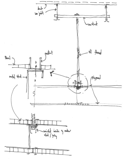
The last bit I had to think about was how I was going to suspend this tray from the ceiling. Using all-thread rods and unistruts is pretty much par for the course and I knew I wasn’t reinventing the wheel – the contractor would know what I was doing. The feature I did take time to consider was how the all-thread rods met, or rather intersected the paneling. You can see in the sketch above, I went pretty direct at first but wasn’t too happy with the result – again, from the mezzanine level, you will see this connection. I started to think about the sequence of construction and realized that I could rotate the uni-strut downward and insert it within the framing of the metal stud, effectively taking it out of the picture. As a result, the all-thread rods will come down within the joint where two polycarbonate panels come together and disappear. This will really make a difference in creating the appearance of the floating-illuminated-translucent ceiling tray.
To put a final bit of perspective on this exercise, these are my actual sketches that I used to work through my idea – for better or worse. I don’t think they are precious and they are not art but I think most people can read them for what they are – a resource and tool. I will give these sketches to some other folks in my office to turn into cad drawings that will eventually make their way into the construction drawings. We basically have about 5 days to design and prepare the construction documents so while I am sketching out these designs and details, Joseph (say hi Joseph) is dimensioning plans, preparing schedules and noting interior elevations. Joseph and I have spent a lot of time talking with one another the last 3 days on the phone – yes, the phone, I am in an ivory tower and he is sadly on the other side of the moat (aka wall) – but I throw him choice bits of stuff pretty often, he is a good guy. I will buzz him –
hey Joseph, raise the wall up 4 3/4″ inches outside the office, hey Joseph, come look at this to make sure I’m not crazy, hey Joseph, the polycarbonate panel needs to miss the girder at the ceiling..does it? Well, then we need to move the wall over…And on and on. The clients are good people but they admittedly don’t know what we are doing or what we are thinking about. They just want it done….yesterday. They haven’t been demanding but like most clients, they don’t understand the effort that goes into doing what we do. But that’s okay, they’ll appreciate it even without knowing why – that’s my job.
All right everyone, back on your heads!

