In a moment of absolute madness, I decided to write today’s post on schematic design and populate it with 11(!?!) schematic design sketches – basically what amounts to a digital summarization of the programming requirements and spatial limitations. Even though I am showing 11 plans here (which for some people will be 11 more than I am qualified to share) I actually had about 100 more pieces of trace paper that played some role in this design process. The reason I didn’t include them is that there wasn’t enough in the sketch to form a complete thought process and I don’ think I have the energy to deal with all the “that’s a bad idea” or “why not do [fill in the blank] instead, it would be a lot better” that will undoubtedly come from this post.
Whenever an architect sits down with a new client on a residential project, the first thing that happens is a conversation about project goals and requirements. It is during this initial conversation that everyone tries to figure out what exactly it is that this project is supposed to accomplish (keeping the rain out is generally assumed and isn’t the sort of question I am talking about). The way this process works for me, and most other architects, is that I prepare a series of rough sketches that show the general arrangement of rooms and their placement on the site. I generally like to assemble all the information I have collected during the programming phase and start blocking out initial diagrams that describe the physical parameters of the project. Normally this is in the form of quick sketches the homeowner approves these sketches before proceeding to the next phase which is Design Development.
In the case of today’s project, this is an existing house and we are trying to build on top of the existing foundation – at least that’s the premise for these studies.
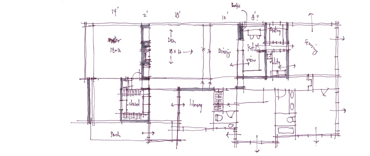
I typically tape an existing plan down on my desk and lay a piece of trace paper on top and start sketching. One of the very first things I do is to start blocking out the required spaces using some room dimensions that I have developed over the years. Part of the process, especially since this is an existing footprint that we are attempting to work within, the first real task is to simply find out if the new program fits within the existing shell of space.
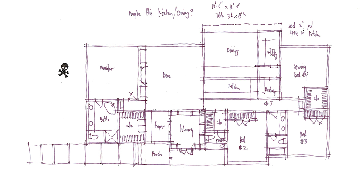
These studies for me are all pretty quick – probably somewhere between 15 and 30 minutes. The real objective is to see if my size assumptions work within the space I have to fill. I am okay if we need to punch out beyond the existing foundation if it makes sense and provides value.
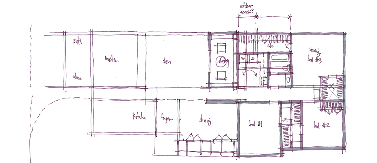
I should also point out that I generally don’t work about indicating windows or finish materials in these plans – but that doesn’t mean I’m not thinking about them. At this stage, especially when we develop a plan that is worth presenting, thee objective is to make sure that thee assumptions we’ve made regarding room size and placement are on the mark. I don’t want the conversation to go down the rabbit hole where all of a sudden we are talking about the color of brick or stone. I also want to work through these plans as quickly as is reasonable and I know that whatever window openings I show during the schematic design phase will most likely be tweaked a bit once we move into the design development phase and we start looking at the elevations.
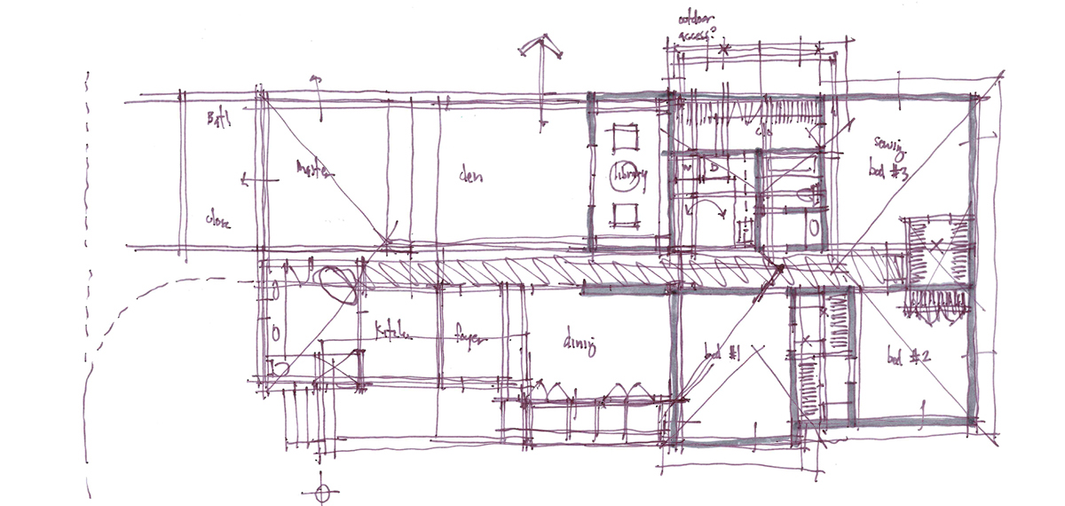
Sometimes, drawings get placed on top of drawings that are on top of drawings … and on and on.
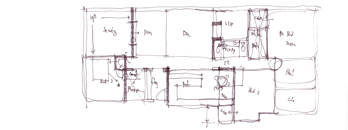
Occasionally, just because it is part of the iterative design process, you need to blow up certain assumptions and start over. Sometimes the results from this process confirm that something you didn’t think would work actually, in fact, does not work. In this particular scheme, we wanted to put the sewing room adjacent to the dining room – which was a design request from the client. It also allows us to study how the plan blows up when we starting moving bedrooms around.
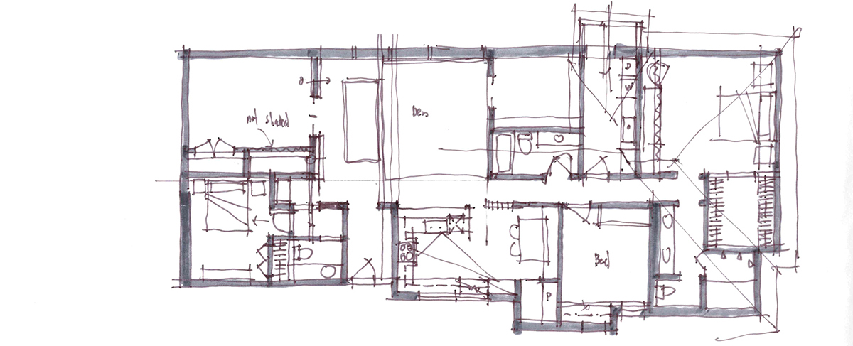
If you can believe it, we take the clients budget pretty seriously and I would much rather err on the side of being overly cautious than doing “whatever” budget be damned. For the people who are paying close attention to these sketches, you could probably figure out where the existing load-bearing walls are located. I don’t mind punching some holes in these walls and increasing the span, but I won’t remove them all-together … seems a bit insensitive to the fact that I have been charged with someone else’s bag of money.
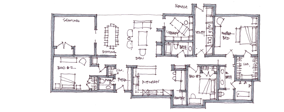
About every 10 layers or so of trace paper, I clean up my sketch so that I can minimize the amount of “sketch creep” that happens as a result of rapidly producing hand-sketches … things understandably slide around a bit. I also use these versions to place furniture to make sure that there are reasonable layouts available based on the door and (anticipated) window layouts.
I wrote a landmark article almost 6 years ago titled “Hatchet Bedrooms” and in it, I wrote:
I think it’s really, REALLY important that furniture is drawn into the plan when designing the rooms. Thinking about how the room will work is paramount to its success as a space and without considering the furniture arrangement, you haven’t really addressed all the possible concerns that might exist.
For the record, you will notice that none of the schematic design plans I’ve shown in this post have a “hatchet bedroom” … it’s that important to me. For you Feng Shui folks, you will also notice that I don’t have any feet facing the door. [BOOM]
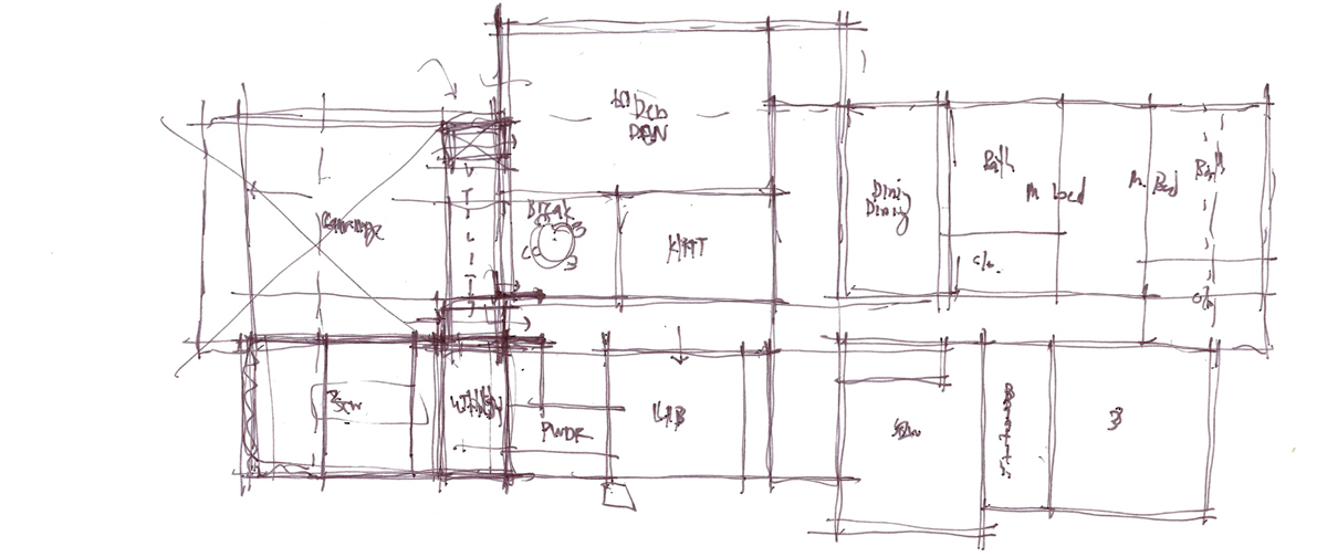
This is clearly the beginning of a new study and I have a few pieces of trace on top of one another. We are trying to put an attached garage into the plan …
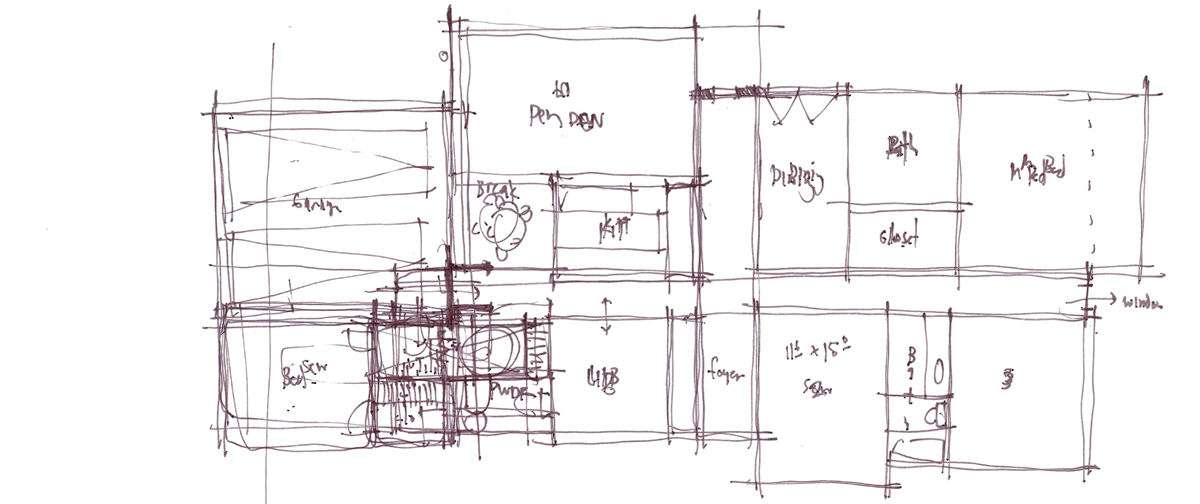
Still working on adding the garage … but I don’t like doors located at the end of hallways. This was a study on how to provide a powder bath, coat closet AND what would be perceived as a private entry into bedroom #3. The main issue, which should be obvious based on the area of the plan that has the most ink on the page, is the getting into the house from the garage.
This wasn’t it.
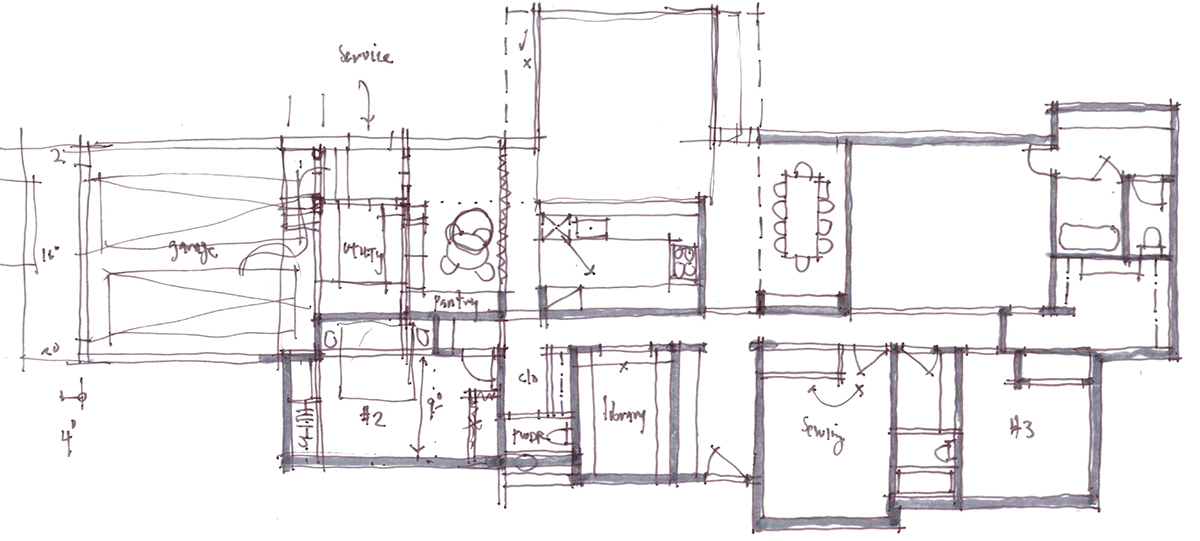
When something clearly isn’t working, quit trying to force it (that’s bumper sticker quality advice btw). As a result, we split the entry from the garage from Bedroom #2 – which yields a much better solution, at least from a daily entry procession standpoint.
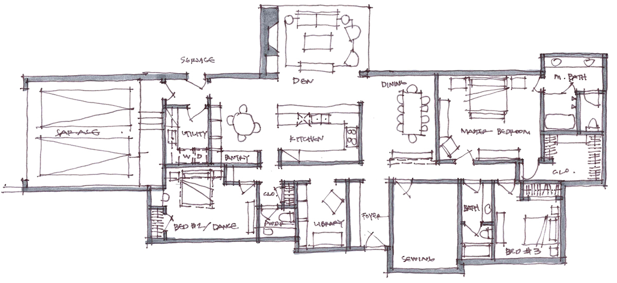
This is is basically a cleaned-up version of the sloppy version previously shown.
Sketching is an important part of my process and I don’t particularly claim that this is a superior method to follow – I suppose it all depends on the person holding the pen. Some people will argue that there is a more natural flow between thinking and drawing without “technology” entering into the process, that you are able to think specifically about the creative process without having to think about the commands and keystrokes that are introduced as technology is introduced. I’m not really convinced with that argument because for some people, particularly those who sketch infrequently, they are probably thinking about the act of trying to sketch if it has not become a part of their process, and I’m not all that sure that this is any different than someone having to think about which button to push on their computer.
In the next few weeks, I will be one of the judges in Architizer’s inaugural ideas competition, the One Drawing Challenge and was recently interviewed by Content Director Paul Keskeys about my own sketch process. There was one particular question that Paul asked that I think is a suitable way to end today’s post …
Paul Keskeys: You still draw by hand a lot, a process that increasingly seems to be skipped by young architects these days. What do you gain from hand sketching, and what advice would you give to designers who tend to avoid it?
Bob Borson: There are a few things that I feel are beneficial when you draw by hand. The main benefit is probably the simplest thing imaginable … speed. When I bring up the idea of speed most people instantly assume this means that I can sketch through my ideas faster than someone who has to interface through some sort of technology, but that’s not what I mean at all (there are some people out there that are pretty darn fast using current technology!)
When I sketch, I think it slows my thought process down and forces me to think through my idea a bit more completely in my effort to actually be able to draw it out in a manner that allows someone else to understand what I am trying to convey.
Whichever creative process works best for you, I say you should embrace it.
Cheers – and Happy Sketching! (or computer-ing)

