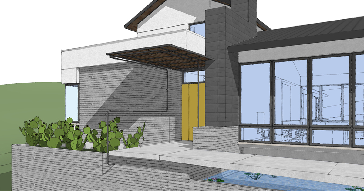
Today I am going to focus on a singular moment that occurs in the entry sequence, a moment I call “The Front Door Experience”. No, it wasn’t the name of my 4th Grade rock band, but it could have been (and no, there will not be a post with a similar name regarding the back door). Since I have a handful of residential projects in the early stages of the design process that I would start talking about some of them. This particular one is in San Antonio, Texas on a beautiful piece of land with acreage, and the clients are a young couple with a growing family.
The project is just over 4,200 square feet and we have a good budget – enough to do some interesting things, but not so much that we can do whatever we want. Without giving you the actual budget, I would like to say that we are approaching all the moves we make as custodians of that budget. This simply means that it isn’t my goal to hit their max number as close as possible – if we can come in under budget that would probably make everyone pretty happy. As a result, we are looking for specific high-touch moments where we will spend a little more time and money to create something memorable and pull back in other areas for things to be what they should be, rather than what they could be … if that makes sense.
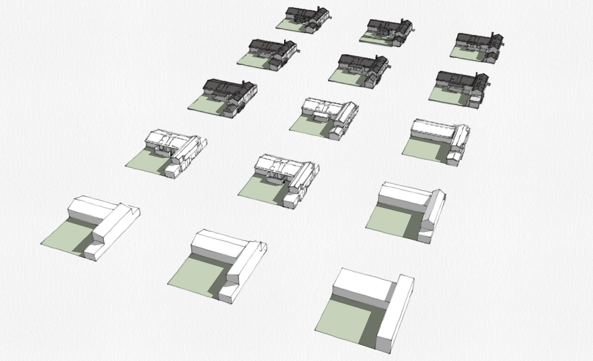
The diagram up above was a series of massing studies we went through to explore the shape of the building, the placement of the masses, form of the roof – everything that would generally give shape to the project. We do not study window and door placement at this point even though we have a really good idea of where they will be located. One of the things that this current pandemic has done to us (or maybe for us) is that we are now pretty good at working remotely and presenting information and processes over a teleconferencing call rather than in person. The matrix of shapes up above isn’t something that we would normally spend much time on with the client – it’s more of an internal process for us – but we decided to walk the clients through this process so they could better understand that there are a lot more moves than they might normally assume.
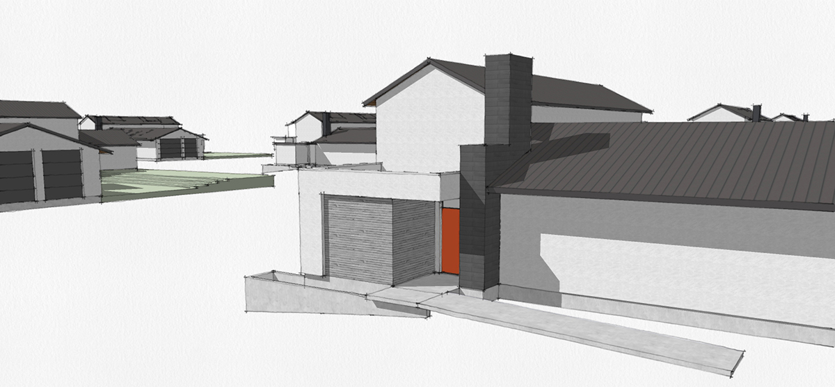
This is a closer look at the detail that is in each of these massing models and while this post isn’t focused on the design development process (I should write one of those posts eventually), I did want to show this particular image since it focuses in on one of our high-touch captured moments – specifically the arrival procession towards the front door.
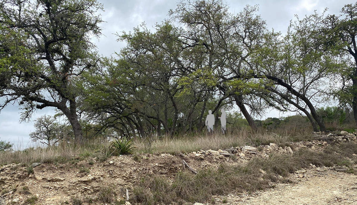
This isn’t exactly where the front door will be but it’s reasonably close. There is a lot of terrain and topography to this site and we are looking to achieve what is called a “balanced site” – whatever we “cut”, we use as the “fill” in other locations. We initially explored a series of internal steps within the house but the client, especially with young children, wasn’t too excited about that direction. As a result, our front door is cresting out of the land in a fairly dramatic way and it was pretty clear that this should be something that we focus on in the design.
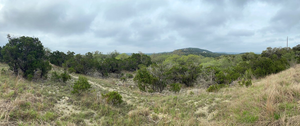
Look at this view – pretty incredible! This is at the top of the parcel of land and the lots are large enough that this view will be preserved.
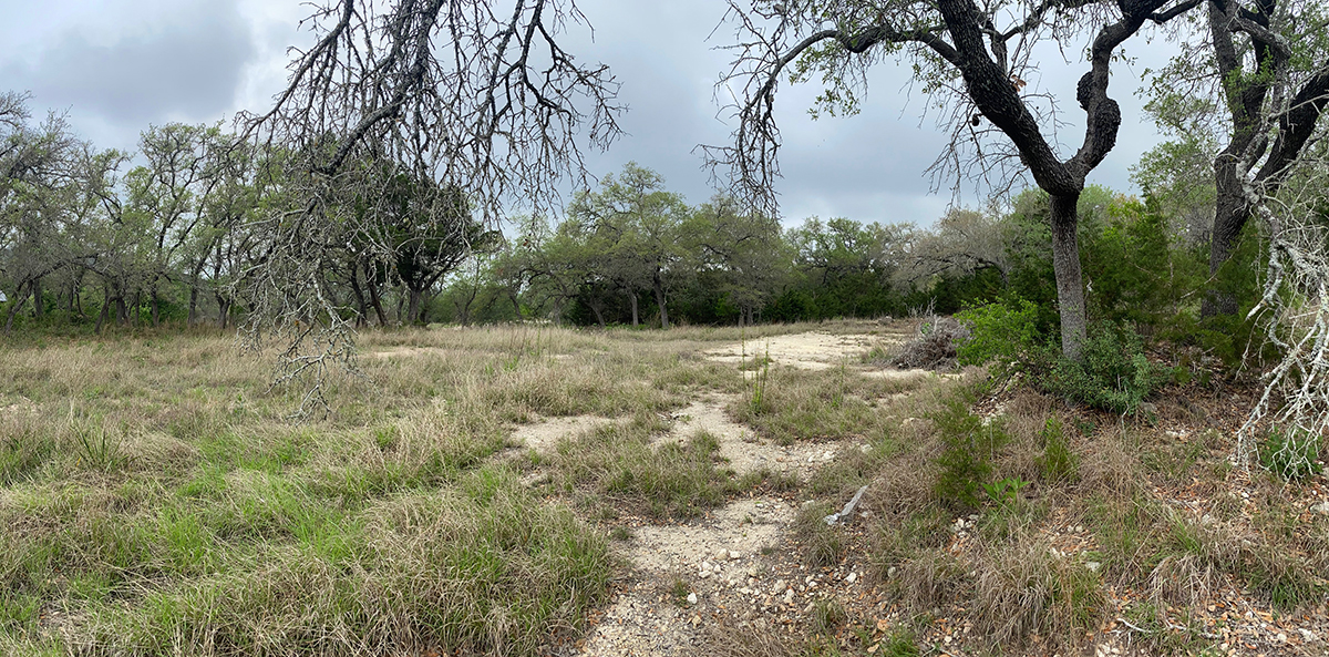
This is at the lower portion of the site and is where most of the house will be placed. This is the largest bit of relatively flat/level land on the entire site so we are going to take advantage of that fact. This will simplify our foundation as well as preserving just about every existing tree on the site – a nice bonus.
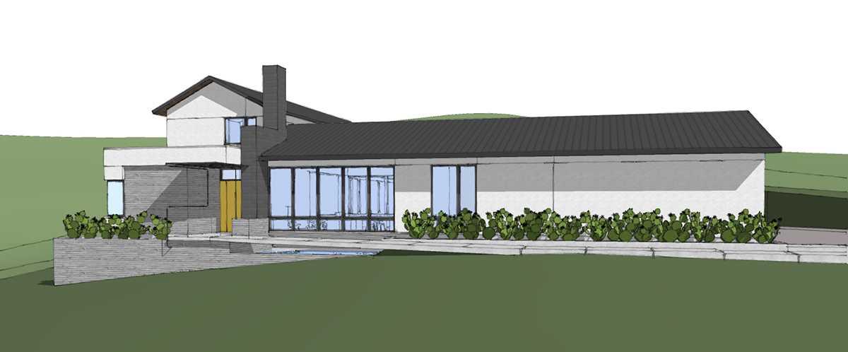
So let’s get back to the front door and the experience I am focusing in on today. I had mentioned that we are not stepping the ground level floor plan up and down as the site topography changes so if you look to the right, you can start to get a feel for how the site falls away as you move to the left and approach the front door (shown in yellow). We are going to heighten this experience by having the path that approaches the front door run parallel to the house and rather than approaching the house straight on and then having stairs (because who wants to drag baby strollers up and down the stairs all the time) and we are going to put in an approximately 42′ long ramp. This ramp will be climbing up (as ramps will do depending on the direction) to coincide with the site falling away from the finish floor elevation.
… but that’s not the only cool thing, there are some other memorable things taking place.
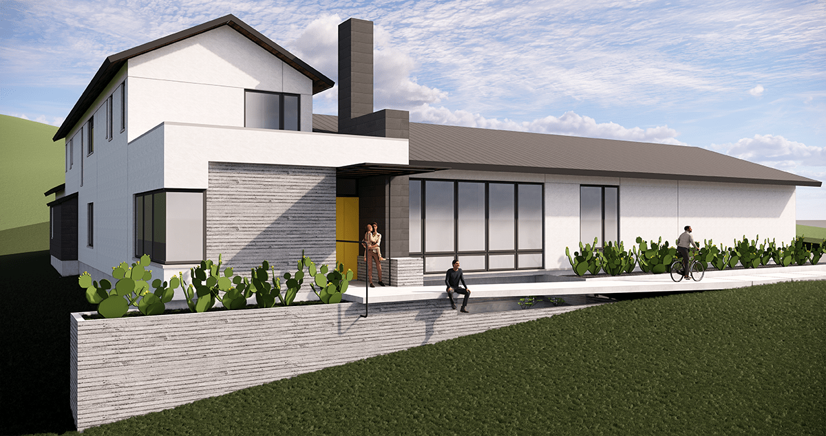
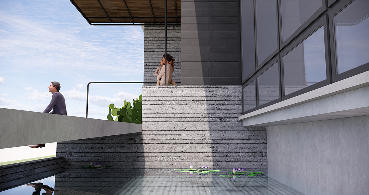
One of the things that I take particular pride in executing well is scale and proportion. If you look at the image above, I’ve thrown some scale figures in place and I feel confident that you did not realize that the size of the house – at least vertically – is as large as we have it designed. The single-story portion that is the bit to the right has a 12-foot plate line and the windows facing the front of the house are 10′ tall.
Kinda makes the ramp a little bit cooler … but did you see what’s under the ramp?!
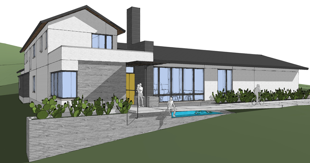
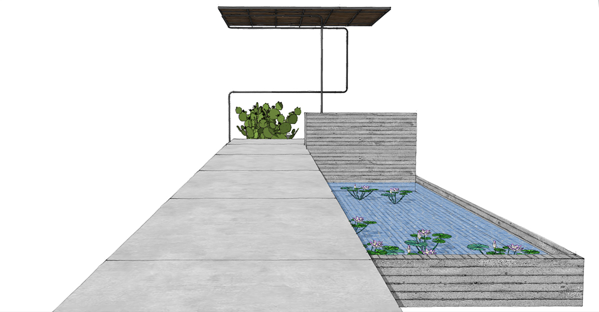
That’s right … a water feature, the thing that regular non-architectural people call a pond or something. It might be hard in the rendered image I included above so I am including the SketchUp version of the same view so that it will be a lot clearer where the “pond” will be located. While I do not anticipate fish taking up residence here I have allowed for this possibility during the design phase by providing protection from predatory birds by extending the water under the entire length of the ramp. We are also going to push this water feature under the window line of the large window wall in the main living room of the house. Take a look at the next image and you’ll be able to see how the water feature slides slightly under the window line.
Before all you code-centric people start losing your minds over the distance from the top of the ramp down to grade, I am going to ask you to settle down. We have not received our topographic survey yet and this model is based on what we pulled from Google Earth. Eventually, we will be doing some regrading and we will modify things at the front so that the elevation change is less than 30″.
Let’s isolate this area so it’s a bit easier to understand what’s going on.
Really what I want you looking at in these images is the handrail … at least I think I can call it a handrail. It’s one continuous run of painted pipe railing and I have it performing a myriad of duties. This is one of the things that makes me the happiest – because as simple as this looks, it took several iterations to work through it to have it exist in a complicated manner but look completely simple and obvious.
If you are a modernist designer, you know exactly what I am talking about. Simple is really hard to execute, especially when it isn’t really simple.
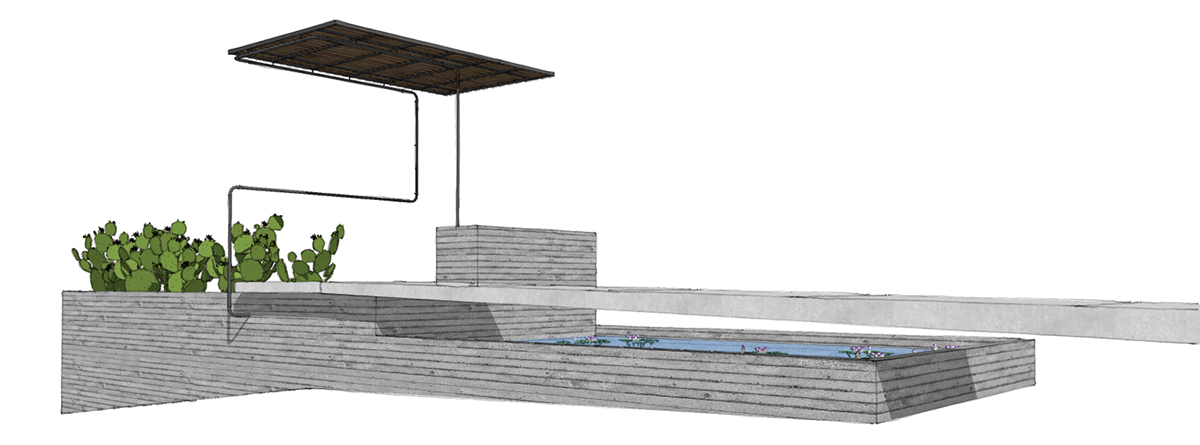
I have “turned off” the house so all we are looking at is the ramp, the board-formed concrete that the client has requested as a finish material, and the covered entryway with the guardrail/handrail/structure isolated.
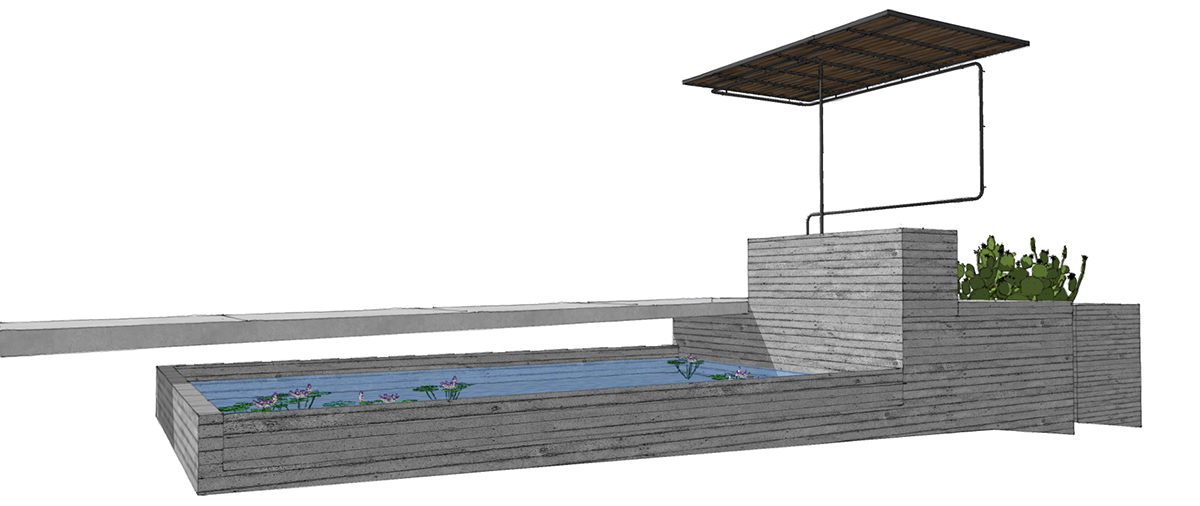
Get it? So simple but it is executing several tasks that I need – handrail, fall protection, structural support for the canopy. This is a talented piece of pipe.
There is a lot going on here which is only part of the reason why this truly is a “Front Door Experience”.
I will concede that it is entirely possible that once the final survey comes into place, that regrading the yard around this entry piece won’t look the way I want it to look and pushing rocks and dirt up against the concrete just so we can satisfy a building code requirement will not get the job done. If (and when) that happens, I will modify this rail – in fact, I already know what I will do should it come to that.
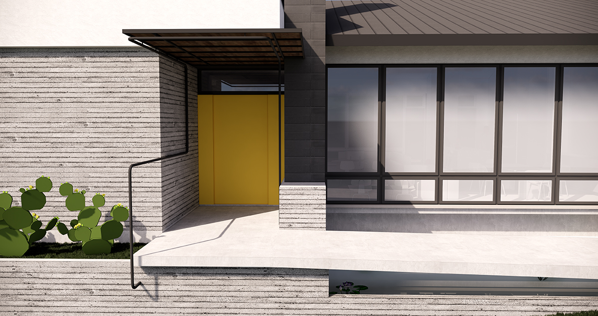
So there you go – the “Front Door Experience” broken down into 3 design moves and 14 images. The irony is that it took me longer to write this post and prepare the images than it did to actually design and draw up these design moves. There is no doubt that your front door is an important consideration as part of the entire design experience. I’ve written a few pieces before on front doors (including this one – which is the most popular “The Front Door of Your House is Important“).
There is actually another consideration in this post that I didn’t focus on – being a good custodian of the client’s budget would suggest that there are a few places where you should focus some extra attention and detail. Most of these will be dependent on the wants and desires of each specific client but in addition to those items, the entry procession should be a memorable one and it isn’t too difficult to make one or two really memorable moments that will leave an impression.
Cheers,

