Most architects have to learn patience over the course of their career, it’s actually one architectural character trait that I always think about but rarely bring up because it always falls into the “Doctor heal thyself” category … for I have little patience.
As I sit here on the couch this rainy Sunday afternoon, wondering what I would talk about in today’s post, it didn’t take long before I settled on the retail area of the medical practice building I have been working on for the last two years. I’ve even continued to work on this project 6 months after leaving the firm I was with when I started this job, mostly because I really like the project but also because the clients are pretty amazing and I can’t imagine not being around to see this particular project come to fruition.
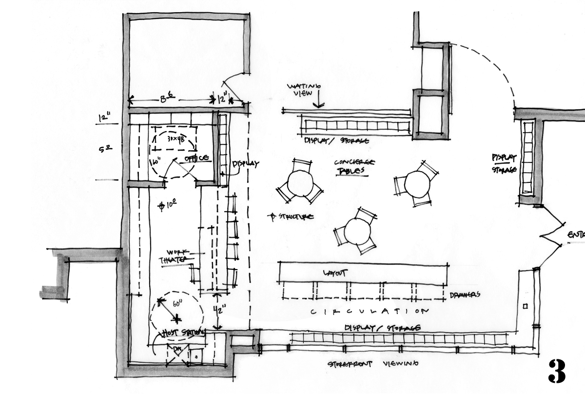
The sketch above is from a post I wrote about this project that dates back to February 19, 2018 – exactly 2 years and 4 days from this moment as I write today’s article. We were discussing a +/- 1,200 square foot retail component that would reside within a 12,000 square foot medical practice and I had just started the architectural sketch series.
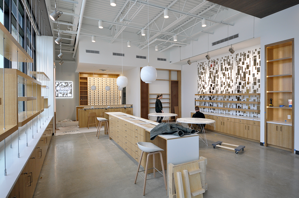
When I was down on site just a few weeks ago to do a punch list walkthrough I took some progress shots and spent some time thinking about how long it felt to get from that initial design concept sketch two years ago to this moment. I am very happy with how things turned out – even happier that the initial concepts made it through the entire process basically intact from what we had hoped them to be – something beautiful that stood on its own but allowed the eyewear that will eventually be displayed in this space to take center stage.
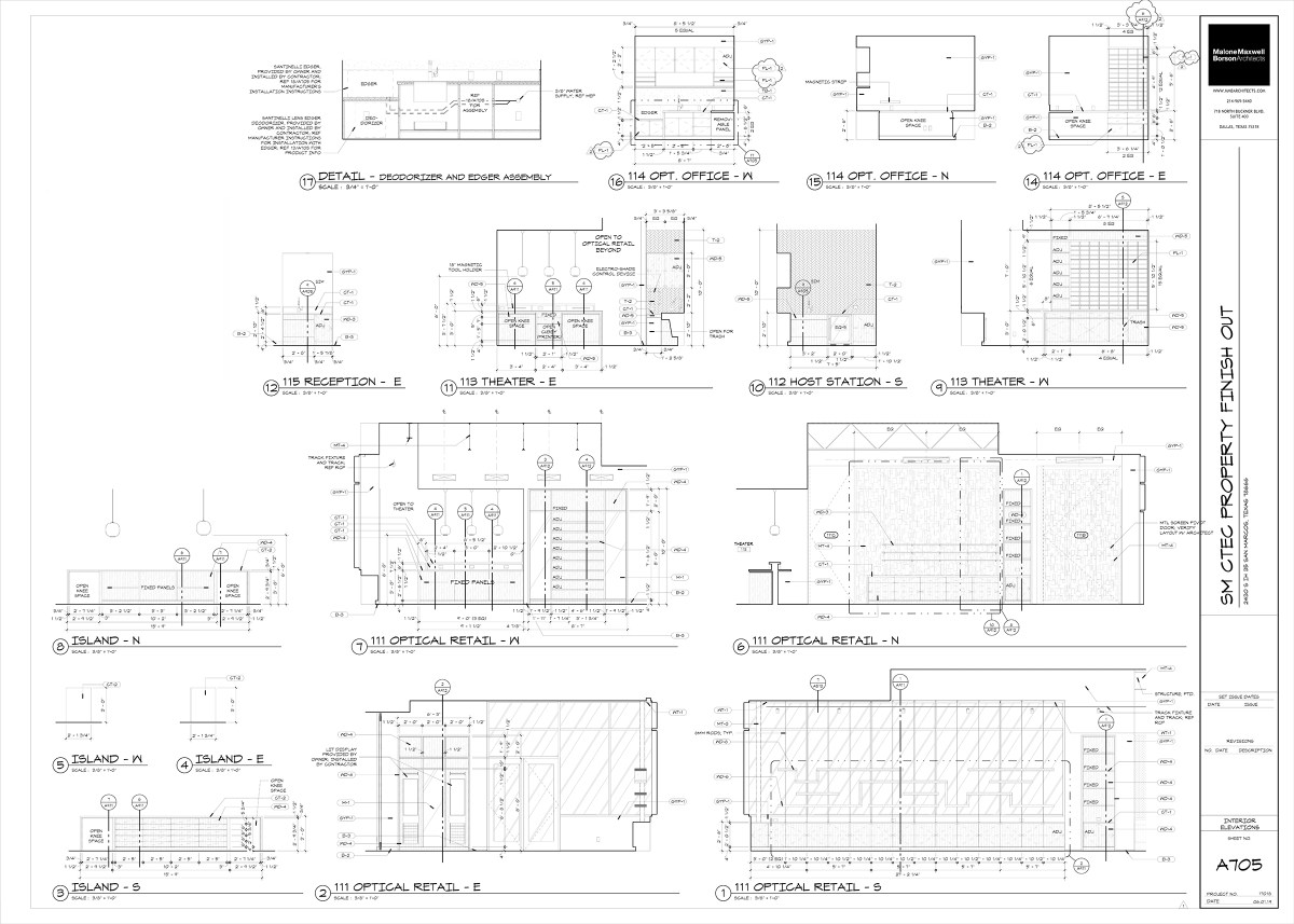
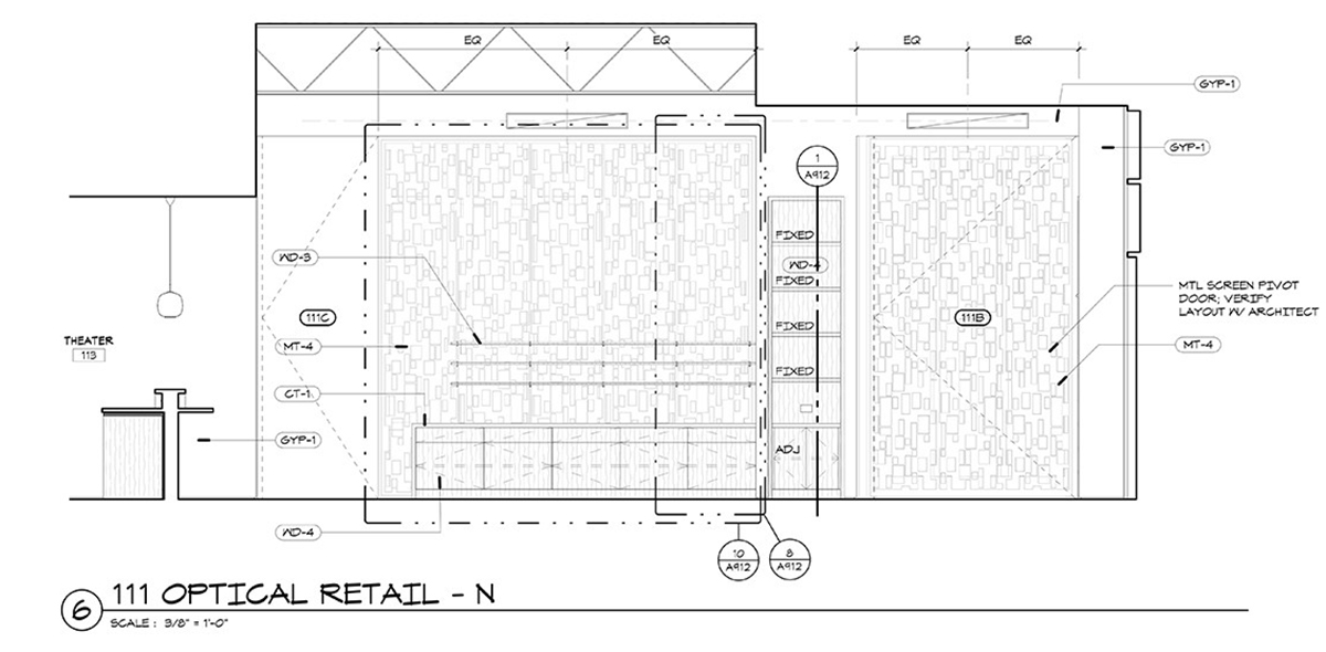
There are two long walls within this space and the one depicted above is the wall that separates the retail space from the rest of the medical practice. On the right, there is a large pivoting decorative metal door that connects back to the main waiting room. On the left, there is a large glass wall that is covered with similar decorative metal panels that lead into the “Dilation Waiting Room.”
Getting natural light into the interior rooms of this project was really important as a design concept and as a result, anytime we had to create physical barriers (the retail component maintains additional hours from the medical practice) we wanted to open up those barriers visually as much as possible.
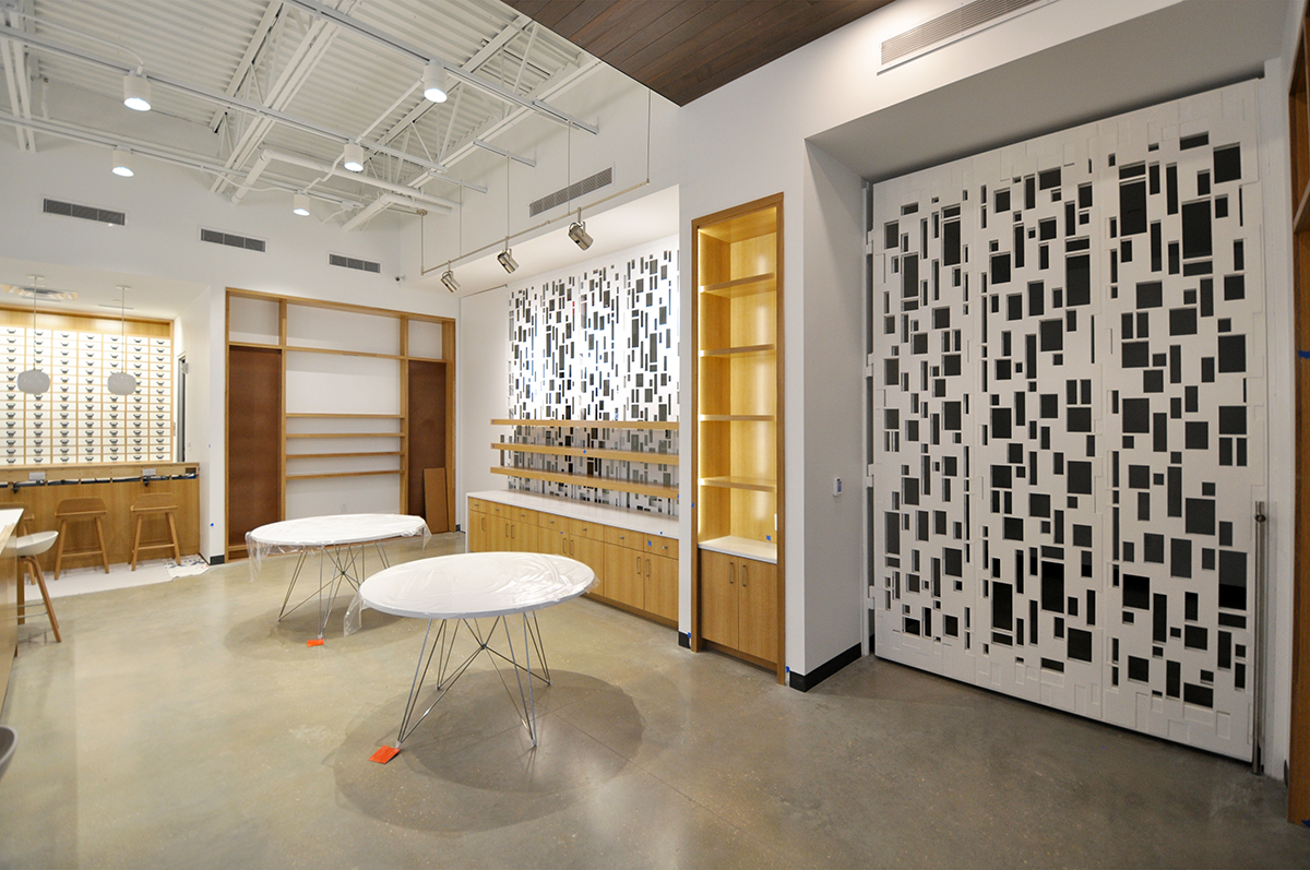
Here is a photo of that same wall. We are still missing mirrors and the lights have not been adjusted, but I think the built version of our design concept is pretty close to the original concept.
One of my favorite things about this particular space is how we played with the sense of scale. There have been clues in the images shown prior to this point but I don’t think most people would realize just how big this space actually is … the pivoting door shown on the right is right around 12′-0 tall and if you tell me you would have guessed that, I’m not sure I would have believed you.
Take a look for yourself …
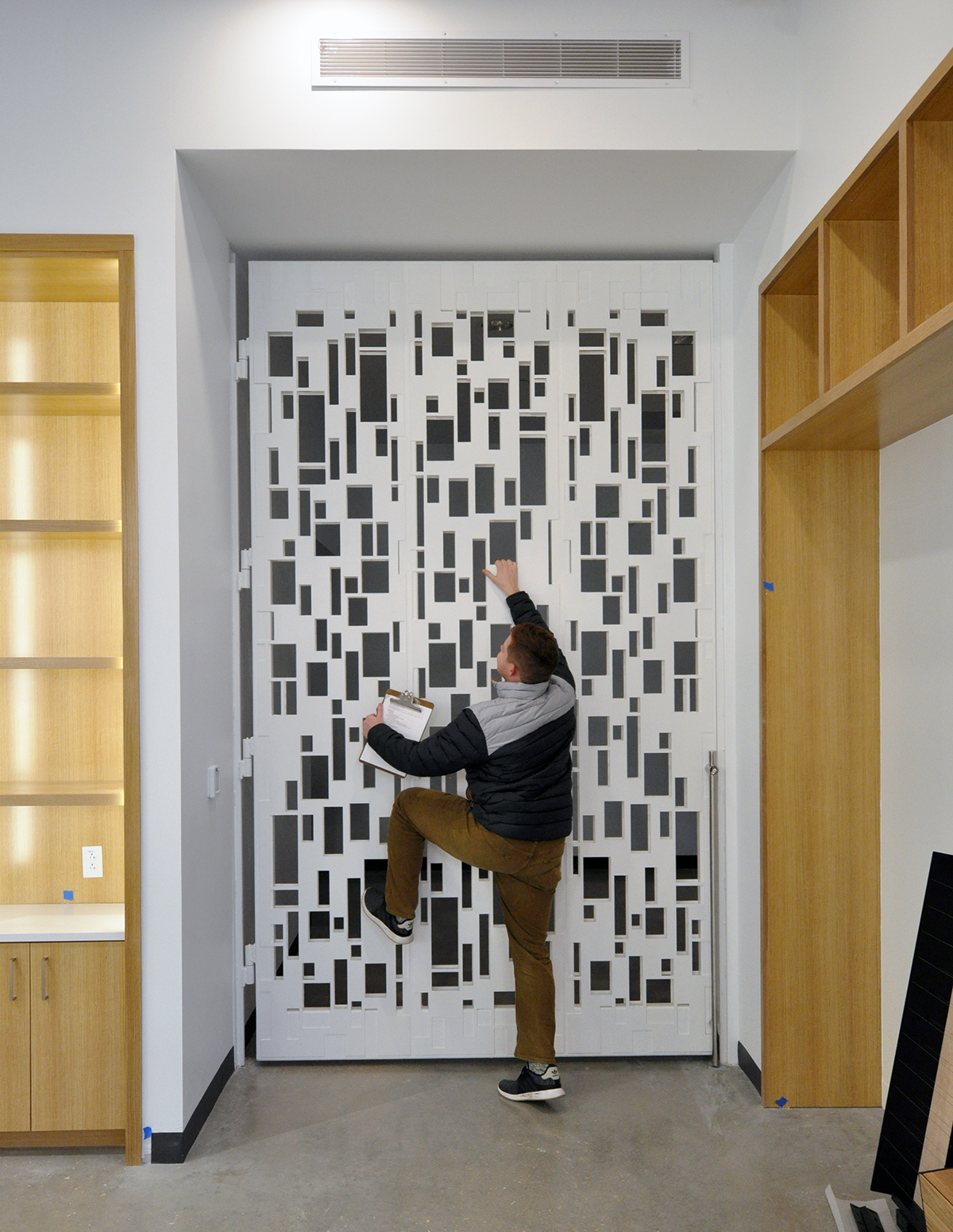
Here is Landon Williams provided for scale … and yes, he is of regular size.
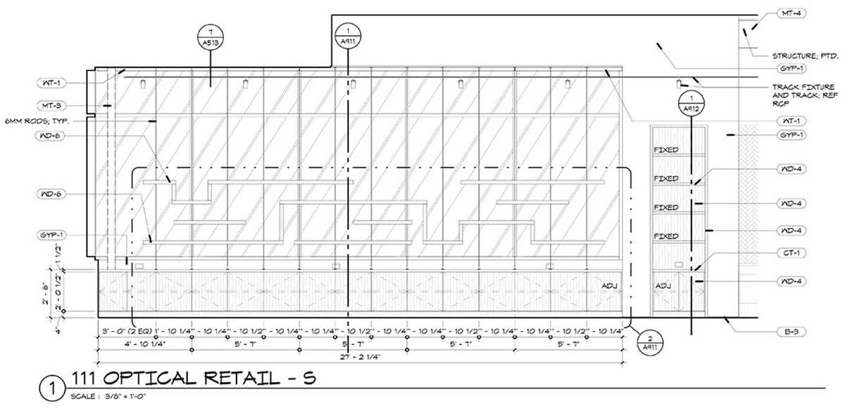
Exactly opposite from this metal-clad wall is the exterior wall and the most open space in the entire project. Obviously display space is an important consideration in any retail environment, but natural light was also important and given its location on the front of the building, this retail space needed to be open to the exterior to allow us to capture and redirect natural light further into the rest of the building. We decided to come up with a custom shelving system that would reinforce the design nature of the entire space, allow for light to successfully navigate through, and have enough presence to coexist with all the goals we tasked this wall with providing. The concept was generated at the time by talented designer Danielle Anderson who I am happy to say has migrated over to my new office at BOKA Powell so we still get to work together.
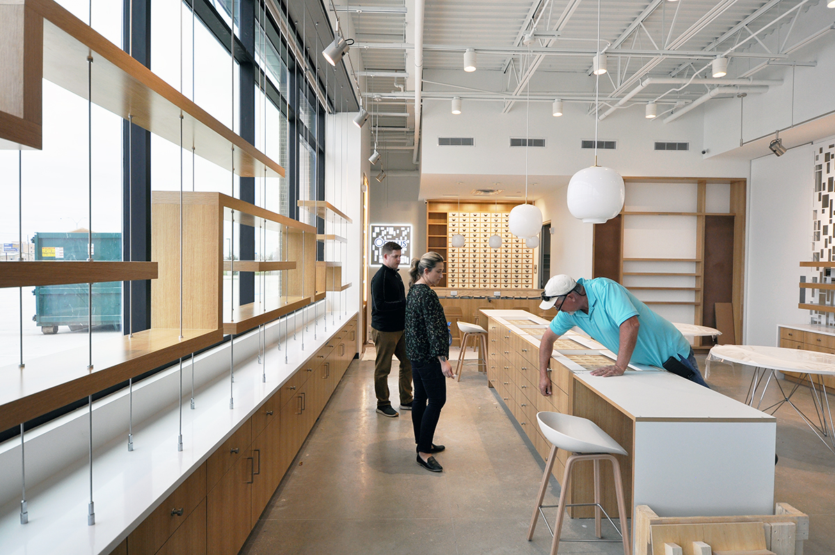
I took the image immediately above when we were on site for the punch list, and I am standing essentially by the front door to this retail space. Once again, you can see how we played with the scale in such a way that everything looks proportional and intimate but there is still plenty of room for merchandise display.
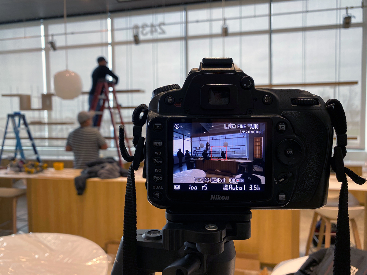
When we arrived, the installers were just beginning to put everything in place and I had concerns that they would not be able to complete the task during my visit … a misguided concern because it took them just a few hours in total to get everything in place.
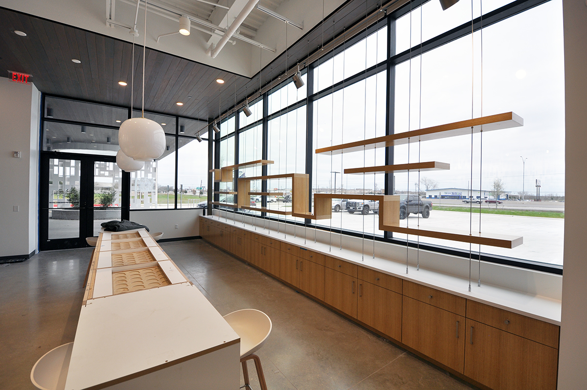
This is as complete of an image as I have but I think it’s pretty easy to visualize the end product. We are still missing the terrazzo countertop on the floating island (which will be amazing once it gets installed) but everything else is as it should be. We will still adjust the lighting once product is placed on the shelves but I am very happy with the final outcome and I’m looking forward to the opening party this coming weekend.
It’s been 769 days since I first talked about this project on Life of an Architect and to get to this point feels like at least that many days … but it’s been worth it. I know that everyone involved with this project feels pride and ownership of the end product, and considering that it’s time for my next eye exam and that I could probably use a new pair of glasses, I know that I’ll be back before too long.
Cheers,

PS – if you have an interest in seeing the original sketch series post for the design concept of this space, just click on the title below. There are all sorts of images included as well as very early renderings of the space. Other than a large ceiling element, very little has changed from beginning to end – mostly refinements.

