I think there is a not-so-well-hidden secret out there that the websites for architects are almost all unilaterally terrible. They are cumbersome and hard to navigate – trying to find information on them seems to be a reward for people who demonstrate an unreasonable amount of patience.
Why is that? Well, I have my theories but the main reason seems to be that architects don’t consider the people who might be viewing them, instead choosing to focus on style … essentially what would look good to other architects. I should point out that I am speaking specifically about small architectural firms – the 20-employees-and-under type firms who generally don’t have someone on staff who is specifically knowledgeable about website functionality, AND, the type of firms whose potential clients have assuredly spent some time trying to navigate that firms body of work via their website. The other problem most architectural websites suffer from is updating them with current projects – something that my own firm has been guilty of for the past several years.
Last week my firm, Malone Maxwell Borson Architects, finally went live with our new website. The old site was just that – old. It was outdated and required someone with Stephen Hawking type knowledge to modify and manipulate and as a result, it was rarely updated. Our new website is really a portfolio website with extremely limited wording. If there is one thing I’ve learned after maintaining ‘Life of an Architect’ for the past 8 years, is that nobody will actually read whatever it is that you write when there are pictures available. What this means is that our new website is image intensive – which I think is a good thing for an architectural website.
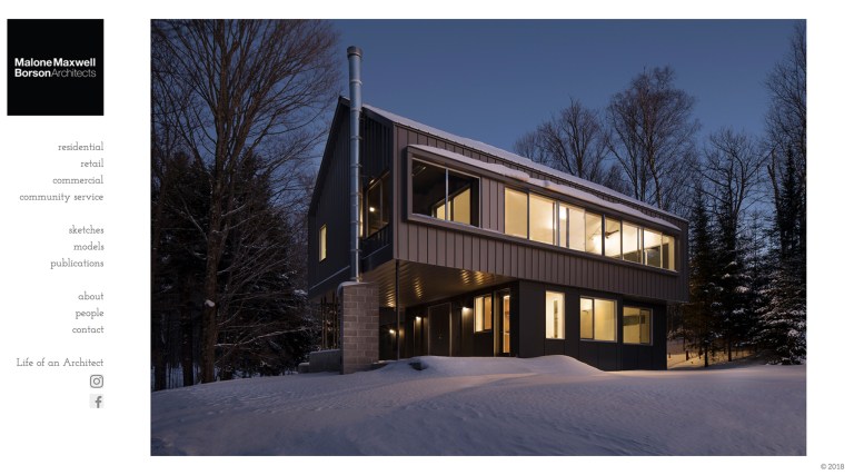
When we started discussing how to lay out our site, we didn’t look at other architectural sites for inspiration, instead, we looked at the websites of photographers. The basic bones to our site are pretty straightforward – start with a landing page that scrolls through some large images and anchor a navigation bar along the edge that will allow visitors to hit the sort of projects they are interested in viewing.
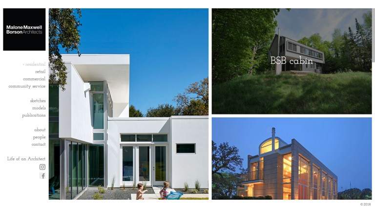
This is what someone would find if they visited the “residential” section of our portfolio. There is one image per project on the landing page and if you want to see more all you have to do is click on that particular project.
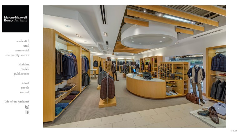
If you are a frequent reader of this site, you are probably not aware that we do other sorts of projects in addition to residential work simply because I typically focus on the houses. We work in all sorts of market sectors – retail, office, churches, schools … all sorts of projects. This is one area that we are working on documenting better – I think 2018 will be a year of photography.
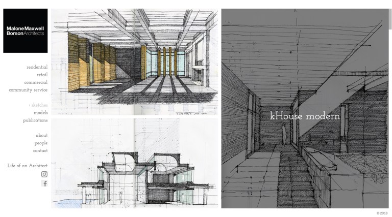
We also decided that we would include some additional sections of our website that speak to the culture we have in our office. We tend to sketch a lot in our office and thought that it would be interesting to share them with people.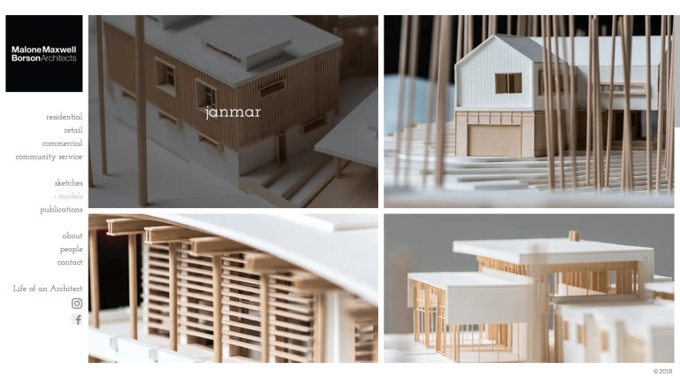
In addition to sketching, we also build a lot of physical models in our office – and if you like models as much as we like models, this should be an interesting section of our website worth exploring.
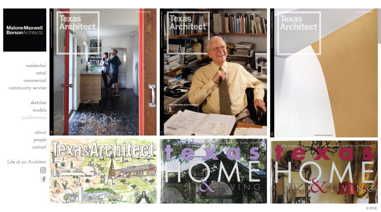
We also decided to add a section to our new website to the articles where our work has been featured.
Finally, and possibly most importantly, is the “People” section – where everyone who works in our office will have some information about them. The people in my office have a lot of personality, and without a doubt, this is the most talented group of people that I have ever worked with. Over the next few weeks, I expect all of their profiles to fill in a bit so you can learn more about them as individuals.
Despite the fact that the website is now live and ready for viewing, I know that there is still a lot of work to be done. That might actually be the biggest argument for making the switch to a new platform and rolling out a new site. Even with my limited technical abilities, I can add sections, photos, videos … whatever I want within moments. Now the fun part begins because let’s face it, the website is really supposed to be there to support the information. I don’t really want you spending your time trying to puzzle out where we placed something.
Now it’s time to focus on collecting the images to help tell the story – which means I still have a lot more projects that I need to get photographed!
I hope you take a moment and check out our new site (mmbarchitects.com) – it’s a big improvement over the last one and I can’t help but think it’s only going to get better.
Cheers,


