How many of you remember the Choose Your Own Adventure books from your childhood? These were books that came out in the late 1970s and early 1980s and the premise was that you read a book and roughly at the bottom of every page or two you were given an option: Go to the Cave … or Return to Camp – or something along those lines. Based on your answer you would be instructed to turn to a particular page in the book to continue on your adventure. I was around 10-years-old when I read my first Choose Your Own Adventure book and I found it rather incredible that I could play a hand in how the book evolved.

You are probably wondering to yourself why I am talking about this particular book series. I have been working on a different blog post for the last week – the next entry in the Architectural Graphics 101 series and it’s taking me a bit longer than I would have hoped. You might not realize it but those posts take a long to time put together – gathering up enough graphic information to fully articulate the topic takes some time because I don’t typically have that stuff laying around in a format that I can just throw up here on the website.
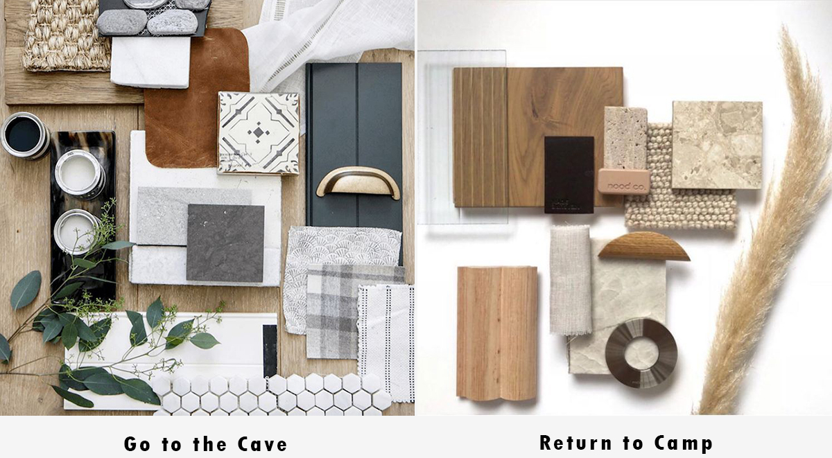
So as I was wondering what I would talk about in my post, I was multi-tasking and talking with a co-worker about a meeting we are preparing for on one of the new Residential Studio projects that we are working on. It’s time to start talking about finishes and materials with our clients but we don’t have a feel for where their tastes lie or what sort of color palette they are interested in seeing. As I found myself in a teaching sort of moment, I was describing how I wanted two color palettes prepared and in the presentation – one made up of warm tones and one made up of cool tones – so we could show both versions to our clients and simply ask them which way did their tastes trend. The way I articulated this process was by comparing it to the Choose Your Own Adventure books … only to realize that the person I was describing it to was minus 19-years old when these books first started coming out and probably had no idea what I was saying – which is too bad because the analogy is spot-on perfect.
Go To the Cave … or Return to Camp?

Here is an example of my analogy at work … seems pretty obvious what is happening here, doesn’t it? The client gets to decide if they want to go to the cave or return to camp without actually having to tell me which “color” they want. By giving them two choices – which is really far more than two – I can get a feel for which direction they would like to go and from there, I can develop a material palette that suits their tastes.

See how simply this premise works? It is not that uncommon that we will work with a client who brings a Pinterest Board with a million pins on it to the conversation (in the old days, it would have been a stack of magazine images) to our meetings to help convey visually what might otherwise be difficult to explain. When that doesn’t happen, I have found that it’s much easier to assemble something for people to respond to rather than simply design a palette and hope that we can eventually work our way through the process.
Go to the Cave … Return to Camp?
Easy and effective, constructive and efficient.
Give it a try for yourself and let me know what you think. I’m already a fan but maybe I can convert a few people along the way.
Cheers,

