Still doing research for my upcoming trip to London – today I was taking a look at 100% Design London – a showcase of a vast range of weird and wonderful materials from wood and plastic to embroidered wallpaper and steel cladding. This is the 16th edition of 100% Design and there will be over 400 exhibitors in the show this year, each one exploring or launching different elements of design. There are free seminars, events and workshops to attend throughout the four days as well as an opportunity to see first-hand leading designers and companies collaborating at the show. Of course I will only have a portion of the morning to walk the show – maybe I’ll have to run.
If you haven’t heard of 100% Design London – or if you’re not going (*whispering* … and I know that you’re not…) let me show you some of what you’ll be missing:
.
.
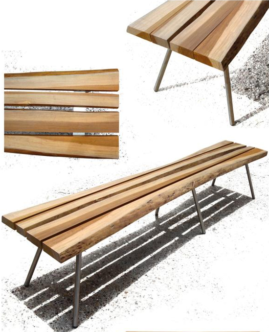
ARQOM, is an Argentine firm that provides design, production and marketing services for third parties. This is the Sr. Costanero design by architect Adrián Prieto Piragine. Dual front backless bench (S2011) made with 85% Argentine discarded native wood and 15% recycled steel (stainless steel/ recycled corrugated construction/ iron color).
I would give my left nut tree for this bench.
.
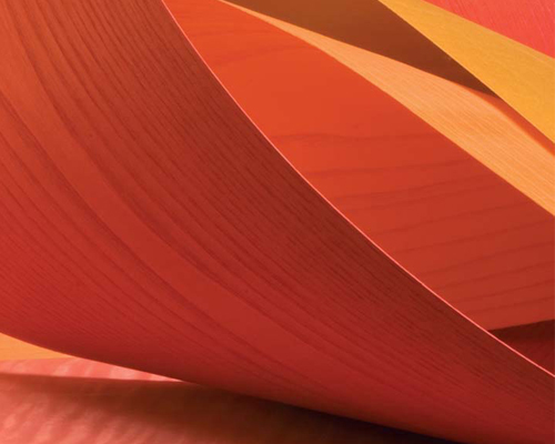
Tabu Tinti – Dyed Natural Veneer from Mundy Veneers. A stunning collection of through dyed natural wood veneers in a Kaleidoscope of colors.
Want your Birds Eye Maple purple? How about Banana Leaf veneer? Or is FSC Straight Grain Walnut more your thing? I can tell you that I would give my right walnut for FSC Straight grain walnut veneer (how many times can I make that joke do you think? Yeah … many, many more times)
.
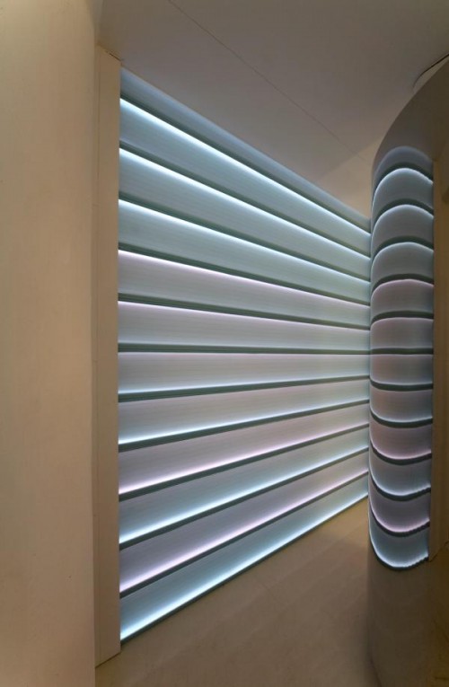
Lumaglass is a unique architectural U-Profile glazing system delivering a fusion of light and glass in one installation, integrating the lowest energy lighting form in a variety of colors to illuminate, what could be, the worlds largest self supporting U-profile glass wall of light in organic shapes.
Structural glazing channels will always have a special place in my architectural palette of materials but no matter how hard I try, I can’t ever seem to find a good match between need/want, budget and opportunity. Maybe this is the system that brings everything together.
.
From S Plasticon, you get structural composite panels with a colored or transparent polycarbonate core with an external layer of transparent thermoplastic material. (Has your brain exploded yet?) You can get this material clear or with color, and with a glossy or matte surface. Oh yeah, you can also use this product inside or outside.
Sweet.
.
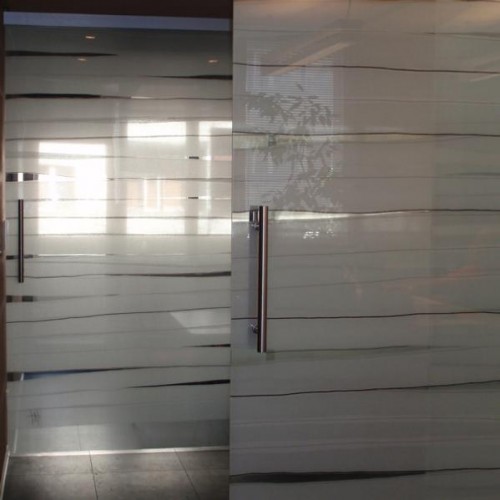
Glass Textile artifacts designed by textile designer Andrea Hegedus have a special appearance due to the unique combination of artistic design, handcraft techniques and industrial technology.
I love this sort of thing – nice clean architectural product with a touch of something that softens up a potentially cold and sterile experience. Don’t get me wrong, I love me some frame-less sliding glass doors but adding a touch of fabric into the mix make these go up to 11.
.
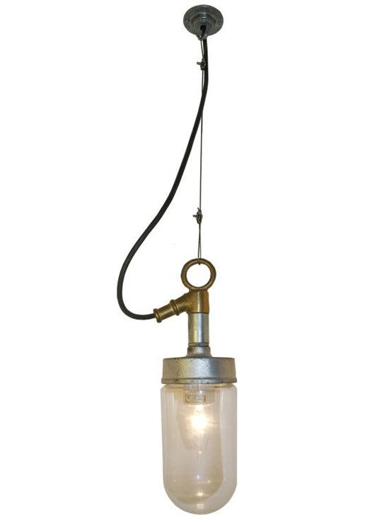
With roots going back to the nineteenth century as a marine lighting manufacturer, Davey Lighting combines traditional craftsmanship and the finest raw materials. Authentic and unique, Davey lights are manufactured in England with the same attention to detail and standard of design required for their original industrial purpose. The fixture above is the 7679 Well Glass Pendant Fitting and is seriously bad-assicle.
If you don’t know what bad-assicle means then you can’t have one.
.
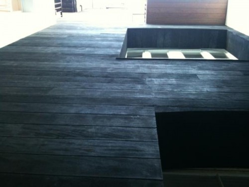
Burnt Decking and Cladding from Exterpark – a contemporary hardwood flooring system for outdoors
<screeching brakes with ensuing neck whip> Burnt timber cladding? Yes please, I’ll have some of that!
.
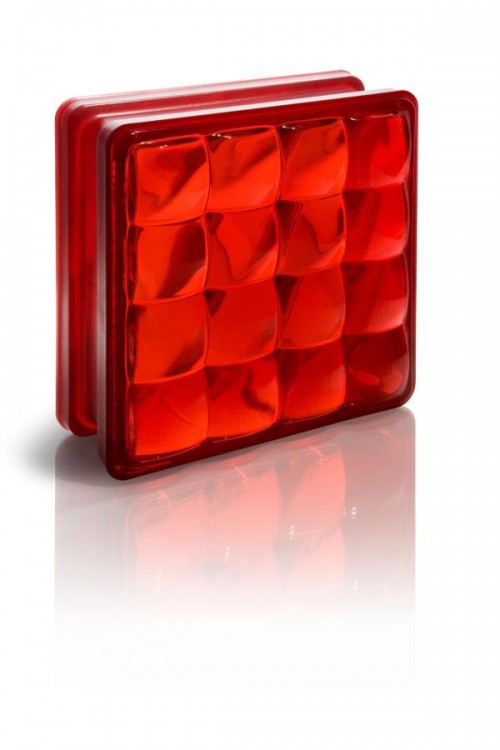
PICT® by Fred & Fred is a module system of partitions made of optical glass which incorporates 16 lenses and a frosted glass screen. It lights and brightens space without use of external energy. By passing through the lenses the light projects inverted images on the frosted glass screen.
Oh SNAP!! That’s glass block! Yes, I know I am infamous on my site for a very rational and justified hatred of glass blocks (see: Death to Glass Blocks!!) These are tricked up glass blocks that might look cool in the Ghost Bar but if I had to look at them every day I think I would commit harakiri with my t-square. So why did I include it here? Let’s just say that these are not your typical glass blocks and I am going to wait … t-square in hand … until I see it for myself.
.
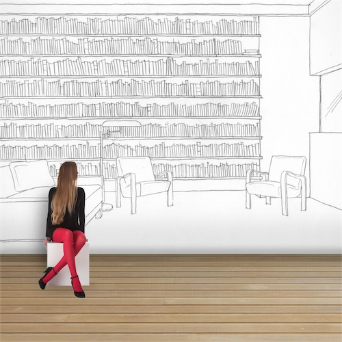
Brigid Strevens Studios has partnered with illustrator and set designer sister Helen Strevens to create these quirky make-believe interior scenes. Each design is hand sketched and will provide an original and distinctive wall covering for the modern residential and commercial interior.
I have to admit that there is something to these wall coverings. As an architect, I took an oath to dislike wall coverings when I accepted my license to practice architecture but there is something very “un-wall covering” like about these so I’m going to corner some of my fellow Blog Tour 2011 designers and get their subjective opinions. I have also been keeping my eye on a company called Wallunica where self-made images can be uploaded directly to the companies web site so that anyone can create and order fully-customised wallpaper of any thing you want. The idea of that is also quite bad-assicle.
.
For more information about the trip I am going on – BlogTour 2011 visit the website and if you want to see for yourself what is available to see at the show, visit the 100% Design website.
Disclosure of Material Connection: This is a “sponsored post.” The companies who sponsored it compensated me something of value to write it. Regardless, I only recommend products or services I may use or will use personally and believe will be good for my readers. I am disclosing this in accordance with the Federal Trade Commission’s 16 CFR, Part 255: “Guides Concerning the Use of Endorsements and Testimonials in Advertising.”

