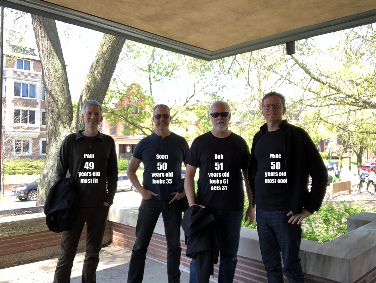
I’m currently in Chicago celebrating the 50th birthday of a good friend of mine. In fact, there are four of us here and we all know each other from our time together from the University of Texas School of Architecture. Evidence presented this weekend would suggest that we are all still about 24 years old despite the realities that we are all considerably older. This has been a fairly architecturally intensive themed weekend and sprinkled throughout our reminiscing has been some interesting conversations about how things are done now compared to how things were done “back in the good old days.” I am many things but a Luddite wouldn’t probably be one of them, but I do like doing some things a certain way even though there is technology out there that could possibly do a task more efficiently. Primarily among these activities is that I like to sketch out my ideas rather than relegating it to a computer program.
For grins, I thought I would use the following example … laying out tile patterns. I posted the following picture to Instagram a few weeks ago and a fairly interesting conversation occurred in the comment section.
For the most part, this is a pretty straightforward photo, but I received the following comment:
“Looks like a perfect use of computation to look at the variations. A quick script in Dynamo could generate what you hand is doing a whole lot faster and effectively”
For those of you that don’t know, Dynamo is a program that runs within the drafting software my company uses (Revit) to create scripts that automate repetitive tasks, explore complex design problems, and streamline BIM workflows in a Revit model. The person who left me this comment was pointing out that instead of trying to determine the tile layout by hand, I could simply write a quick script and Dynamo could do it for me.
While he is absolutely correct, from my standpoint there are a few considerations to his argument, at least where I am concerned, that doesn’t favor using this piece of software – the main one being that I don’t really draft in my office anymore and don’t know Revit or Dynamo. Beyond those, I don’t want the computer doing my tile layout for me.
Saving time is one of the main arguments for allowing the computer to generate a mix of tiles in your layout – you can easily change the percentages of the mix to quickly determine if an 80/20 mix is right or if an 83/17 mix delivers the results you want. For me, I definitely went old school on this process … I did it by hand.
[GASP]
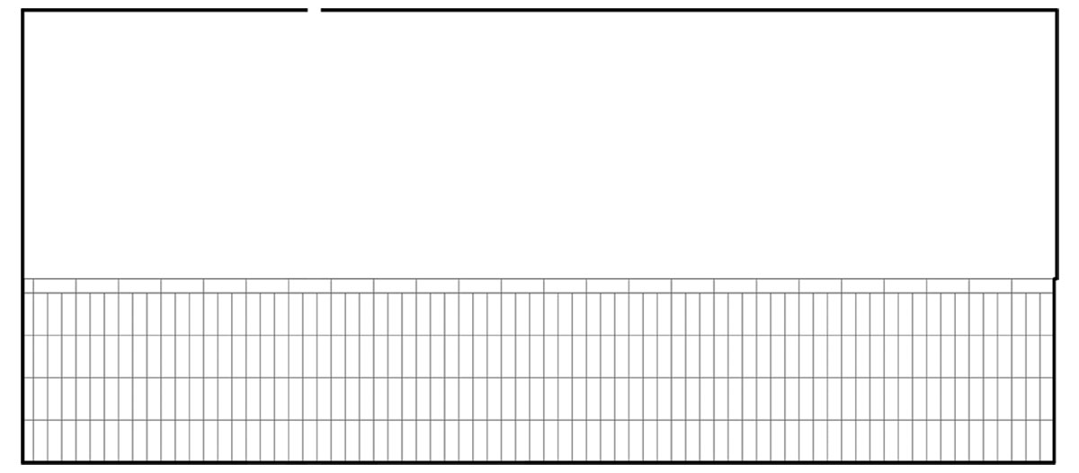
This is the elevation in question – quickly printed out from our drawing set.
- Step 1: Count the number of tiles
For this, I actually counted the horizontal rows across the top (there are 24) and multiplied that times 3 columns * 4 tiles per column + 4 tiles for that little sliver on the far left-hand side. This gave me a grand total of = 292 tiles - Step 2: Do some really easy math
I was interested in an 85/15 split so I multiplied 292 * .85 which equals 248.2 tiles … I rounded down to 248 - Step 3: Do some more easy math
I subtracted 248 from 292 which gave me my 15% balance of 44
Pretty easy so far as I have 248 tiles of one color and 44 tiles of an accent color. Here’s where being a designer kicks in … I wanted to lay out the tiles myself so that I could make sure that I liked their distribution. So far I have invested about 23 seconds of my time, which is about 12x less time then it took for me to actually type these steps up.
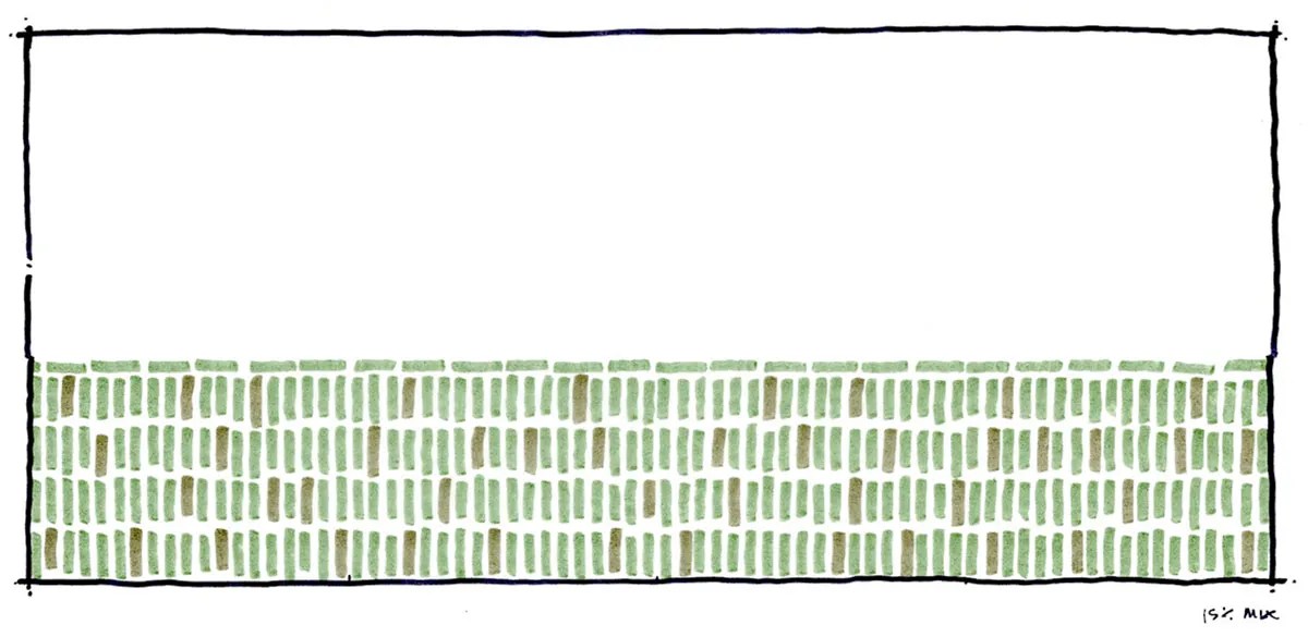
So here is the layout using my 23 seconds of math. It’s a little sloppy but easily got the point across. I won’t presume to know what you’re thinking [yes I will] but I’m going to guess what you’re thinking:
You: Bob, look at all the tile, it must have taken you quite a lot of time to draw up that pattern, at least as long as it took you to write up that paragraph explaining the math. I know that you’re trying to say that it’s sloppy but c’mon … it’s amazing!!
Me: Thanks, but it really didn’t take me very long. If you must know, I would say this took me at maybe 30 or 45 seconds.
You: LIAR!!! There’s no way …
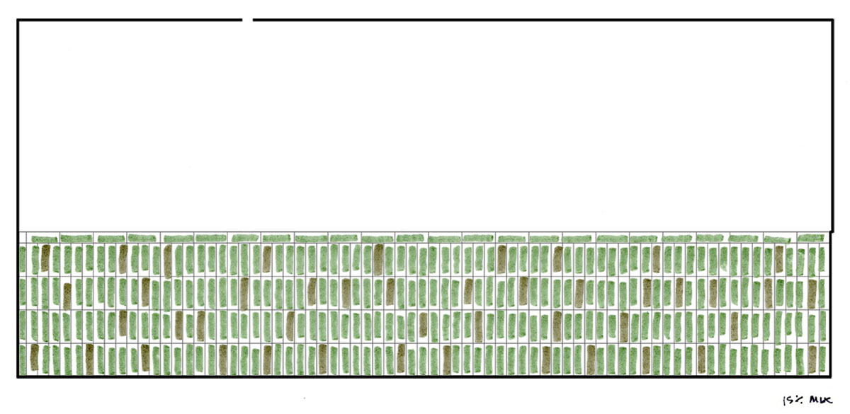
I am not a liar and here’s how I did it … I simply overlaid a piece of trace paper on top of the printed out elevation. Whomp!
There was one step that I did prior to this one, but it made more sense to move the images around. I actually made a few versions of these tile layout studies and during the photoshop assembly of getting them ready for today’s post, I cleaned up the perimeter’s edge (that’s the black line defining the outline of the elevation). You can see it more clearly in the next image …
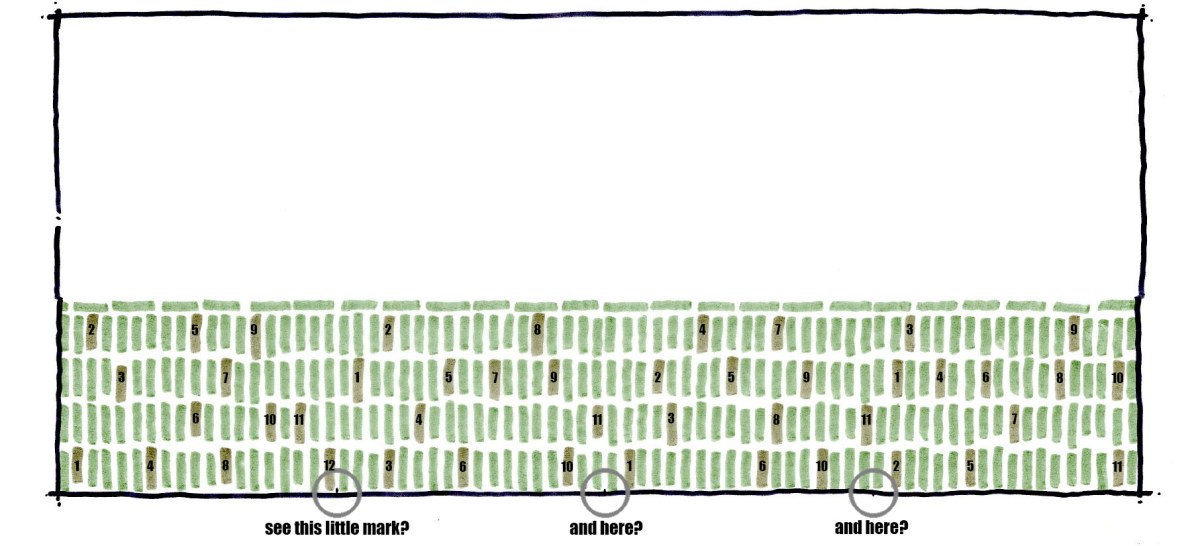
Okay – I tried to make things a bit more obvious in this image and if you look at the very bottom, you can see that there are three little tick marks. Instead of writing out all the step-by-step instructions, I’ll just blurt it out. I basically divided the entire wall of tile up into quarters with some more quick and easy math and I put a tick mark at the bottom so that I would know the boundary area. From there, I just needed to put 11 accent tiles into each quarter (44 tiles divided by 4 = 11). When I was drawing it up, I put the brownish accent tile mark down first and then came back afterward and just filled in the field tile.
And for your eagle-eyes out there who will do the math, you’ll notice that there are actually 12 tiles in the quadrant to the far left. For my own special amusement, I added 1 additional tile just because I can.
So how did all this take me? Maybe 90 seconds total. I probably did all four of my studies in a 5-minute window and I was happy with the results and settled on the 85/15 split.
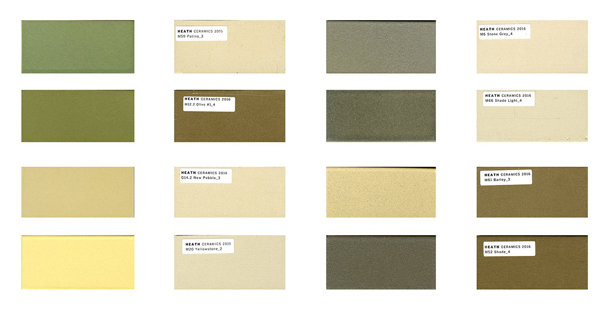
There is a lot more to this bathroom than just the single wall of tile that I showed above. This is a commercial project I’ve been working on and there are 2 pairs of Men’s and Women’s toilet rooms (4 total). We didn’t want to match the tile used in each space so we have selected 4 complete sets of tile to personalize each space.
Nice, right?
There are times when I am acutely aware that there is technology out there that could potentially make my job go a bit faster. I would also imagine that the scale of the tasks I am working on would be impacted by my decision to do this by hand or write a short algorithm that would allow my drafting software to make these sorts of decisions for me. If this was a professional football arena and I was working through the layout of 60 bathrooms and 145,612 tiles (instead of 292) I would be the first in line to take advantage of some technology. But it’s not, so I’m not, and therefore I didn’t … it’s that straightforward for me. I also tend to think that the end result is impacted when we put “technology” into the actual design process in an automated manner.
When challenged with: If I design the tool to create the pattern have I not also created and designed the pattern? No, I don’t think so. My counter for such arguments is If I build a piano, it does not make me a musician. I am aware that this is a simplified response to what is actually a much longer and (at least to architects) possibly more interesting conversation. This is a fairly mundane task and if I could take that algorithm and simply run it over and over again until I get a pattern I like, I could then have a seamless transition to my construction documents. In my hand-drawn version, I would have to hand this sketch to the installer … which I could actually do and it still wouldn’t take that much time, but it is a matter of scale. If the space I was working on was much larger than this, I would assuredly be wasting some time on a process that could be expedited. It could be relegated to the computer and I could then turn my attention to problems that the computer can’t solve for me.
But where’s the fun in that?
Cheers,

ps –
I mentioned at the start of this post that I was in Chicago celebrating the 50th birthday of a friend of mine. The picture above was taken by placing my phone on the ledge of a window at the Robie House by Frank Lloyd Wright. The four of us all graduated from architecture school together but have since scattered to all corners of the US (this was the first time we have all been all together in the same place since 1992).
