Now that the 2020 Holiday season is upon us, it is even more important that my bar be up and functioning. I thought today would be a good day to walk you through the renovation of my own bar, and of course, any good walk-through starts off with a sketch and an explanation of the challenges and goals.
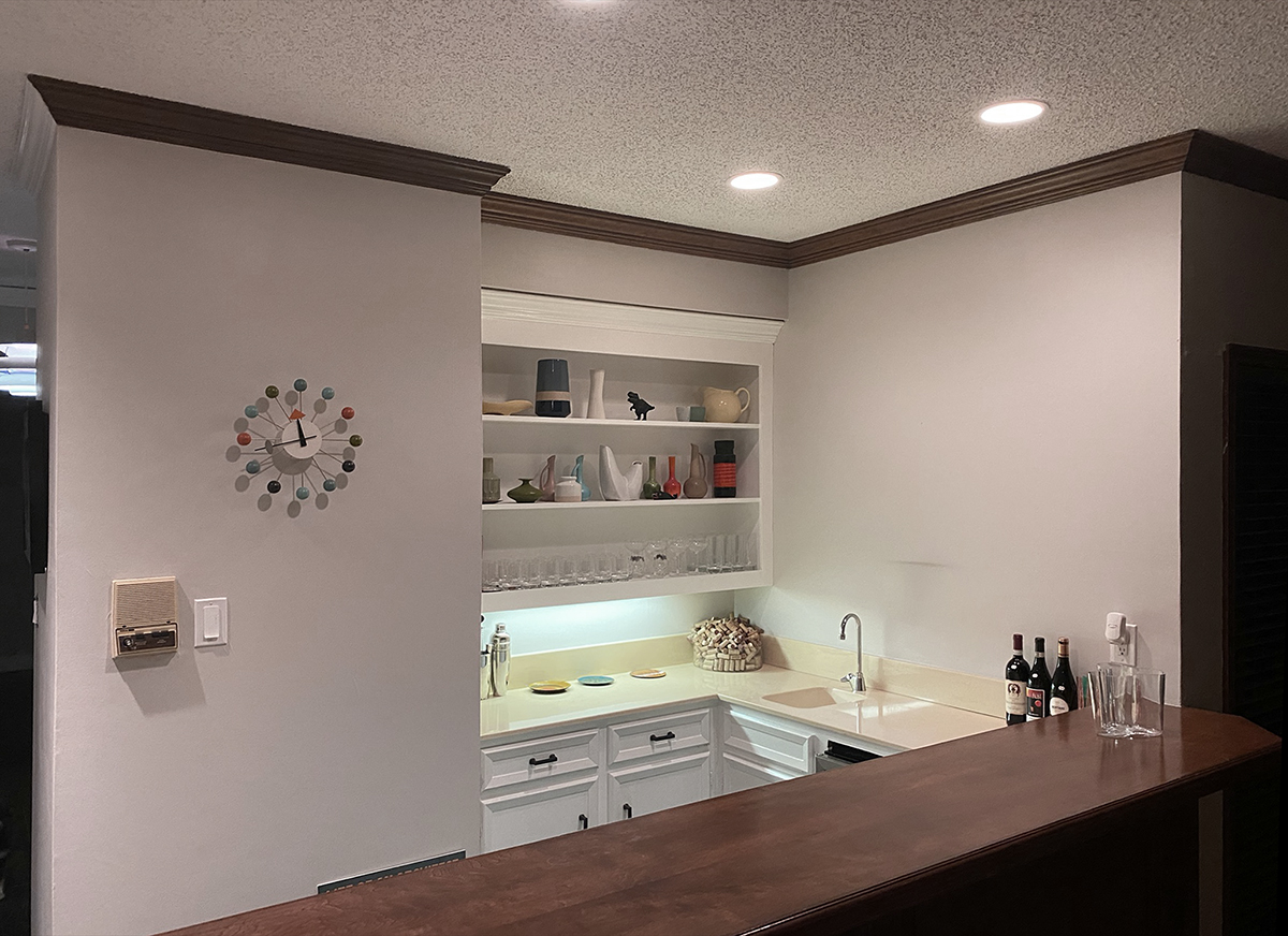
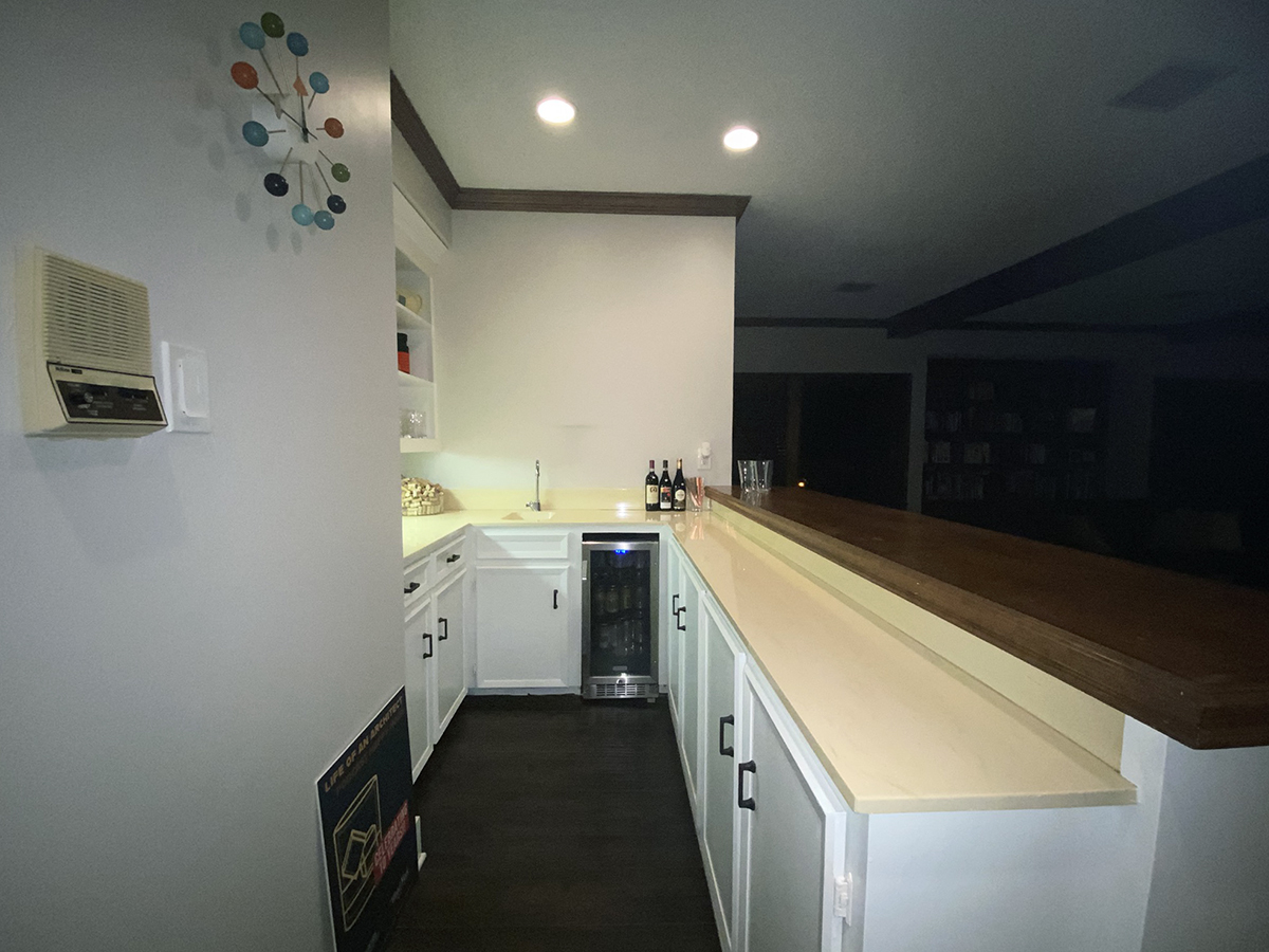
I suppose the first challenge is that it’s ugly in a 1970’s builder home “what’s on sale” kind of way. I know that this bar has been renovated at least once before because this version doesn’t really match the construction drawings I have for this house. Built-on-site paint grade cabinets, yellow solid-surface countertops, and stained tooth-rot brown elevated millwork countertop. Other than the fact it exists, there is little to like about this bar.
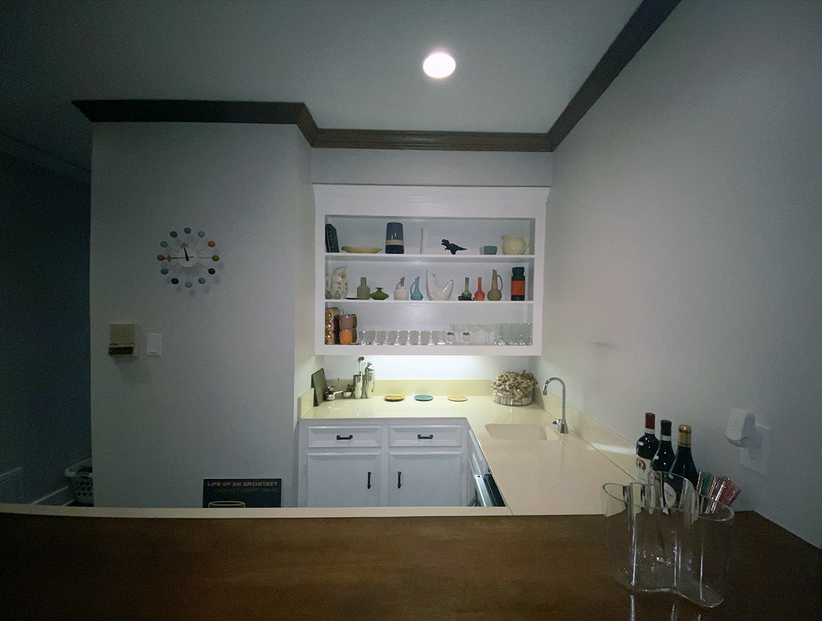
When we decided that this was a space worth some attention (and therefore part of our budget) there were certain things that we knew we would have to keep. We weren’t going to rebuild any walls and since there was a lot of built-in millwork in the house that is remaining, it wouldn’t make much sense to just replace the millwork in this area. That meant paint, trim. hardware, and most importantly, the configuration of the countertop … because it made zero sense.
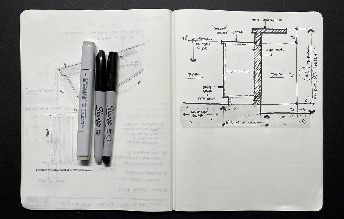
So here is an end elevation of the countertop – which is the only view that clearly demonstrates the issue with the counter. You can see that there is an elevated bar portion on the right-hand side (the countertop that was made out of stained wood). Normally this wouldn’t be a problem, and some people would even think that this is the right thing to do … but they would be wrong.
Why?
At a working countertop – like the one in your kitchen – those are typically set at 36″ tall. When you design in a bar height countertop, like the one shown here in wood, it should be set approximately 6″ taller – at 42″ above the floor. This is pretty standard stuff and if you were to go buy “bar height” chairs or stools, they would set the seat higher to accommodate the fact that the counter is higher. Seems to make sense so far …
The sketch above shows my actual condition. All the countertop heights are set correctly relative to one another but the floor in my Den steps down 6″ … which means the bar height countertop is 48″ above the floor. This means at best, you could never place a bar chair here, which means at worst, someone who was 5′-4″ tall could walk up and set their chin on the countertop without bending their knees.
That’s ridiculous.
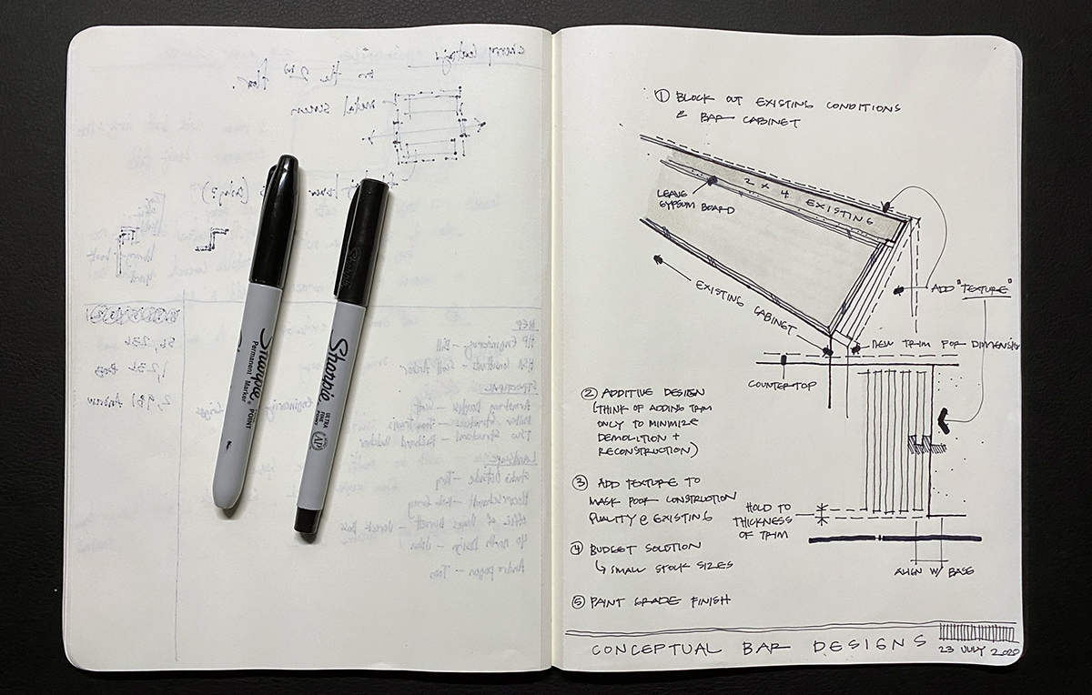
The second sketch I have here was pulled out of my sketchbook – it was one of my original concept designs for this bar. Until the bar was actually demolished, I didn’t have a good feel for how it was built. I had a pretty good guess but I’ve been surprised a few times on how the construction was executed on this house. I also wanted to keep the cost down so I know that it would be painted to match the rest of the millwork (no steel plate for me) and I knew that in order to keep the construction marching along, the design would have to be out of stock sizes that are readily available.
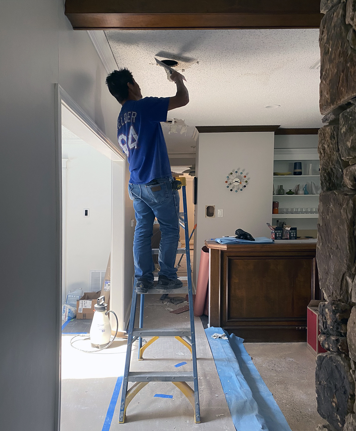
I don’t have many images of the front of the bar prior to the demo, but this one gives you a pretty good idea of the stained wood panel and trim that was in place. I find pretty much everything about this to be icky but what I really love (sarcasm) is this: if you look closely at the corner of the bar, below the wooden countertop, you will see that a painted face and a stained face come together at the corner. It also happens at the crown molding at the corner as well.
This sort of transition drives me absolutely bonkers.
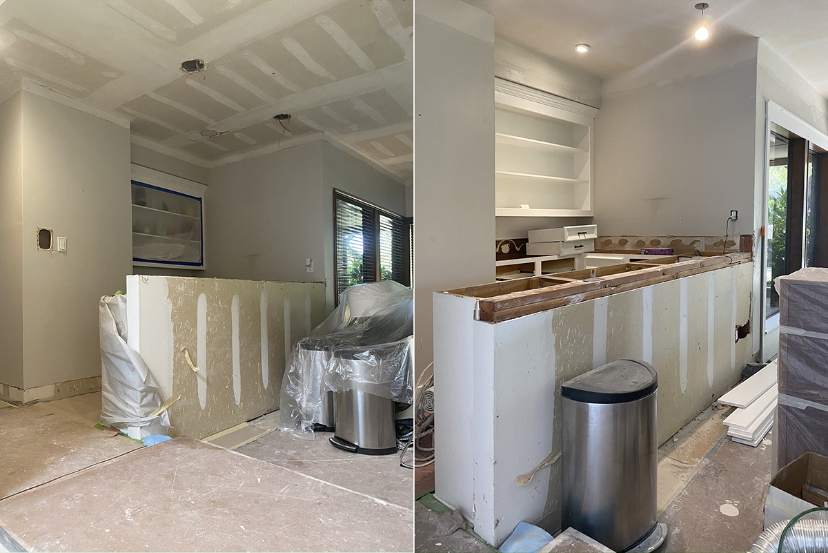
The image above – there’s actually two – shows the bar during demolition in the morning (on the left) with the elevated bar, and an afternoon shot (on the right) which now has the bar height dropped down.
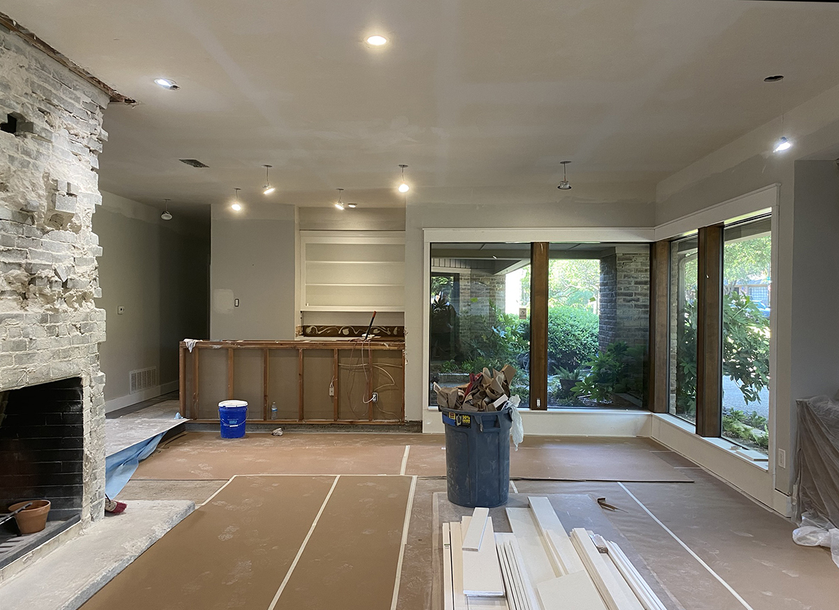
At this point, would you be surprised to learn that this was considered “clean” in my mind. I included this photo here for two reasons:
- I wanted to present the bar within the larger context of the space in which it serves, and
- Just before I took this picture was the moment that I realized that the area where the gypsum board had been removed would need a 1/2″ veneer wood panel added back in so that the trim I was planning on adding would sit on top of the baseboard that would run along the bottom.
I can’t imagine that’s clear so let me show you an image I made to help communicate the design to the guys building it on-site …
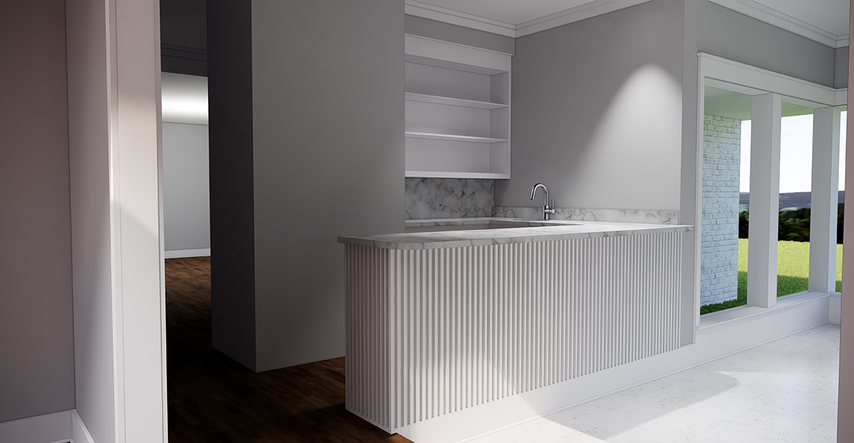
Of all the drawings and sketches I prepared, this image was the most effective way I communicated what I wanted. It’s also the image I showed my wife when I asked for her opinion on what I was proposing to do to the bar. I know she’s happy now but I’m not entirely convinced she was on board with this at the time.
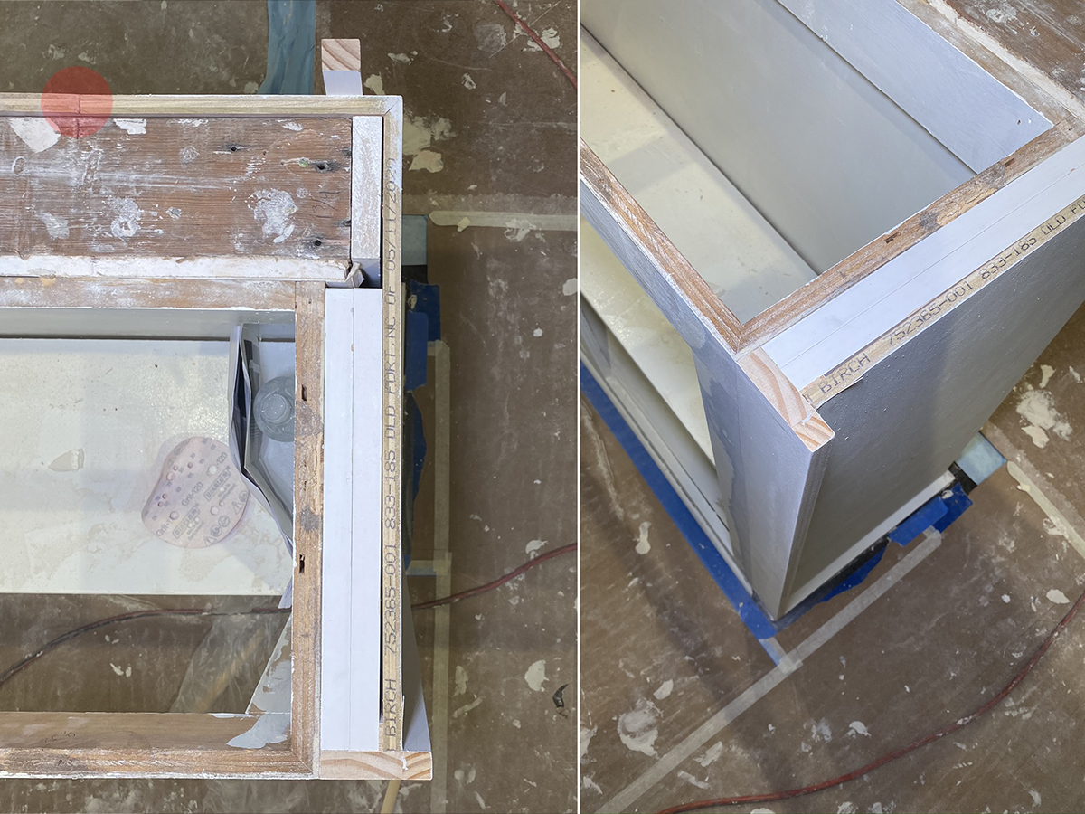
It’s the little things that seem to either get lost or are underappreciated in these sorts of projects. You can see how I had them build out the new cabinetry around the existing wall and cabinetry because I was trying to hit a very specific dimension. (For the record, they still missed it in one area but I’ll show you that in a minute) The dimension I wanted to hit was predicated on using 3/4″ stock trim with a 3/4″ gap and since I wanted the trim to start and stop at very specific points, you can see why this would be important.
If you look at the red dot in the image above, this was a panel joint and since the existing wall was not square, you can easily see how the panel has a “fold” in it … unacceptable if left alone but an easy fix is readily available.
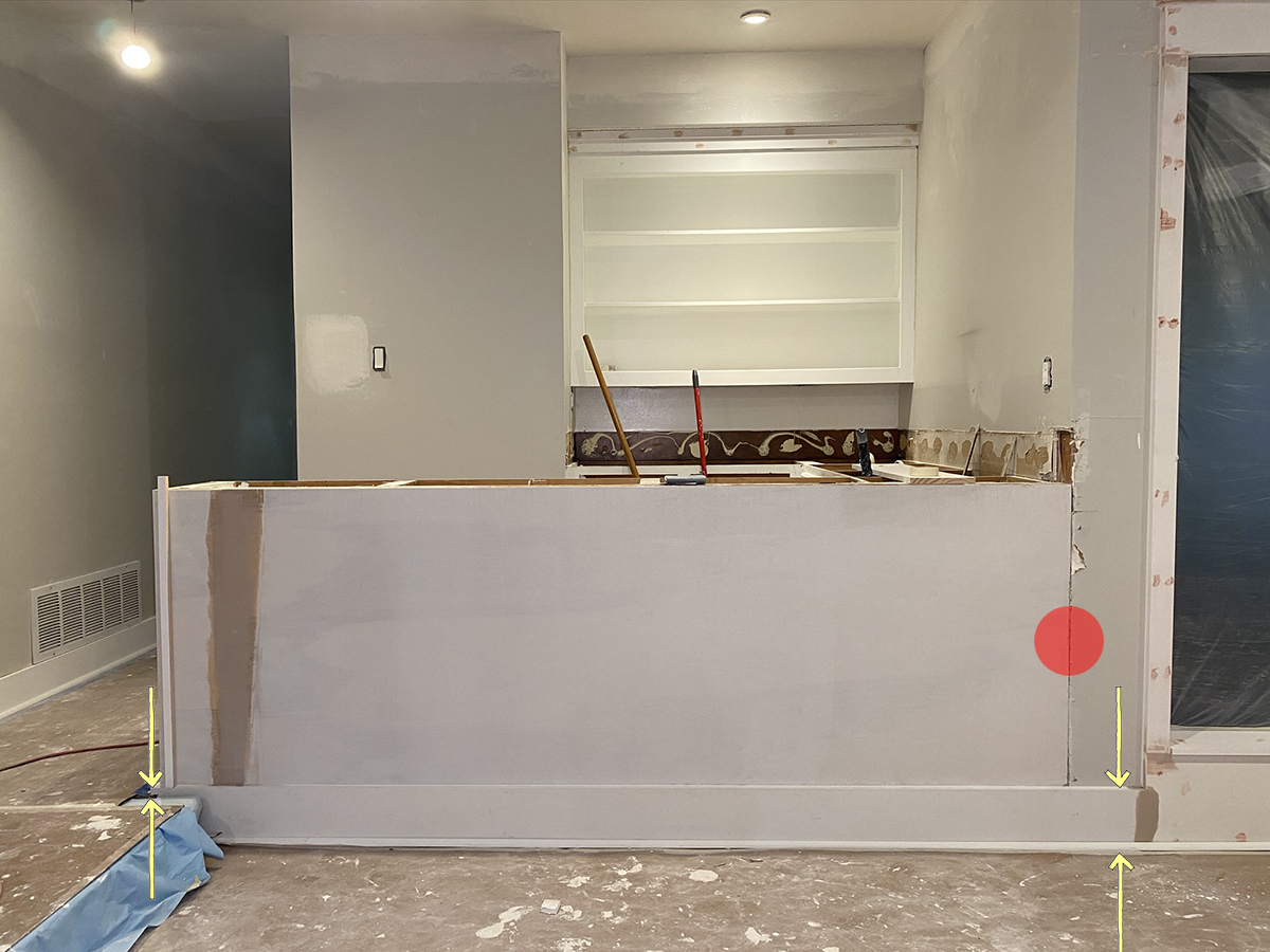
See all that wood putty (it’s on the left in a mauve color) above where the panel seam would have been? I had them float that area out and sand it smooth so you would not be able to see the fold. On the right-hand side, I added a red dot to show how I needed to have the wood panel sit flush to the gypsum board so that the base would run across the bottom without interruption and my 3/4″ x 3/4″ dowel trim pieces would sit on top of the base. The arrows are in place to show you that the height of the base in this area was set by the height of the wood floor on the left. I wanted a 3/4″ plinth for my dowels to terminate … which also meant that I would not need (or want) 3/4″ shoe mold that exists everywhere else in the house.
The shoe mold is the clue for what was wrong with how the existing wall and cabinetry was built out incorrectly.
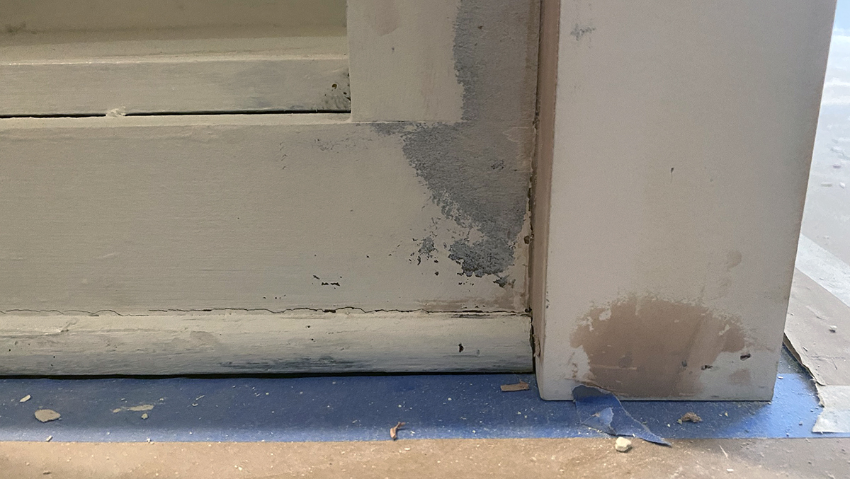
This is on the inside face of the cabinet and you are looking at the toe kick under the cabinet. For all you eagle-eyes out there, the trim piece on the right was originally flush with the cabinet base – which wouldn’t work because I needed an interior corner so that I could terminate the shoe mold.
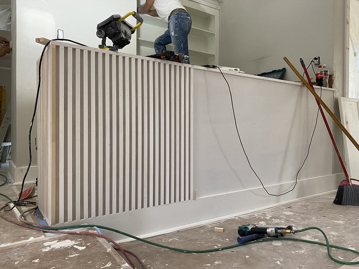
Here is a look at the dowels getting installed – it’s actually quite an easy installation once you’ve got everything set up and level. In my early sketches, the word that stuck out to me was “texture” as I was trying to have the front of the bar be something other than a slab of some material.
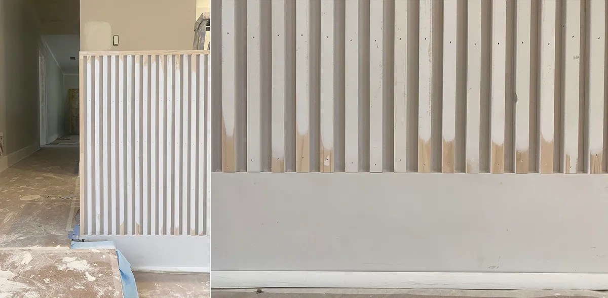
Once all the dowels are set, you have to run a sander over them at the top and bottom so that they will be nice and smooth when they are finally painted.
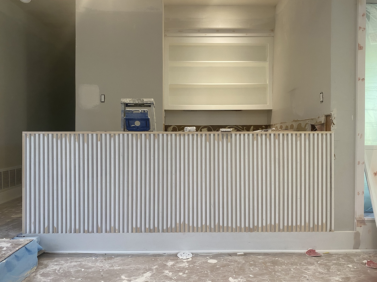
This image will give you a better idea of the whole. I caught the guys on their lunch break so they still had some sanding left to do, but all told, this entire design was started and completed in just a few hours
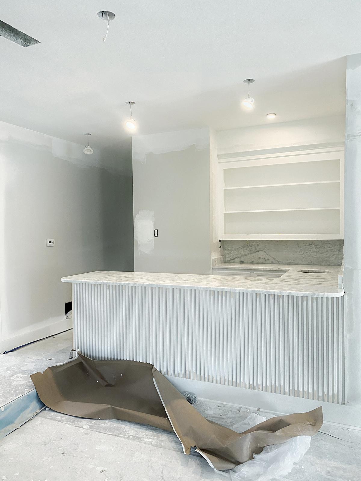
Fast forward a few weeks and we had the countertops installed. There’s a whole thing about the painting going on at this point which involved the removal of one crew and having a second crew brought in. Normally I would have avoided installing the countertops when there was paint spraying still to be done but at this point, it simply couldn’t be helped.
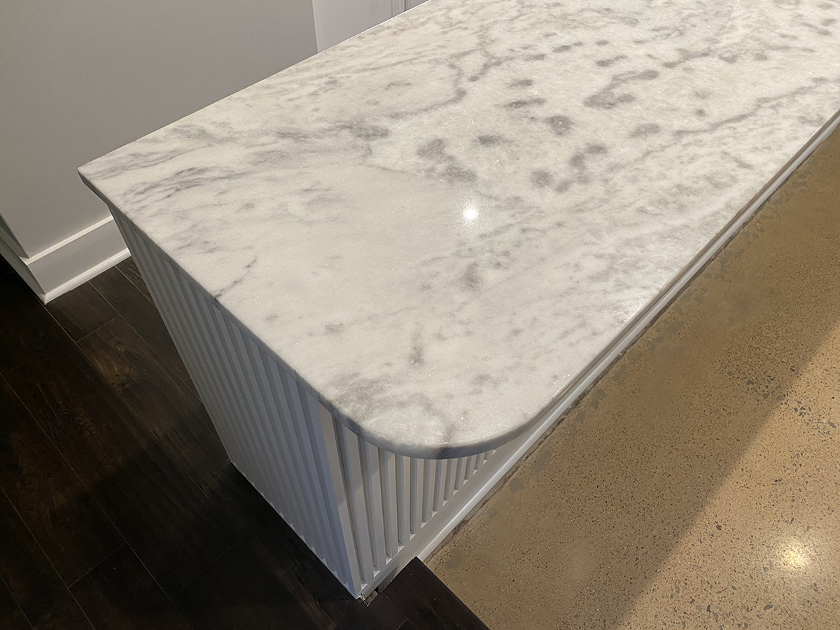
We installed a 3cm dolomite stone called “Shadow Storm” which is probably one of the more befuddling stones out there. Dolomite is slightly harder than marble but markedly less than granite or quartzite. Generally speaking, I don’t really like most granites and there are even fewer white ones out there that I like (bad to worse). Since we were going mostly white, the stone had to have some movement to it (rather than a flecked stone that looks like it’s been peppered) so my wife and I had a sit-down conversation about the maintenance of that sort of stone would require and were we okay with that. In the end, we obviously decided that we were but I would imagine that we should circle back around on that decision in a few years.
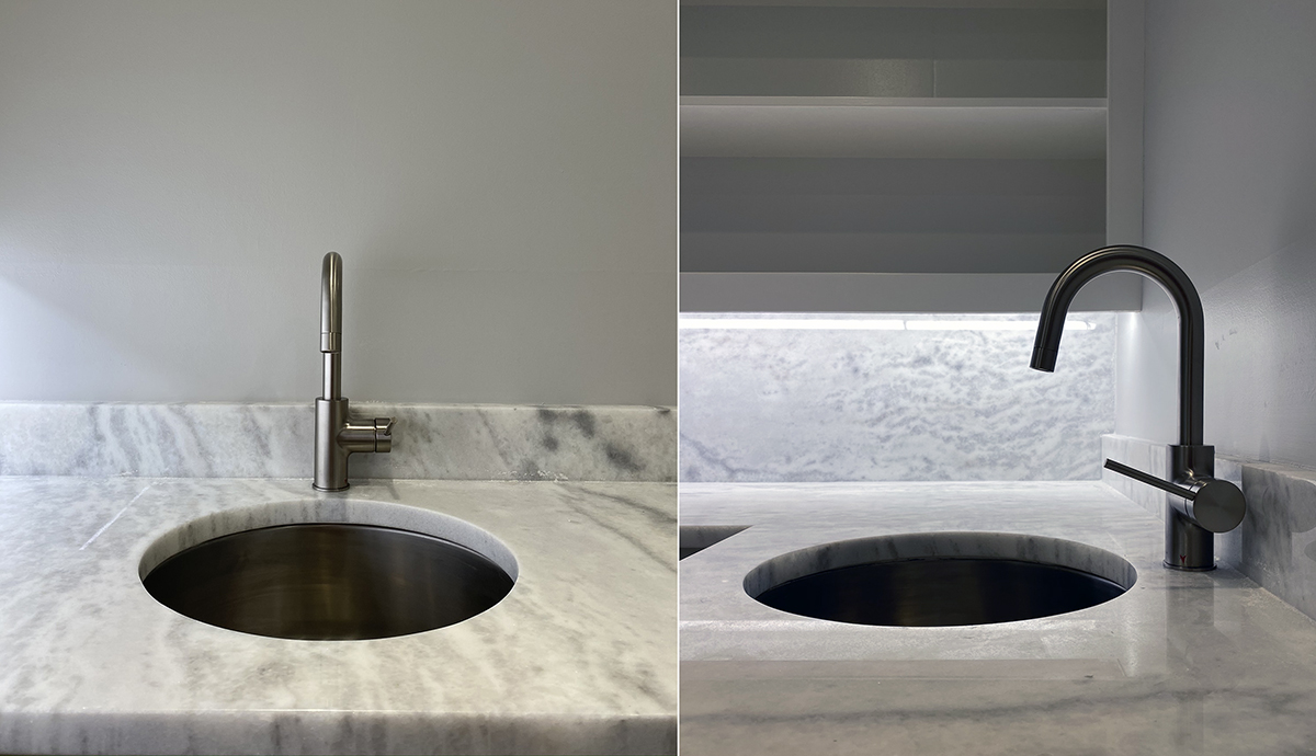
The other moving part of bar area was the selection of the sink and the faucet. I like round sinks when they are used in bars, and I am particularly fond of them when they are larger than ordinary bar sinks. Before you ask, I used a 16″ Krause Oletto Kitchen Faucet and a 17.125″ Miseno Circular Undermount stainless steel bar sink for a grand total of $280.
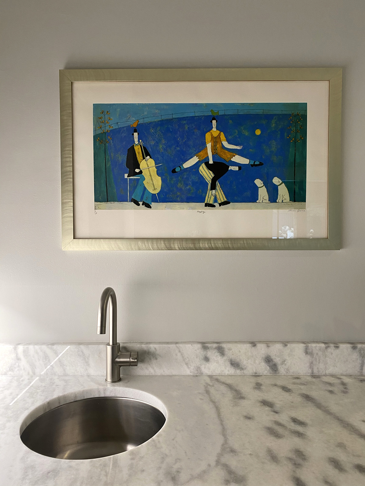
I have received a bit of the “unimaginative white” blowback for the palette I’ve put together – and while I think those people can pound sand (as if I asked) I will use the art on the walls and the decor in my house to provide the color and variety. I don’t want to redo all this again in a few years and the neutral palette I’ve put together will allow me to change things like furniture (which wears out) and art instead of replacing items with more permanence. If I had a client who came to me and the budget was one of, if not THE most important consideration, and I suggested something more bold and extravagant, I would think that I was not a very good custodian of their budget.
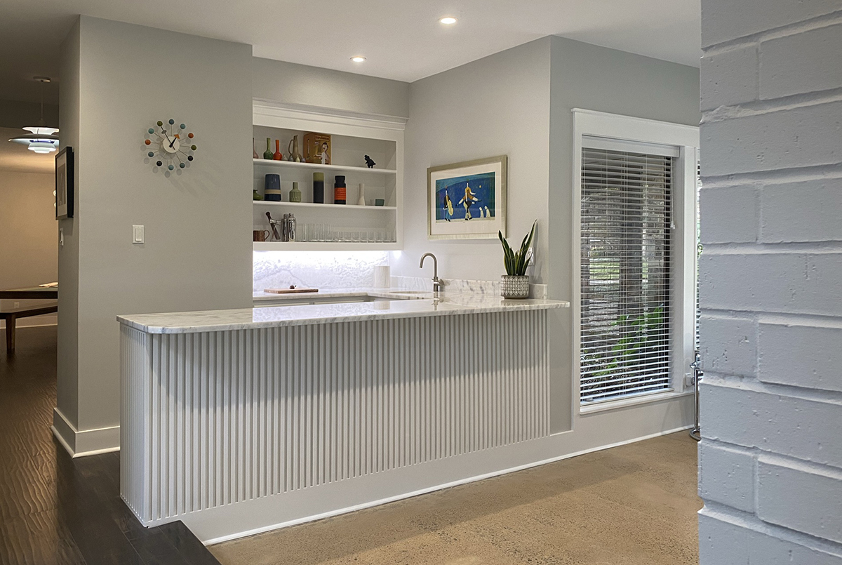
So here is everything put together – minus any “styling” since half of my house is still being stored in boxes. I’d like to think that the finished product looks exactly like the SketchUp model I made of this area just a few months back and despite the challenges it took to get here, it was worth the time and definitely worth the money.
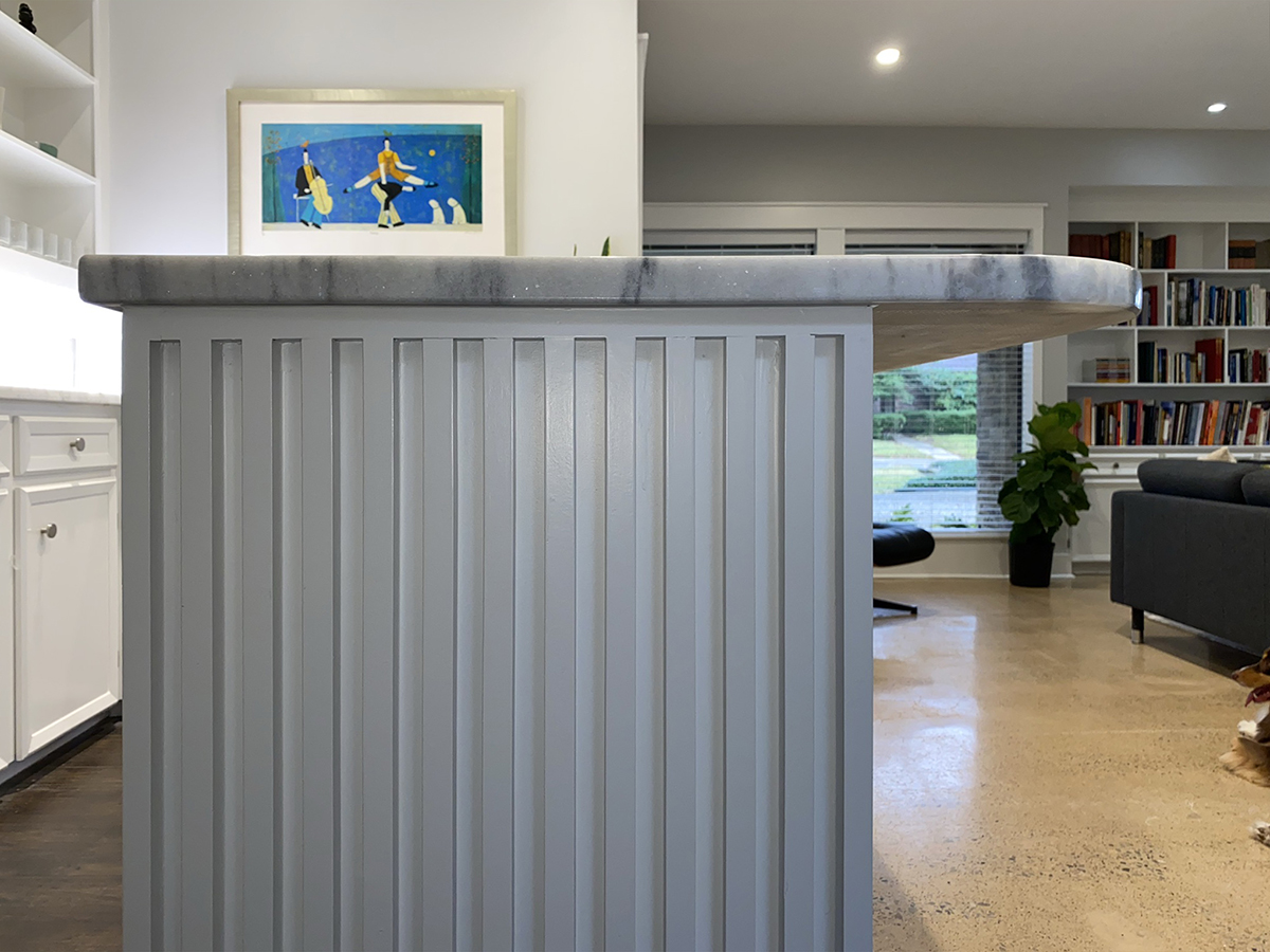
Here’s a look at the end elevation – just to drive the point home how important it was to get the math right on the total depth of the cabinetry so that the spacing on the 3/4″ dowels would be correct. It’s not hard math but it is the sort of thing one should consider when trying to design on a budget – these little things matter because they ARE the design.
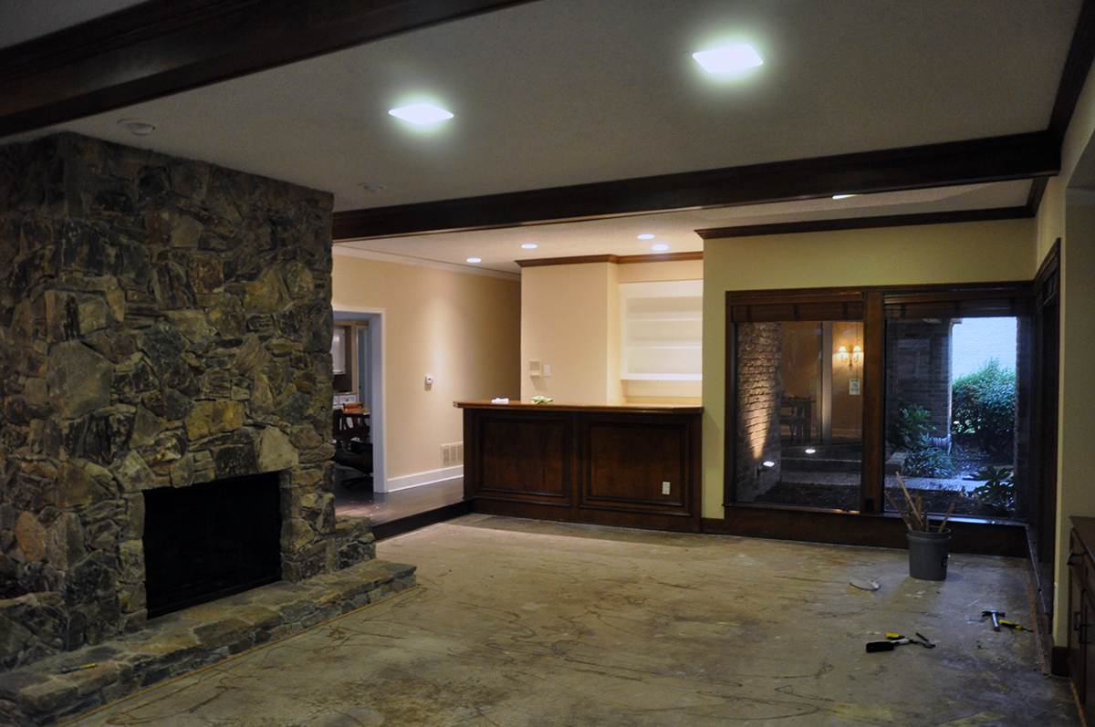
Can you believe this is the same space? Despite the windows and the typically magical light we receive in this room, it was dark and really, really icky. Despite not moving any walls or changing out any windows, this space has been transformed rather remarkably considering the budget.
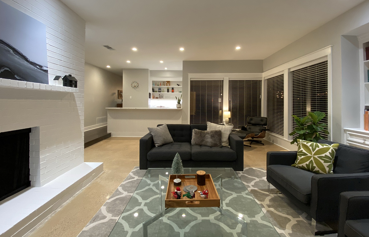
This entire process could be described as “Addition by Subtraction”, which is a phrase I probably overuse. The construction quality is not top-notch but it suits what I paid and despite the lack of bold moves, this is a space that I would gladly spend my evenings and weekend mornings … and if I’m lucky, a place where I can enjoy my newly renovated bar with good friends.
Cheers,


