Just for the record, writing a post on AutoCAD layers, pen weights, line types, and pen colors, is almost the last thing on my list of things I want to be doing. First and foremost, I do not consider myself a particularly gifted technology-focused person – compared to some of the people I know, I am barely mediocre when I am at my best. That, coupled with my beliefs on perception is reality and that you dress for the role you want, I don’t want my primary responsibility to be the “CAD Guy.”
I care about this stuff, but it is simply a means to an end. I want my drawings to read clearly and with precision. The fact that it looks like I care about the way they drawings looks should only reinforce to the contractor that they had better take my drawings as seriously as I do.
To that end, and because I can’t take receiving another email on the subject, I am writing today’s post on layer names, pen weights, and layer organization, with prejudice.

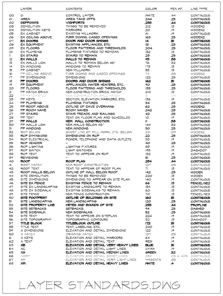
The image above is the Holy Grail to my drawings – at least it was when I was still drawing in AutoCAD. Now that my office is 100% Revit, the only time I use this setup when is when I have to draft my playhouse construction drawings.
I have 69 layers total and I haven’t needed to add a layer in over a decade – everything that I have needed to draw is represented on this list. I should start off by telling you that all of my drawings are broken down into 3 groups:
- Plans
- Titleblock Information
- Everything Else
If you look through the layers here, every layer that is represented exists only because I need to control when and where it shows up. This means I can assign pen weights and line types to a specific layer and never touch it again. Very rarely (as in 99.9% of the time) I might come up with some reason why I want to modify the standard of a layer but I generally try to avoid it.
skip this next paragraph unless you are a glutton for technical punishment
Since the layers are primarily broken down by plans and then everything else, every layer (and the content on that layer) has a consistent hierarchy to how important it is – which means I can set the pen weight of a single layer and it will consistently look appropriate. For example – the layer ‘FP Equipment’ will always have appliances, water heaters, AC units, etc. on it. I typically want these to pop out a bit from their surroundings – which in most cases would be the cabinetry. The line weight for the equipment is .25 mils versus .13 mils for the cabinetry. [Pen weights in AutoCAD are measured in “mils,” which are thousandths of an inch] On the other end of the spectrum, all details, wall and building sections, interior and exterior elevations, are all drawn purely by line weight and as a result, are not on a layer that is specific to the content.
Confused? Let’s try this – when I draw a window in plan view, I put it on the “FP Windows” layer. When I am drawing that same window in elevation, I draw it on several of the “x” layers.
What’s an “x” layer”? I’ll get to that in just a minute. For now, here is a breakdown of my layer list:

The numbers don’t really serve a purpose anymore. In the old days, the firm I worked for had multiple offices … some were on AutoCAD and some were on Microstation. At the time, Microstation didn’t allow you to a) name your layers, you had to use numbers, and b) you were limited to 63 total layers. In order for the offices to trade drawings between them, our office had to follow this naming convention.

This is actually the name of all the layers. If you are wondering why they have the names that they do, I’ll get to that in a minute. I do find it somewhat remarkable that in the last 15 years I haven’t needed to add any more layers.

A description of what goes on the layer – pretty obvious and straight-forward.

This number represents the color assigned to the layer. That’s right, if I have 69 layers, I use 69 colors. You might be asking yourself ”
“Why not just use 6, or 7, or 10? Whatever?”
Because – and people who draw this way, feel free to back me up in the comment section – I can tell if something is on the right layer just by seeing if it’s drawn in the right color, and if it’s drawn in the right color, I know that the pen weight will also be correct. It doesn’t take too long until people become familiar with this methodology and the quality control process moves along a lot quicker when you know that things are where they’re supposed to be.

This is the assigned pen weight for each layer … the Holy Grail of my drawings. Developed and tweaked over an incredibly long time (and many different offices) this is the most important column of information on this entire list. There are 9 different pen weights on this list, probably could be 8 (I don’t need both .44 and a .40) but in my mind, the most important are:
- .05 mils
- .19 mils
- .32 mils
- .51 mils
which are the pen weights I use for my details and elevation drawings. They are also associated with the most nuanced layers on this list, and their usage is subject to the greatest range of artistic interpretation (i.e. the easiest to get wrong … otherwise known as “not the way I would have done it”).

The line type assigned to each layer. The only time these ever change is when using the “x” layers and you are drawing by line weight and not content.

Layer names … a source of on-going controversy just about every place I have ever been. Because I like using shortcut keys when I draft, rather than clicking buttons on the menu bars, I wanted a way where I could control an entire group of layers at one time.
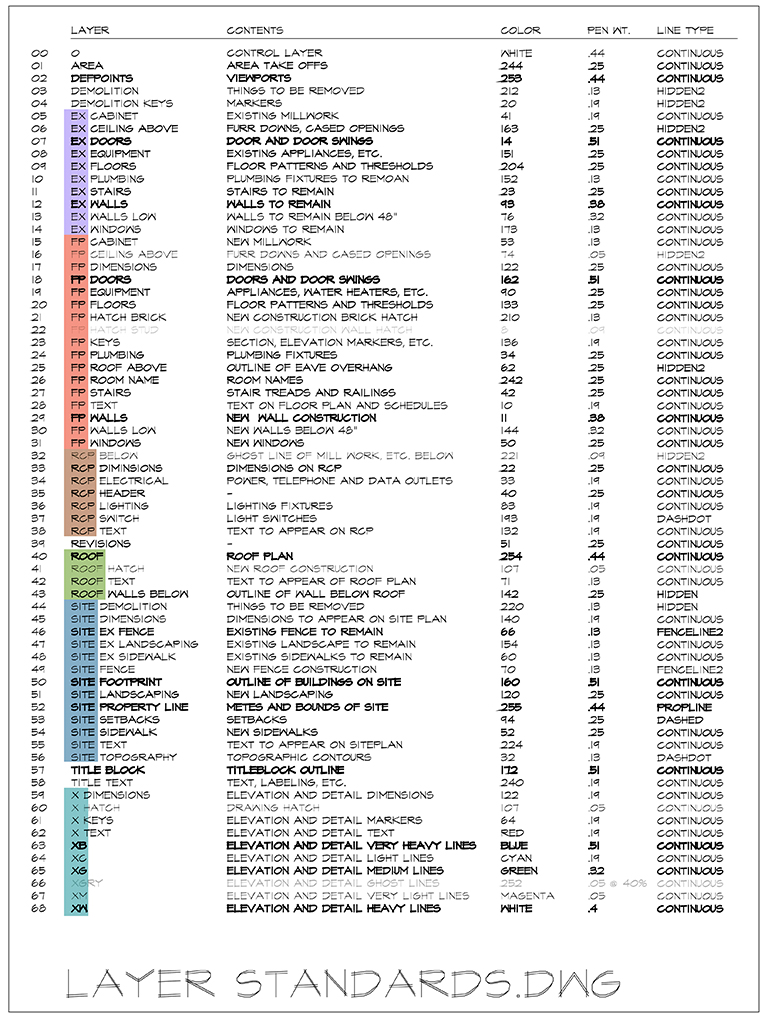
This just meant that I needed to come up with a prefix to assign to each group of layers. I have color-coded my groupings in the image above to show that there are 6 typical groupings that I use. They are:
- EX – for layers where Existing content will go
- FP – pretty straight forward, it’s for Floor Plan
- RCP – for layers that are specific to the content indicated on the Reflected Ceiling Plan
- Roof – because someone else will point it out, the roof layers are the ones that I tweak the most often. My roof perimeter pen weight is always set by layer (.44mils) but when I draw the ridges and valleys on that roof, I will change the pen weight.
- Site – all the information pertaining to the piece of dirt
- X – purely layers for drawing by pen weight (elevations and details)
With these prefixes, all I need to do to either look at all the floor plan layers is to type:
-la [enter] on [enter] *fp*
Maybe I want to turn all the site layers off?
-la [enter] off [enter] *site*
Pretty straight-forward, quick, and easy.
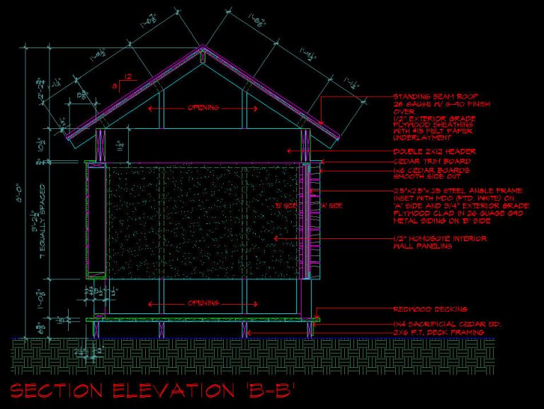
To help you visualize what a drawing created only using pen weight would look like, I thought I would show an elevation that I drew for one of my playhouses. My apologies that the image isn’t higher resolution, but it’s basically a screen grab, so the deck is stacked against me on this. A quick visual review of the pen colors used on this section/elevation will reveal that all of the ‘X’ layers except “X Keys” and “XW” have been used. I can look at this image and accurately visualize exactly how the drawing will appear once it’s printed out.
I should also point out that I NEVER, EVER, EVER draw lines on top of other lines. When I need to change pen weights to convey my drawing message, I change to the appropriate layer.
[if you are new to this series, please check out ‘Architectural Graphics 101 – Line Weights‘ for more information]
Hopefully, this Architectural Graphics 101 entry on Layers will address all of your burning questions. As I mentioned at the top of the post, writing this post was something like taking the architectural registration exam – you won’t like it but if you want to be taken seriously, you have no choice but to suck it up and get on with it. I am happy to take one for the team and share my layer standards, but now you owe me.
Cheers,

This is the 4th entry in Architectural Graphics 101. Previous entries include:

