If there is one thing that I love most about the design process, is that there is always something new to learn. This is generally true about the entire profession of architecture – things are always changing – what you would once dismiss as unnecessary will sometimes evolve into something that is necessary. The use of renderings for residential design has become one of these things … they have become so ingrained into the process that I can’t imagine not using them now.
For those of you keeping score, that’s both a good thing AND a bad thing … but let’s start with the good since I am a positive person most of the time.
Since starting the residential studio here at BOKA Powell, things have been clipping along at a nice level – enough to justify its existence, but not so fast that we are finding ourselves struggling to introduce a new workflow into the office. In simplest terms, residential work is a lot more hands-on than our commercial work, mostly because our commercial clients have done this before and understand the process whereas residential clients are typically going through this process for the first time. As a result, we communicate with these two groups using the same tools but just a bit more discussion goes into the residential projects.
I have used SketchUp on my residential projects for ±16 out of the last 20 years and have always thought that it facilitated good conversations and understanding with our clients (not all of whom have terrific 3-dimensional visualization skills). As a result, the images shown above are fairly typical of what we might be using during those conversations. While I have known about the use of Enscape – mostly I used it at my last office as a Revit plug-in to generate photorealistic renderings with fairly little additional effort (a key consideration in an effort to keep costs down) – it wasn’t something that was built into our process.
We have resources at BOKA Powell that I didn’t have before – access to more specifically developed skill sets, and among those skillsets is access to someone who is highly adept at using Enscape, and just like that snap we can produce 3-dimensional images with speed and clarity. The value that they bring? The conversations with our clients are much easier and the response and engagement of those conversations are incredibly productive. I’d like to think our 2D graphics are nicely assembled and legible, but let’s be honest … they can’t really compete with the next images.
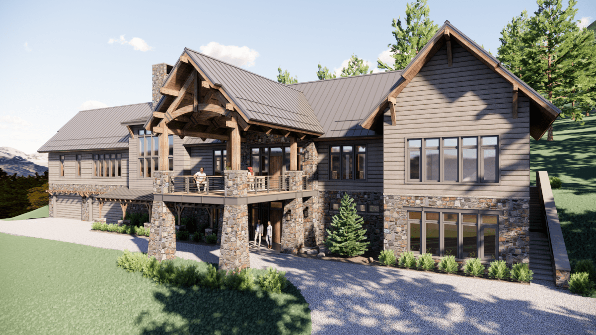
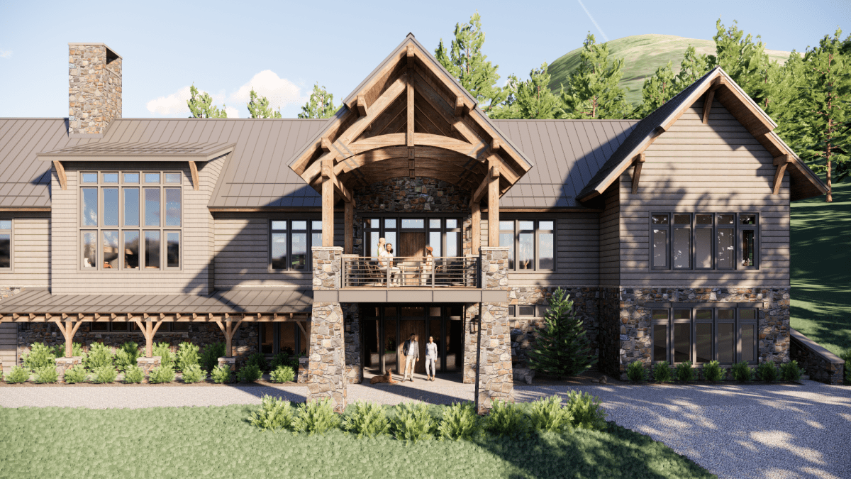
Not too shabby, right? This is a combination of SketchUp and Enscape and with very few steps taken as we migrate from one platform to the other.
I am compelled to point out before all you render-savants chime in and send me emails about how much better these could be, that speed and clarity are key to this process, with emphasis on the speed (I feel like we already have the clarity). When we prepare actual proper renderings – whether we do it internally or send it out to a company dedicated to producing renderings – a single image could take anywhere from 4 hours on the short end, or 2+ weeks on the high end … residential clients are not going to be paying for that sort of dedicated creation.
This might shock you … our residential clients don’t pay extra for this at all – we do this as part of our design process as it benefits us and our ability to communicate our ideas more effectively, and who doesn’t want that?
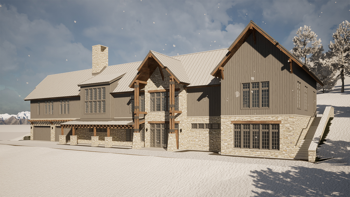
As an example of how we use this process to evolve our designs, this was a rendering that was prepared earlier on in our design process. When comparing this early image to the more current version above it, we were able to easily convey to the client the opportunity that was presenting itself at the front entry. Subsequently, a port cochere was created and an outdoor terrace added above it. All we had to do was create the images and they basically explained their value to the client all by themselves.
The main consideration here is that scale, proportion, materiality – all of it, is conveyed in a manner that does not require everyone to have 3D visualization skills. One of the items that I will admittedly confess to not originally thinking about, is just how effective this can be when focusing on the interior spaces.
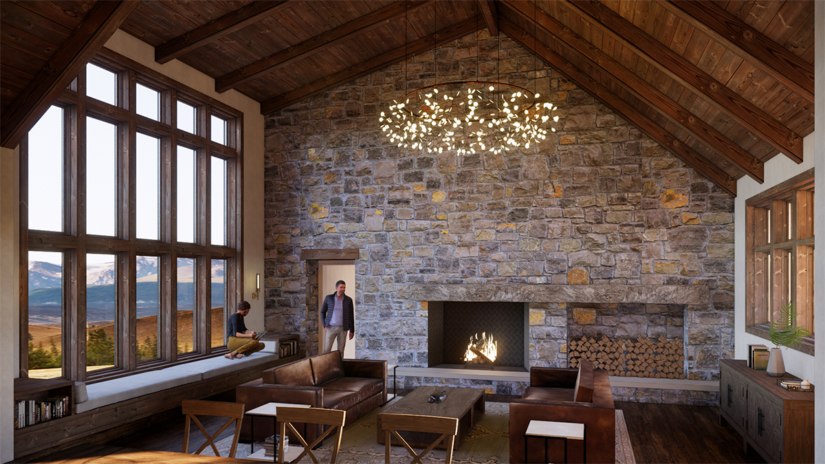
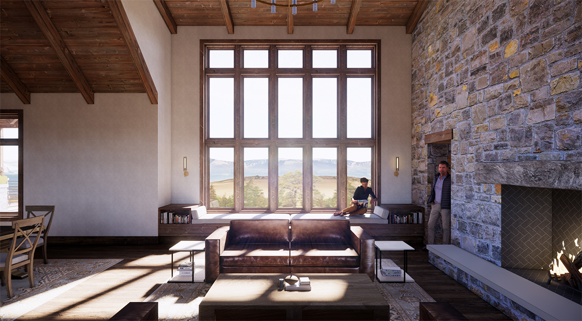
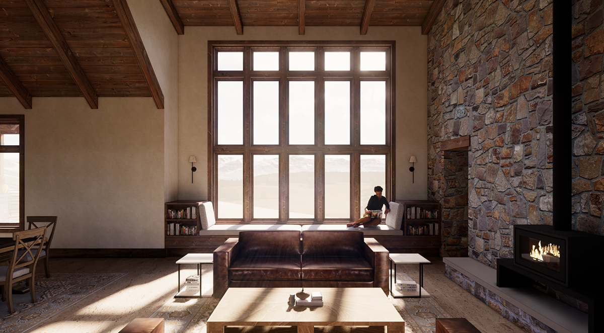
Here is an example of the main living space – pretty effective at conveying a sense of space, isn’t it? It helps that when I, or a member of my team, lays out a floor plan that we spend the time to draw in the placement of the furniture. I wrote an article almost 6 years ago titled “Hatchet Bedrooms” and in it, I wrote:
“I think it’s really, REALLY important that furniture is drawn into the plan when designing the rooms. Thinking about how the room will work is paramount to its success as a space and without considering the furniture arrangement, you haven’t really addressed all the possible concerns that might exist.”
Since we have planned on how the rooms would function and how the furniture would be laid out, it is a fairly simple matter of placing modeled furniture components into these images. I say it’s simple, but I’m not the one doing the work … I watch it happen and we are able to use pre-existing pieces that are already modeled to help fill our rooms with furniture and lifestyle items.
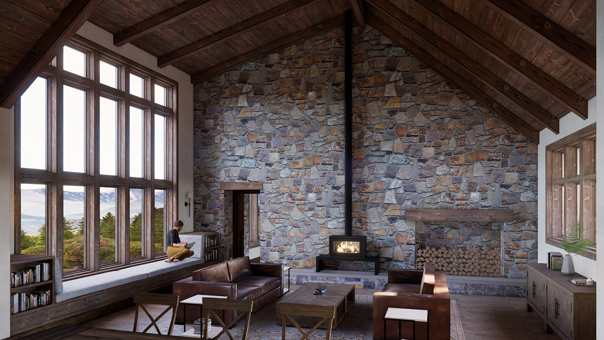
We are also able to switch between our design options with speed – one version with a fireplace, one version with a wood-burning stove. (for the record, they went with the fireplace)
We are also able to move through the model and select specific views that can help us with our conversations. Since these are not static images (like you would receive from a visualization company) our ability to use the tools that are already in place to help facilitate intelligent conversations.
The view out the window is pretty good, isn’t it? That’s a nice touch.
Of course, there are nuances that are incorrect in these images, but few people focus on them. For example, there aren’t any joints in stone slabs that make up the hearth. Could we have put them in? Of course, we could, but we don’t need to spend that additional time because those joints are not the focus of our conversation.
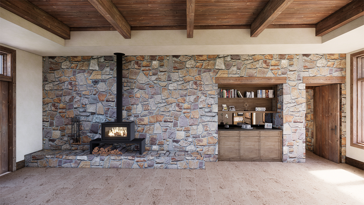
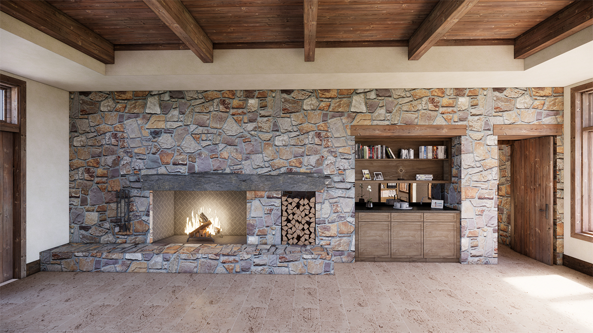
I went digging back through our previous meeting presentations and found a few that focused in on one of the bedrooms. Again, we were discussing the use of a fireplace versus a wood-burning stove. The other consideration was the built-in cabinetry that’s just off to the right. This was an unprogrammed feature for this room but we felt that it was an important addition to the space.
I started this post off by saying there were some good things, and some bad things when using 3D renderings to facilitate client meetings and design conversations. So far I have focused on the good – and there are plenty of them – but let me briefly touch on one of the bad … and it can be very bad. If you are an architect and you also work on residential projects, you could probably guess what I am about to say …
When you use photo-realistic images, sometimes the conversation can focus on the materials used in the rendering that are not intended to be the finished product. For example, the stone texture we used to map onto the walls in these images is the right size and shape, but the color is off … and the client not surprisingly focused on this material and we had to explain that this was not the stone that we would be using. The same holds true for things like cabinet panel profiles, cabinet pulls, door hardware, etc. We do not have the time to model these sorts of items and maintain a) the production timeline, or b) our fee. We could model them but we can’t absorb that sort of time within the framework of our billing without charging for it … which kind of defeats the point in using these images the first place.
I hope this post was interesting to you – I find the evolution of technology into the design process to be something that is always intriguing. Just like incorporating 3D printing into our process, the use of rendering software is a powerful tool in the design process.
Cheers,

PS – I don’t normally provide “shout-outs” in these posts since the work I present is almost always the result of the efforts of several members of my team. However, the images today come to you courtesy of Luis Spinola – he does amazing work and he is the person responsible for making the use of 3D images a viable possibility in our workflow.


