Pantries are one of those spaces that exist within every house that either get a lot of attention or no attention at all. If you were to stop and think about the pantry in your own home, I bet you would know which category it falls into (my own falls into the “no attention at all” silo). I would also climb out on a limb and say that the reason your pantry falls into one or the other category doesn’t really have anything to do with either the square footage or the value of your home … it’s because pantry spaces have for years been relegated to leftover space adjacent to the kitchen with barely more thought than is it just a closet with shelves, or [gasp] a walk-in closet with shelves!!
This doesn’t have to be the case anymore and in the last few homes I have designed, we have endeavored to make the pantry a space that not only functioned well but was actually a nice space to work. Originally, the idea grew out of preparing a space that would address the issues associated with the modern open – and extremely public – kitchen. As more and more modern kitchens are designed to be open to the rest of the house, there were inherent challenges that came along for the ride. Pretty much every kitchen designer worth their salt wants to avoid lining up appliances on the countertop, and I am not particularly a fan of rolling tambour doors and “appliance garage” cabinets. As a result, more and more of the kitchen spaces I have been designing include a version of a secondary mini-kitchen of sorts. This was not added square footage, but rather we would carve square footage from the main kitchen to create this secondary space.
Let’s start with an easy example – this was from one of my projects from a few years ago:
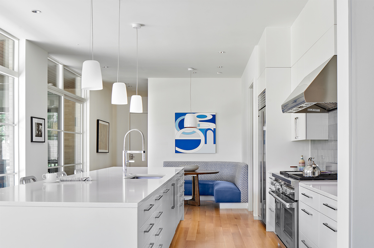
This is a very public kitchen and let’s be honest – nobody really wants to see clutter all over the countertops in this sort of space. Since this is quite literally the public face to the kitchen area, it makes sense to find a place to relocate all the things that we tend to use on a daily basis and locate it just adjacent to the kitchen. In the photo above, there is a door just in between the kitchen proper and the dine-in breakfast area with the banquette (which are also very popular additions). Through this door is where you find the “Butler’s Pantry” … even though it isn’t technically a Butler’s Pantry, nor do these clients have a butler who needs a pantry.
For those that might not know, a “Butler’s Pantry” is traditionally a multi-purpose space typically located as a pass-through space between the kitchen and the dining room.
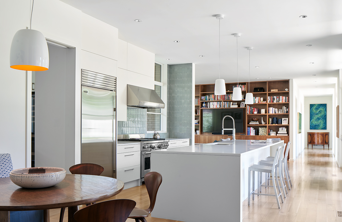
Here is another view of the same kitchen – and you can see just how open this space is to the rest of the house – with the door into the pantry being conveniently located just to the left. I’m pretty sure I’ve said it somewhere else on this site but I absolutely love this particular kitchen. First off, the light in this space is incredible – it only receives morning sun as the space is oriented along the North-South cardinal points, and the late afternoon West sun is shielded by a substantial overhang (technically the second floor) and approximately 5′ off the building line is the property line and the fence. That is a 16′ long island – which isn’t only fantastic because of the amount of workable countertop, it also allows for a substantial amount of lower cabinet space which was important since we really wanted to limit the number of upper cabinets along the outside wall.
Anyways, that has nothing to do with the fact that this is a post about pantries.
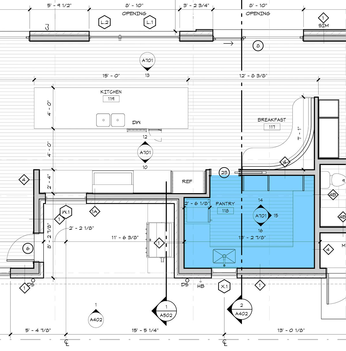
Here is a plan of the space to help you with your visualization as well has to get an idea of the amount of space divided up between the public kitchen and the more private pantry space … which in this case also acts as a catering kitchen, so this is a pantry extraordinaire!
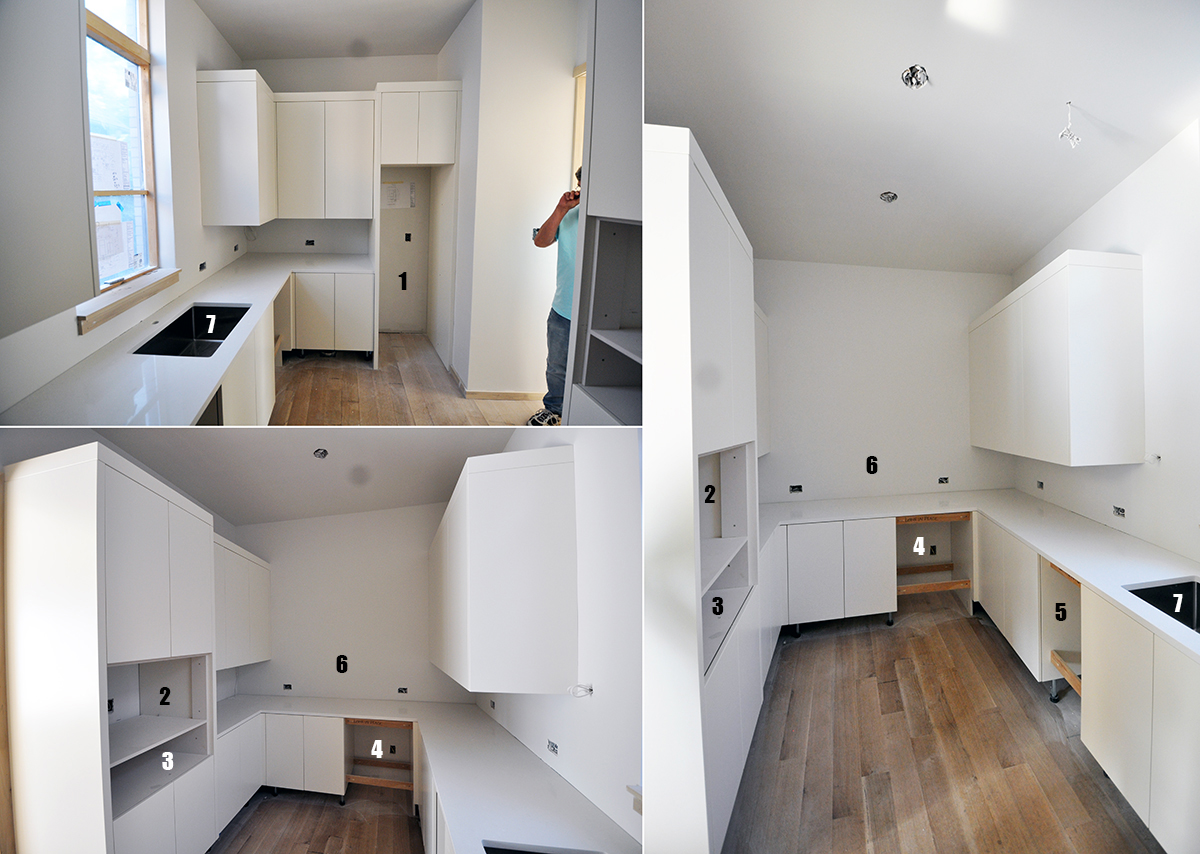
I had to go digging through my old hard drives to find some pictures of this pantry. We had a bad habit at my last office of not taking final images of working spaces like these (and laundry rooms, powder baths, etc.). So I don’t have final images but I do have some images of the cabinets going in and it should help those of you who don’t read plans for a living. I have also added some key tags in here to help explain what’s going on:
- This is a space for a tall wine refrigerator
- Microwave – which I love moving out of the kitchen and into these service type spaces. Most people only seem to use them to reheat leftovers, melt butter, and heat up drinks.
- Warming drawer – we seem to be getting fewer requests for these of late but they can come in handy if you do host events and need to keep things warm while organizing or plating up dishes.
- Ice Maker – this was a large one
- Dishwasher – this would be the second dishwasher they have. One is in the main space and one is in here – again, works well if you have caterers working away or if you are having a smaller gathering and simply want to run the dishwasher and close the door to this space to help abate a little noise.
- I decided to tag this area only because it might be weird that there are no upper cabinets in this area. This was done specifically for catering in mind – think elevated chafing dishes with sterno heating elements below. Removing the upper cabinets in this area just made things easier and gave the servers access to the full depth of the countertop.
- Sink – didn’t really think I needed to point this out but felt I would err on the side of caution.
Let’s look at another pantry that was done for a cabin project of mine that I featured on this site.
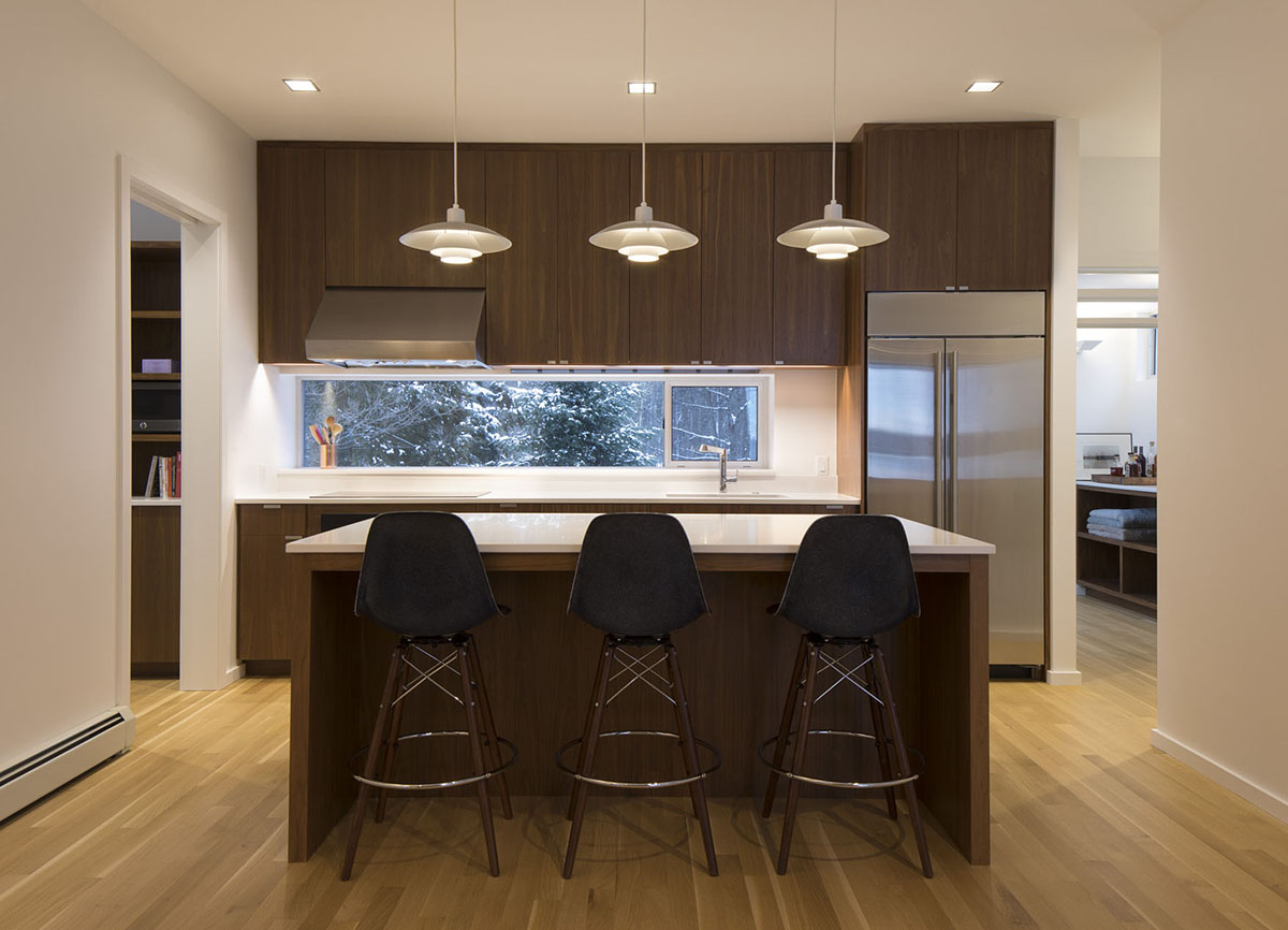
This is the kitchen at the cabin – pretty wide open and on display for the entire second floor to see. Once again, we carved out space from the main kitchen to create a pantry space which was literally an extension on the main kitchen, but off to the side so that a pocketing door could be opened/closed to control the visibility and access to the space however you saw fit. My wife and I recently took a 4-day weekend trip up to have a bit of a socially-distanced holiday.
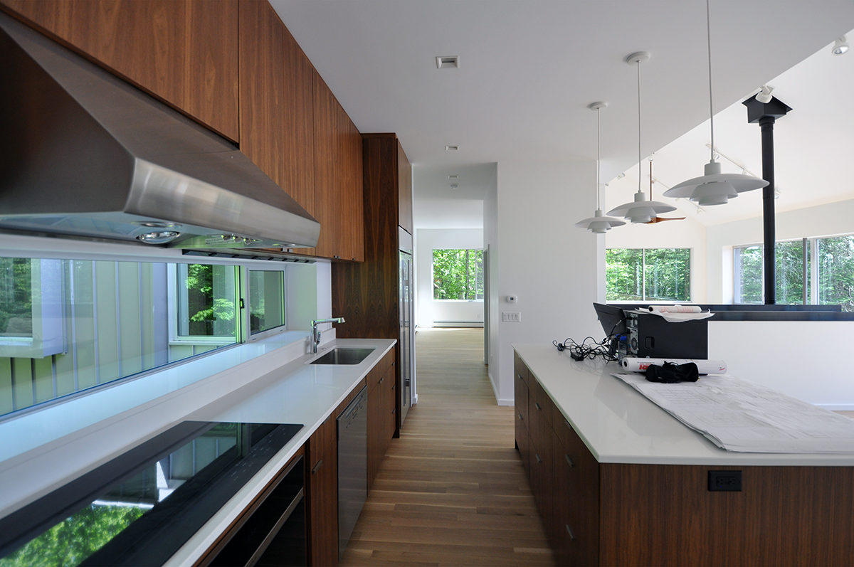
Just like the first kitchen/pantry I showed in this post, I thought a few photos to help orient you – as well as demonstrate how open these kitchens really are – before we get into the plans and elevation drawings. This photo was taken a few years ago prior to the client taking possession and it was employee Landon Williams and me up on-site to do the final punch list and closeout on the project (which is why there’s nothing in the space other than our office equipment).
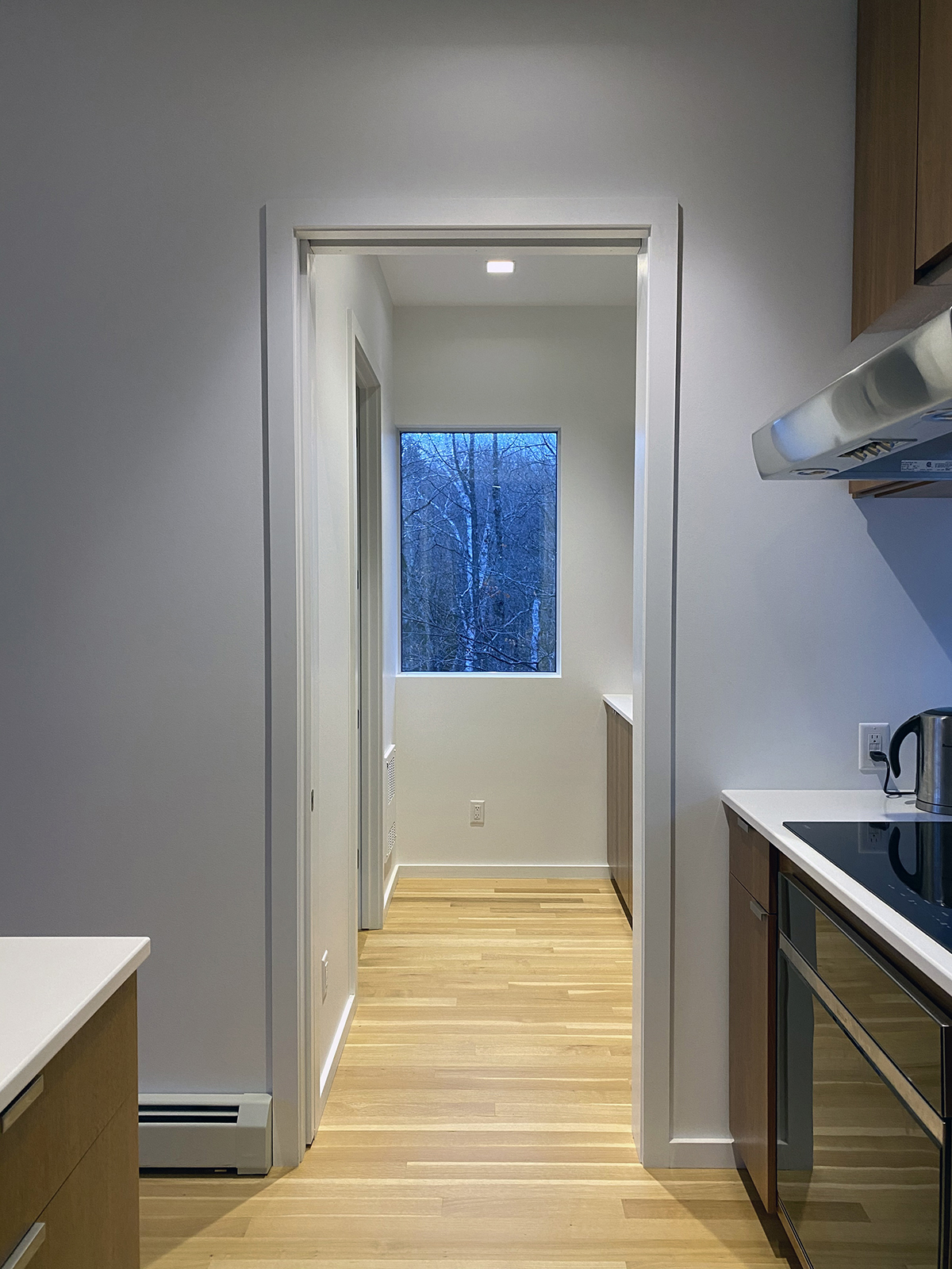
But let’s get back to the pantry – which you can start to see in the image above. The thing to note about this particular pantry is that while it isn’t small, it isn’t particularly large either – slightly larger than a walk-in pantry you might see in a house the same size as this one. There are three design gestures we made to help this pantry be all that it could be:
- We used the same materials in the pantry that we did in the main kitchen. This means that the two spaces visually flow together as one rather than feeling like one is a lesser space.
- We moved this pantry to an exterior wall so that we could add a window in the space – a view that just happens to be particularly special to this client.
- The cabinets, countertops, upper cabinets – everything – aligns from one space to the next so other than the pocketing door, this basically is the kitchen.
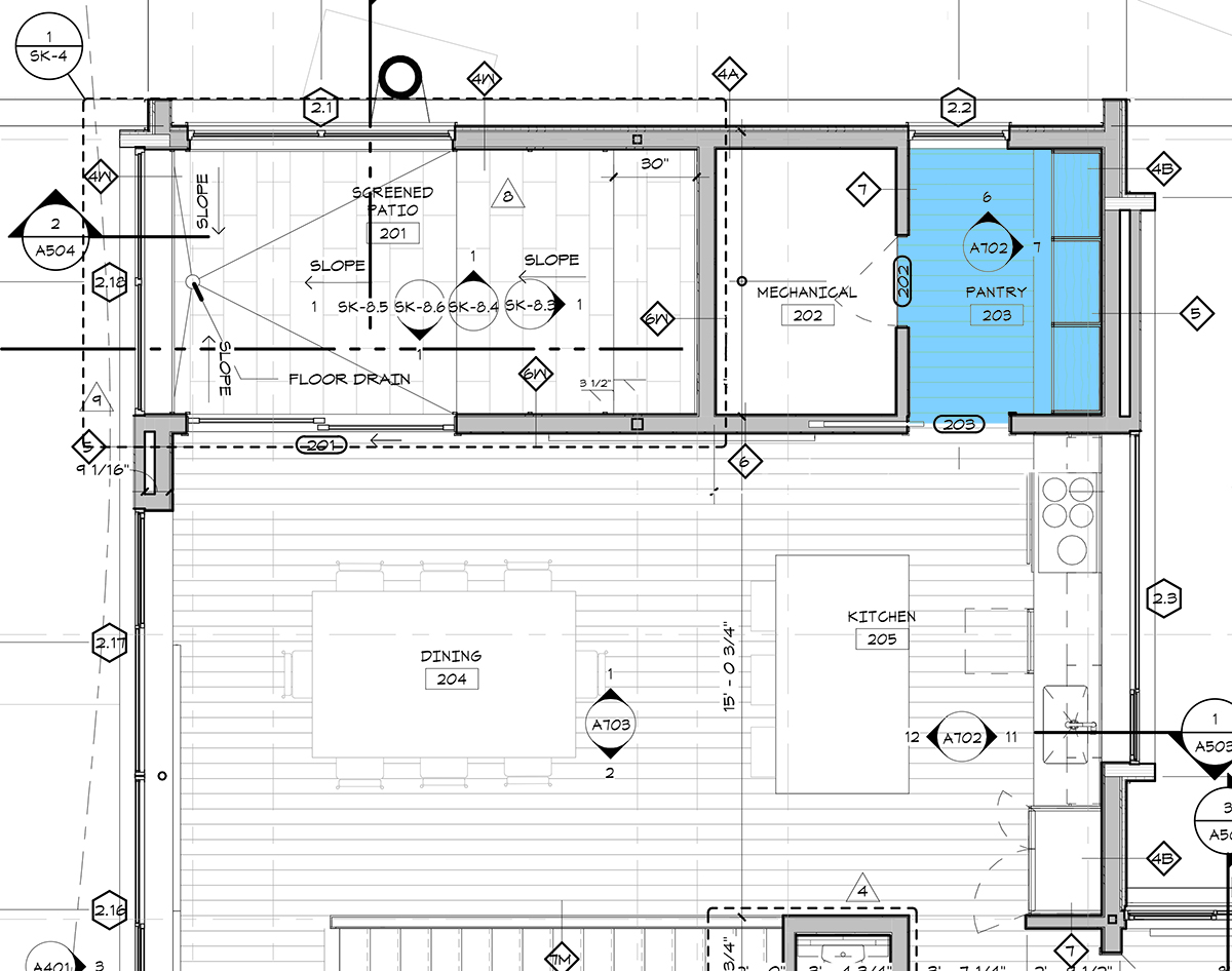
Hopefully, now that you’ve seen the images, reading the plan makes a lot more sense. The really big takeaway here is that the size of the kitchen isn’t very large, which depending on how you look at it, either makes the pantry large in comparison – OR – more functionally sized based on the size of the kitchen.
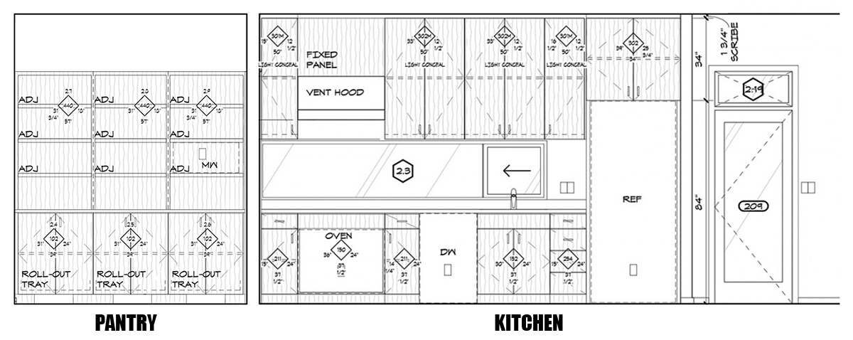
I decided to include this composite elevation drawing to show you what I meant when I said that the pantry millwork was an extension of the kitchen. You can see the gap between the two which indicates the location of the wall. Anything that you need from the pantry is easily relocated into the kitchen with only a step or two – probably similar to any traditionally designed pantry location.
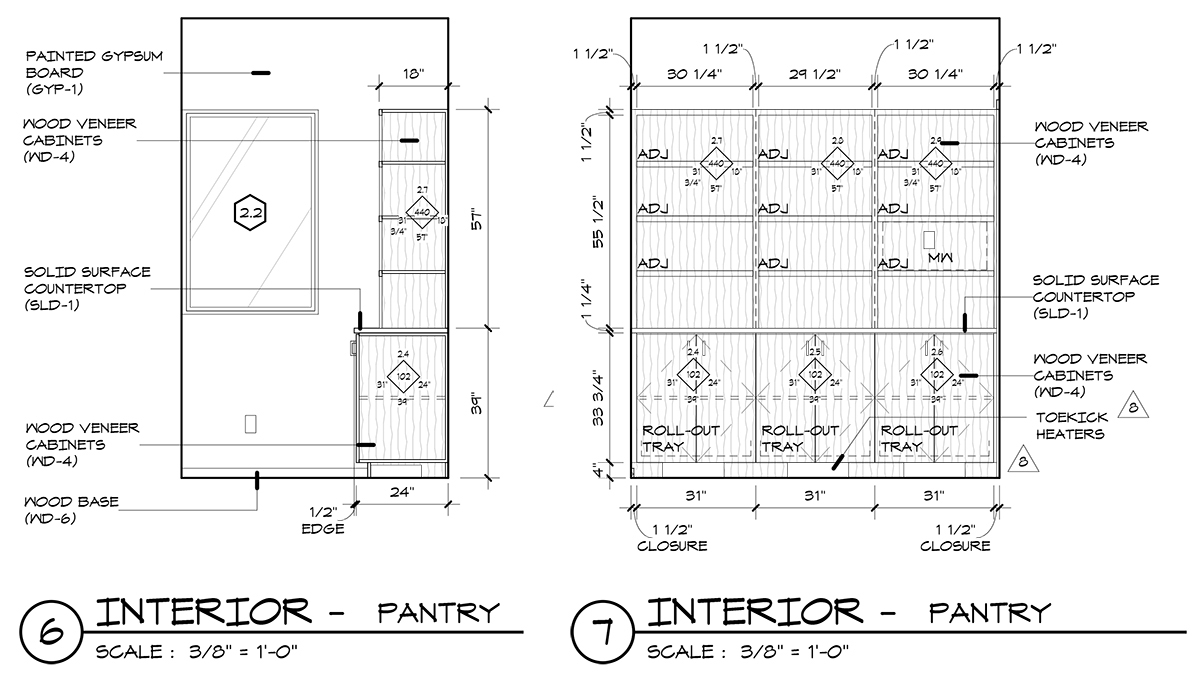
The other item I would like to point out is that the pantry is made up of base cabinets and open shelving above. Most traditional pantries are floor-to-ceiling shelves but I’m not convinced that this is really the best way to layout a pantry. The floor is typically relegated to large items and bulk storage – most of the time I find bins of pet food and bulk packages of beverages. The thing that makes both pantries I’ve shown today go is the countertop that exists between the base cabinet and the upper shelving. The countertop allows this space to function as a workspace in addition to a storage space.
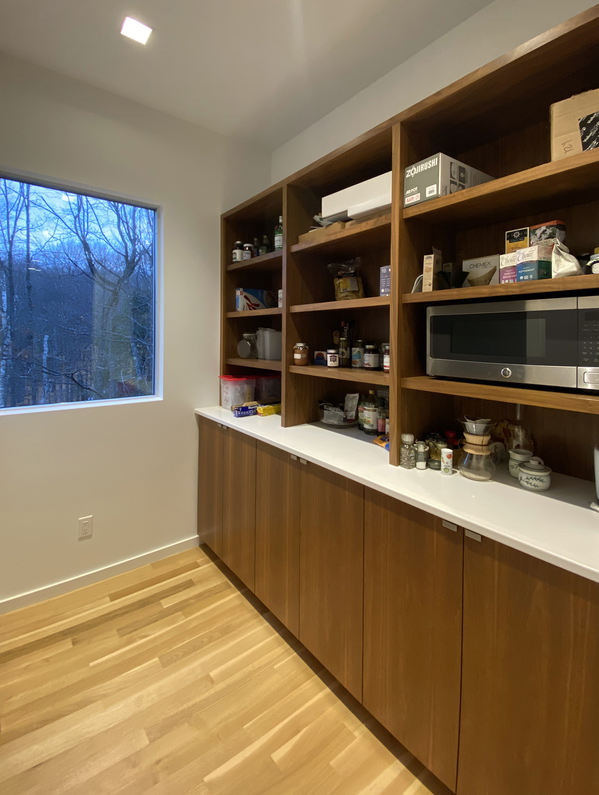
I have no doubt that the client of this cabin is having a heart attack that I am showing this pantry because it isn’t beautifully arranged and prepped for this photo – which is exactly the reason I am showing it (not to give her a heart attack, but to show how the pantry currently functions). The vast majority of people who will use this pantry are guest that are there for a visit and as such, this pantry doesn’t bulk up on bulk items. For example, there are staples that someone might need but there aren’t the random packages of jello or pudding. Most of what is here are either left behind from other visitors or items of need that people tend to forget when traveling.
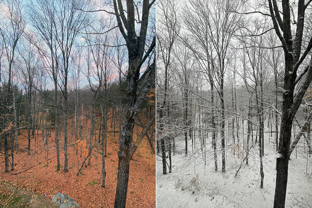
The last image I will leave you with might be one of the most important because it is the view you get from the window in this pantry. Adding something as simple as a window to a pantry can transform the space more than almost any other design move you could make. The pantry is not a dead-end room buried within the interior footprint of the home – it is a light-filled workspace that can be as much of a pantry as you need but in reality, is much more than just a storage room.
Cheers – and here’s to better pantries.

